From April 2024 to September 2025, I was contracted to provide design services for a Seattle-based tech non-profit, Computing for All.
I was hired to help build their brand and lay down the foundation of their creative strategy/execution.
Computing for All (CFA) places Washington's under-represented youth into tech jobs; working with colleges, training partners and companies to place recent graduates and trained students into employment and internships.
I worked with their Marketing team, attended strategy sessions and provided a multitude of assets to help increase their brand awareness and connect employers with tech candidates, through their talent portal, email marketing, digital branding, and on-site events.
When I first started my career at Farmers, our Creative Services department worked on internal projects for employees and agents (long-book documents, flyers, program IDs, illustrations, internal motion graphics, etc.) within the umbrella of Corporate Communications/Internal Communications.
After new leadership changes, we transitioned to the Marketing Department and changed our focus to our customers. That included marketing campaigns (direct mail, emails, social posts, animated and static display ads, motion graphics, etc.), illustrations, web design, etc. I worked very closely with account executives and content managers to collaborate on strategies, messaging and, ultimately, the final design of deliverables to help increase brand awareness and generate leads.
I also worked with our in-house printing department to deliver production-ready assets so we could execute speed-to-market and deliver value to our customers. I worked closely with Farmers Strategic Partnership Account Managers to gather data and determine which deliverables resonated with Farmers' target demographic.
We needed to increase engagement on the Learn From Experience section of farmers.com. So we created a short, fun video for LFE called "Summer Maintenance Tips". We also showcased the video on YouTube and Instagram. Statistics show that users will stop scrolling for video, versus static images.
I worked with a content manager, who came up with a script, and I did a quick story board. We got approval from the client (an internal stakeholder) and I dove into the graphics, using Adobe Illustrator and Adobe AfterEffects. The client was delighted with the result and we increased the click-rate by 10%.
I also created micro animations proposed for farmers.com as a way to entice the user to click through into homeowners and renters section of the site.
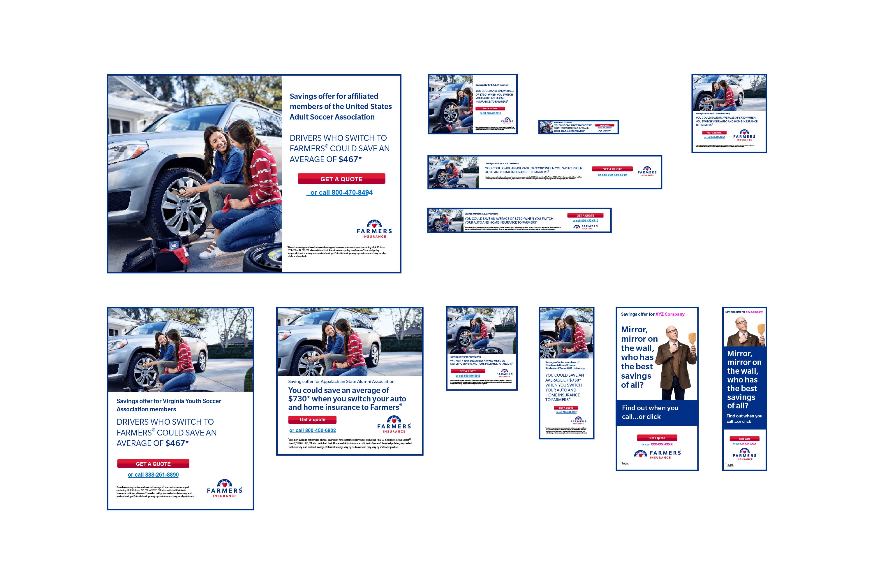
As a part of Farmers Insurance acquiring MetLife, we had to very quickly rebrand thousands of assets from the MetLife branding to Farmers branding within one quarter. Because I am fairly familiar with HTML5 animations, I got the bulk of the banner ads. Due to versioning, I executed about 200 different ads.
I rebuilt them in Tumult's Hype, did code cleanup using Visual Studio Code, and tested them via Google Ad submission.
"Parking" (below) increased click-rate by 23% and brought more traffic to farmers.com. Because of the sheer volume of ads created, I launched an HTML5 Google Ad submission documentation for fellow designers, enhancing team efficiency by 25%.
Our team created stylescapes (from Chris Do's Branding sessions) for our brand evolution, which came out of design thinking strategy sessions. We wanted to stretch our brand guidelines and try some new ideas, very quickly and in sprints*.
Our team had about two weeks to create stylescapes and mockups. I created two stylescapes and combined them to one mockup.
*There was no data research or user feedback when we started designing due to time constraints.
This is called 'Value Millennial.' Grayscale was more emphasized, with touches of color. Also, line art was used for the illustration style, versus the previous solid, flat style.
This one is called 'Optimistic Blue.' I wanted to use a more mid-blue color (versus Farmers 287 blue) as the main theme, with touches of green. I also added a more personal font, Brandon Text, in addition to Farmers brand font, Slate Pro. The presentation was well received by Marketing leadership.
Based upon the stylescapes, I combined both to create the mockup. We tested with the target demographic and received positive feedback.

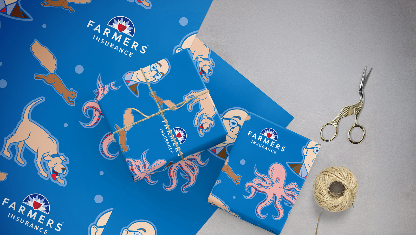
When we merged with MetLife's Auto and Home divisions, we acquired Affinity and employer groups--another channel to market our products. This meant we had to create and deliver 'templates' to our clients, who worked directly with our Strategic Partnerships.
I created templates for direct mail (using Adobe InDesign/Photoshop/Illustrator), buckslips and print ads (using Adobe InDesign), email (using Figma) and social posts/banner ads (using Adobe Illustrator) with our brand spokesperson, Professor Burke (the actor J.K. Simmons). We also used stock and brand photography. The objective was to provide options to our clients.
I closely collaborated with the account executive partner/content manager and we had to consider variable elements, which are designated in pink. The digital assets in particular increased brand awareness, lead generation, and click-rate by 10% for target demographic via Affinity groups and employer-sponsored channels.
Scroll through the images by clicking on the numbers/arrows below.


This is a combination of Powerpoint presentations, illustrations, interactive PDFs (created in Adobe InDesign) and icons (created in Adobe Illustrator): for employees and agents. Also included are Procreate illustrations for social media.
Scroll through the images by clicking on the numbers/arrows below.


I love to take my artwork and mock it up. Plus, it's a great way to show the client how a piece would look in their space. The art below is from Procreate on the iPad. Some color, some b/w.


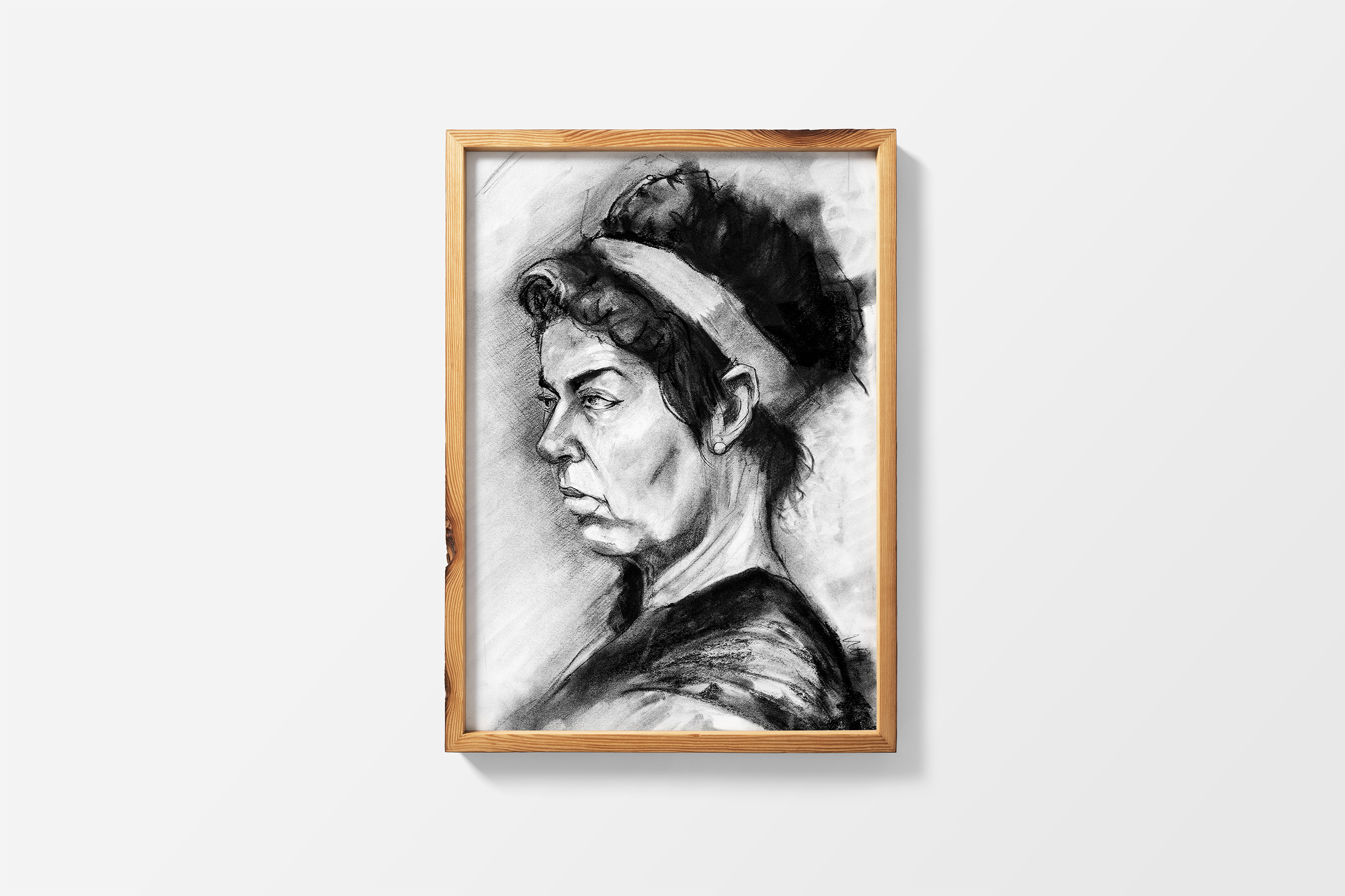
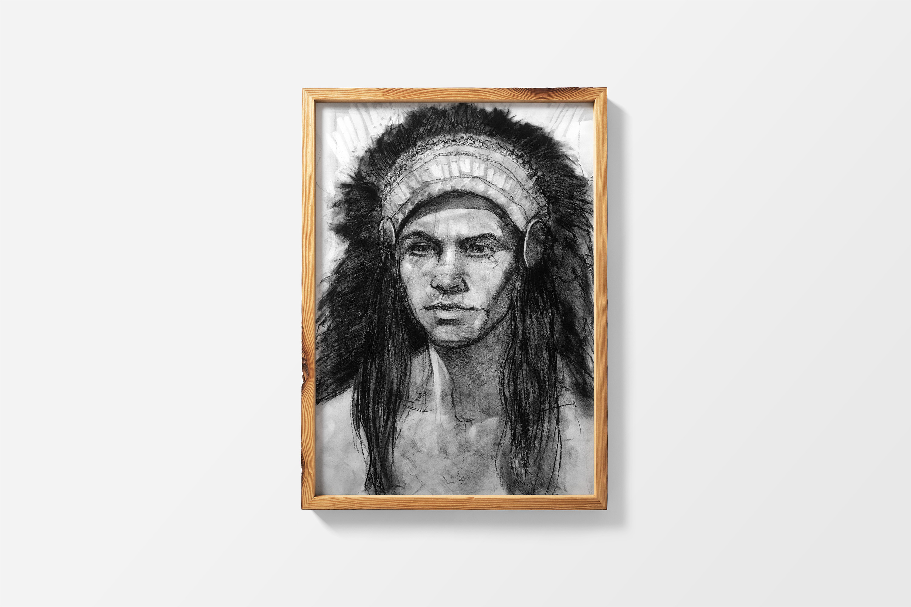
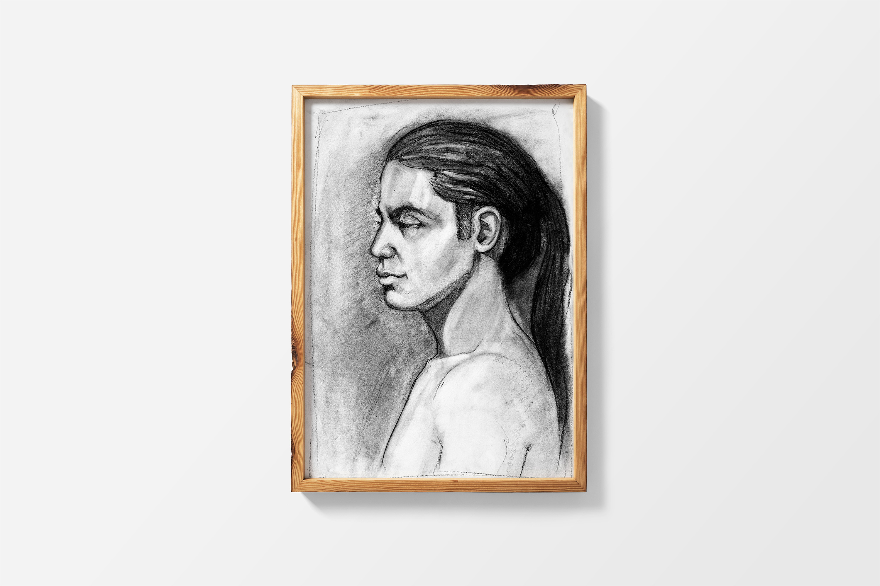
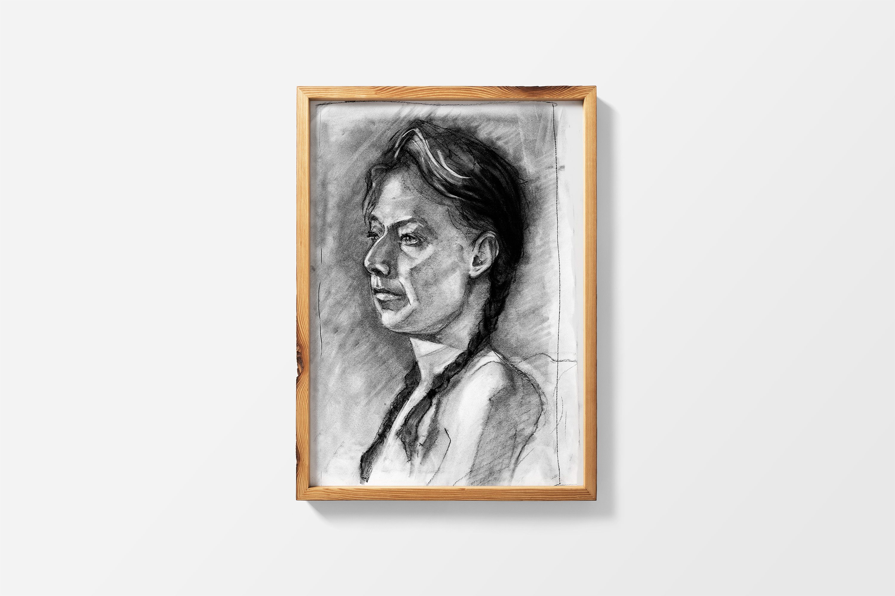
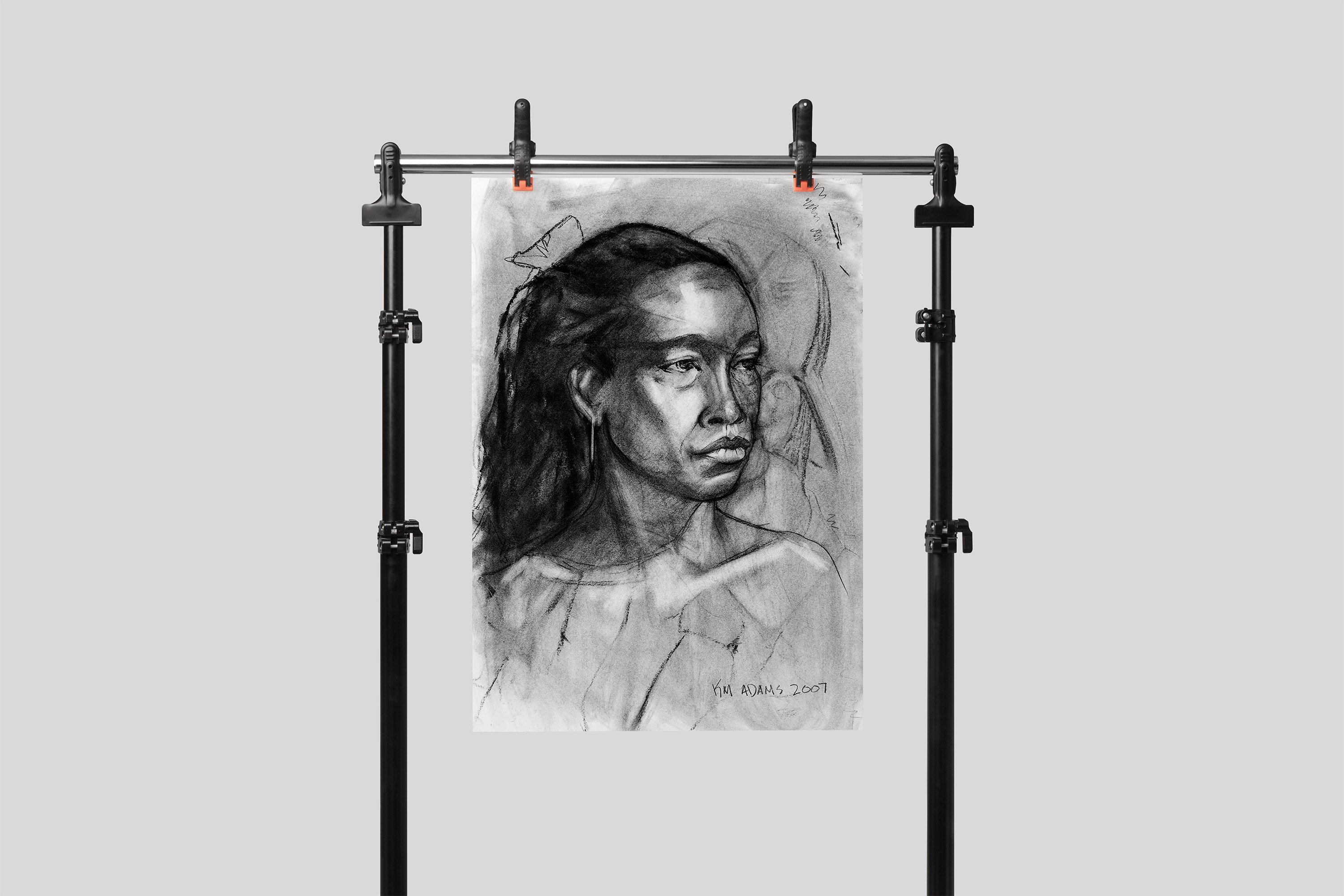
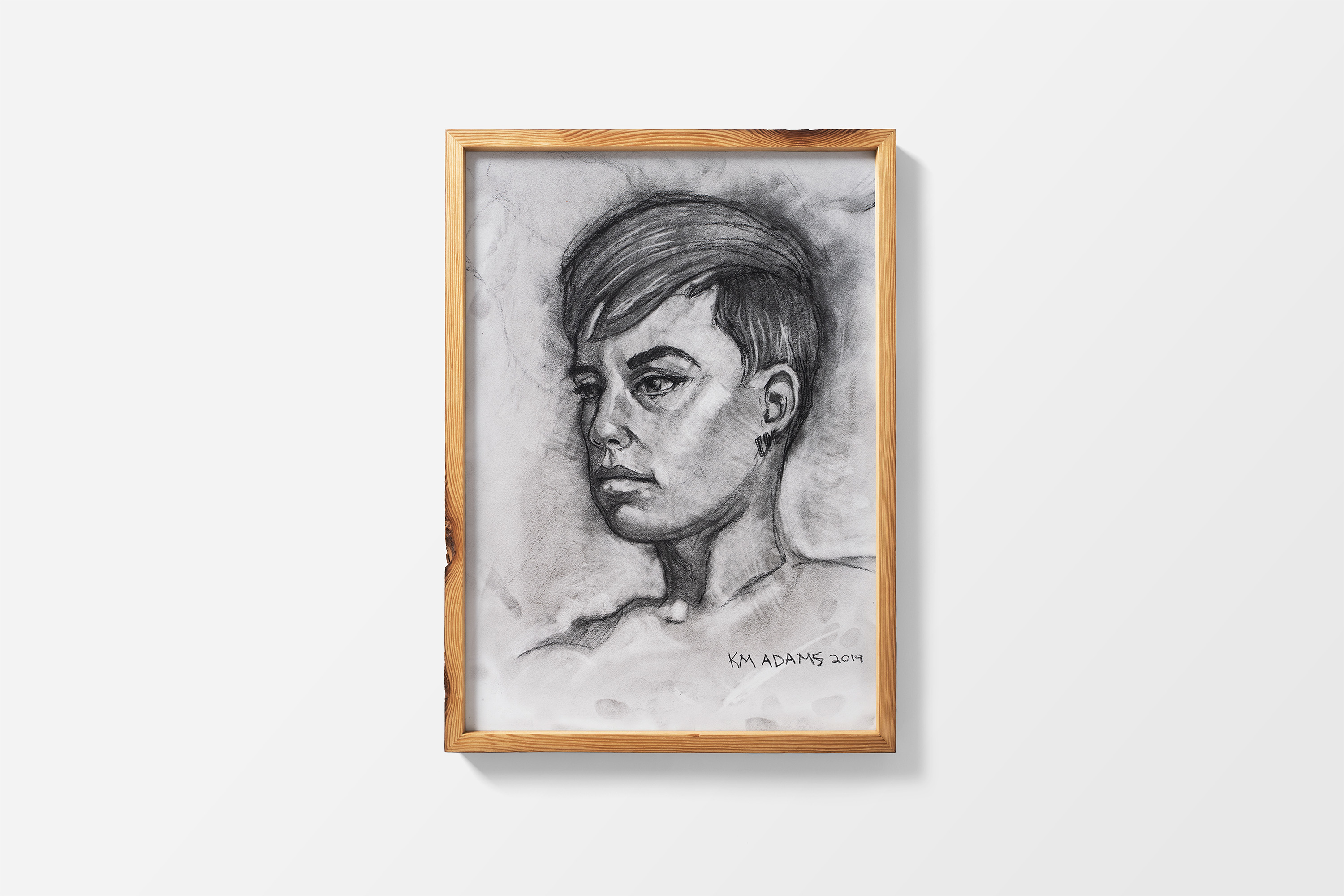
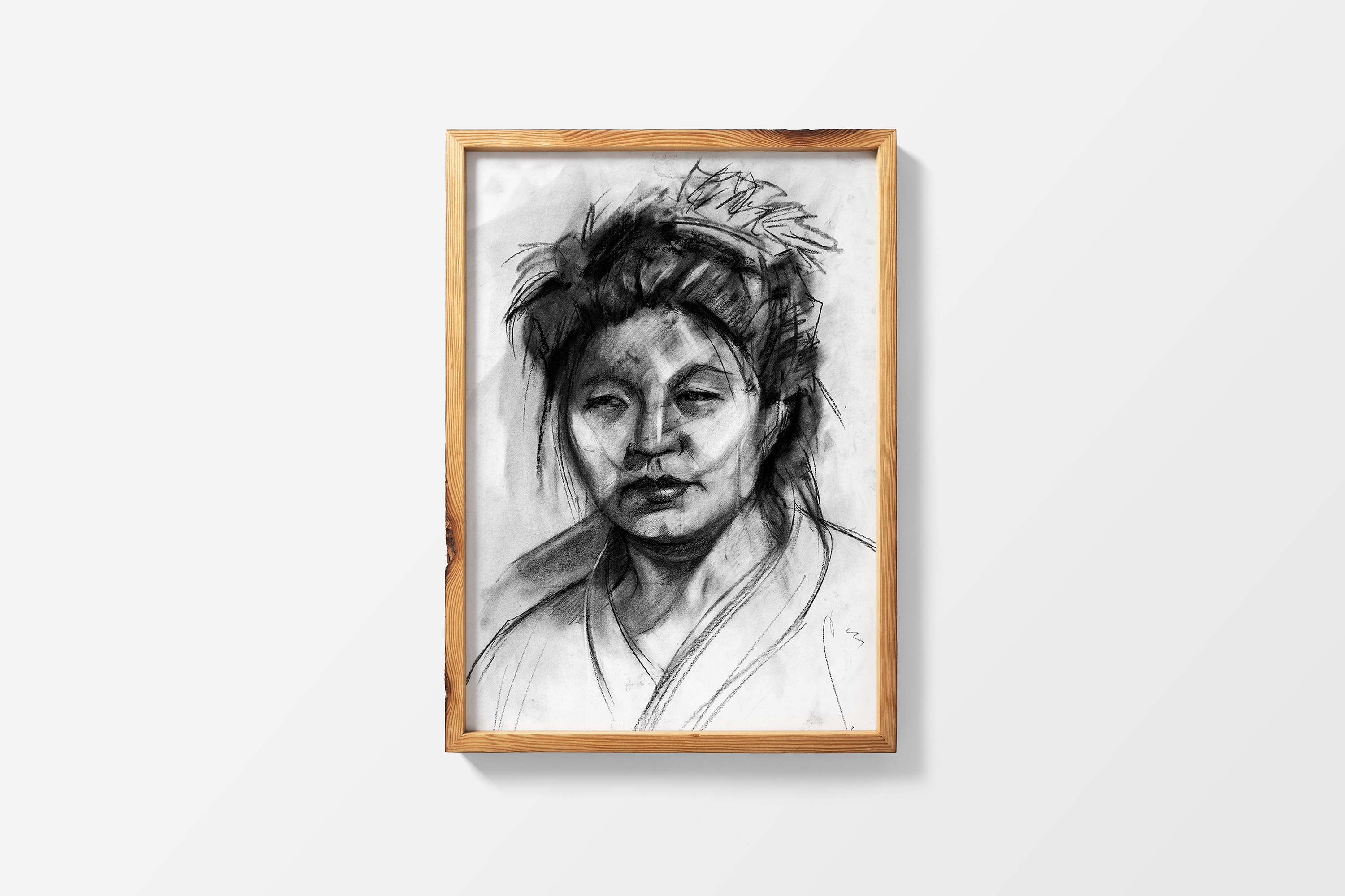
Below are portraits I created, through traditional media.
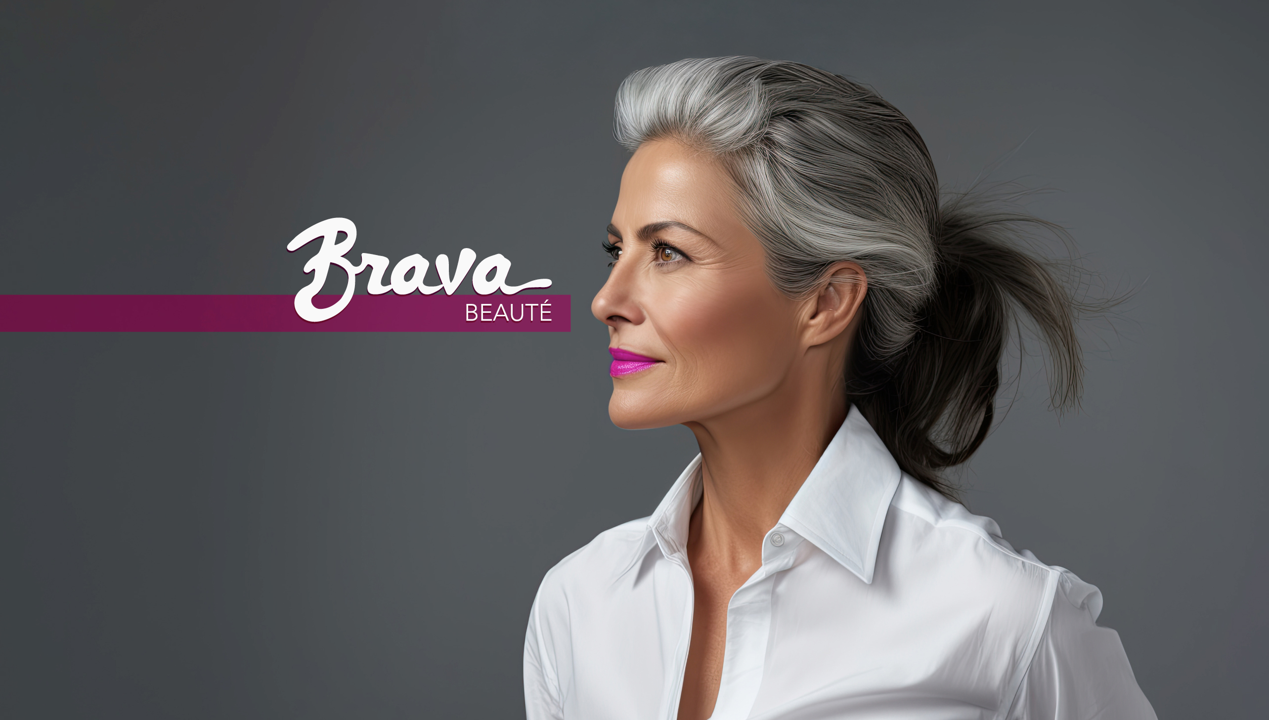
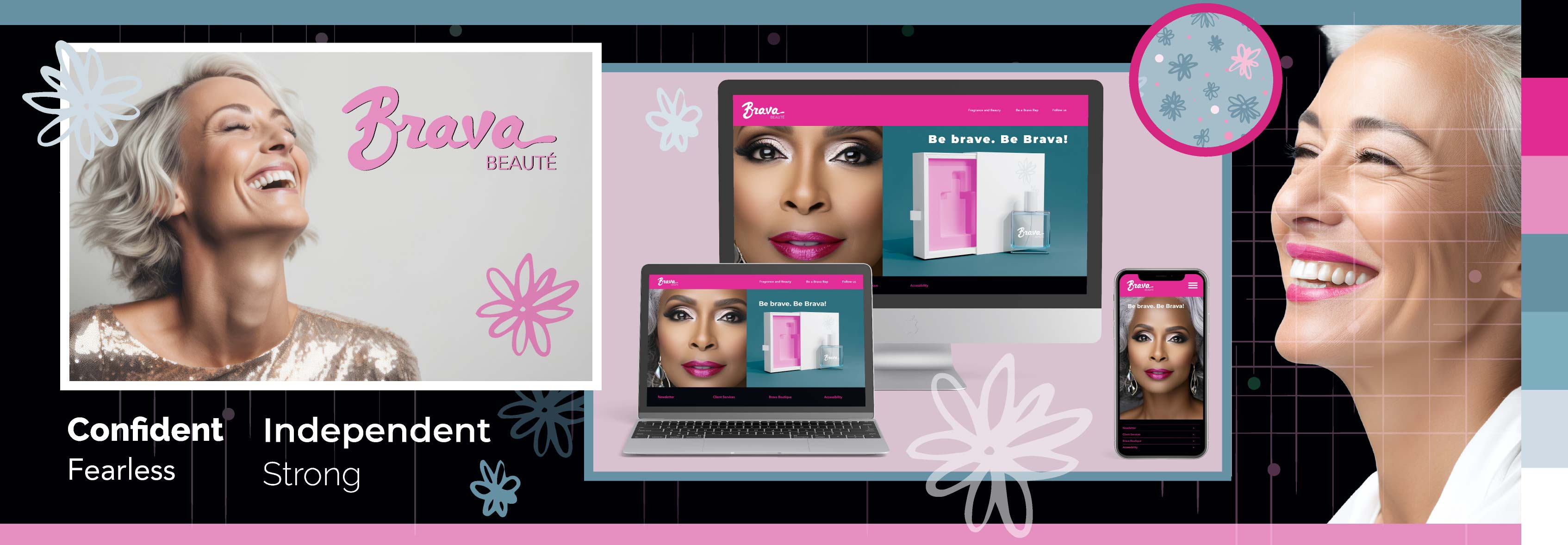
To address the challenge of providing a comprehensive beauty product line to Baby Boomer women, I created a full identity system that consists of a logo, email design, stylescapes, website design, content, and other assets. Not only was package design considered but also creating assets for online brand-building and easy purchasing was also implemented, since BB women are tech savvy and do their own sleuthing when buying products (scroll down to see the preliminary research below).

In answer to the BB women challenge, Brava Beauté created an array of products, easily available for online purchase (via app or website) or in high-end retail stores.
Scroll through the images by clicking on the numbers/arrows below.


This is perhaps my favorite portfolio piece.
My supervisor at the time, Cliff Singontiko, told me of a 30-day skateboard challenge, started by infamous Chris Do (founder of Blind Agency and The Futur online design business school).
Chris Do provided the Photoshop mockup template and encouraged all participants to post on Instagram with the hashtag #30DaySkateboardChallenge. Cliff knew I loved a challenge so I dove in.
I used my art to create the designs: vector art I had created in Adobe Illustrator from personal projects, pixel art from my digital paintings (as well as traditional paintings I had scanned in), and various textures that I either created or got from stock image banks.
Once a theme emerged, I used Broadwell Distressed for my font and took it from there.
I had a blast.
And I went creatively nuts. I blended textures with slick graphics to design something magical. I created art. Cool, funky art.
Although my work commute at the time was horrible and I became sleep-deprived, I couldn't wait to get home and design another board. I often found myself working until past midnight, just to get the board right.
So, let's hear it for Instagram challenges and awesome bosses that encourage us to explore our creativity!
Scroll down to see the final designs.

Scroll through the images by clicking on the numbers/arrows below.


Before I did any sketches, I researched more about the buying power of Baby Boomer women.
An estimated 39 million Baby Boomers are women, so this demographic cannot be ignored. Which is why we see more and more mature women in commercials, print magazines, etc. Marketing to this demographic is a no-brainer for any beauty product line.
The Baby Boomers in general has been the demographic engine driving social change in the U.S. for the past fifty years. Within this large cohort, significant numbers of Baby Boomer women earned college degrees, entered the labor force, and began to maintain their own households during the 1980s. Women born in the late 1950s and early 1960s were the first group to overtake men in the completion of college degrees.
In 1990, when Baby Boomer women were between ages 26 and 44:
• Women made up 45 percent of the labor force.
• Just more than one-quarter of working women had college degrees.
• Women were 17 percent of physicians and 22 percent of lawyers—up from less than 3 percent of lawyers in 1970.
Purchasing style of Baby Boomer women:
•Baby Boomer women have more disposable income and money to spend.
•Boomers trust their Google moves more than social media marketing and videos.
•Boomer women’s influence account for a significant chunk of consumer purchases.
•Boomer women feel invisible and misunderstood by marketers and businesses.
•Woman empowerment and the environment are hugely important for Boomer women in terms of purchase decisions and brand loyalty.
Sources:
https://www.americanprogress.org/article/fact-sheet-4-generations-of-american-women/
After researching BB women, I roughed out some lettering sketches. I knew that I wanted the lettering to be unique. And, when I want to bang out ideas quickly, I will go straight to the iPad and fool around with drawing any combination of letters. I will do my name or anything else I can think of just to 'warm up.'
Eventually, I came up with a final design, which I rebuilt in Adobe Illustrator.

Tor-a was born out of a need for an art connoisseur to easily find, book and check-in on an art tour--either at a museum or at a gallery--on their smart phone.
The final product: a mobile app where the art lover can search and book tours, add on certain perks such as parking, check-in with a QR code, review tours, and connect with other art lovers.
Scroll down to see the complete project: the research behind the design.


Final screens.
When it comes to UX, many don't realize how much research goes into preliminary phases of building out a mobile app. From the research/ interviewing, to data-extraction, sketches, prototypes, testing those prototypes, sifting through insights/patterns and conducting MORE testing--there is a ton of footwork before a MVP (Minimal Viable Product) is available for launch.
Before I could do any in-depth research, I had to ask myself what would a successful art tour app look like and who would want it? Once those questions were answered, I had a first step towards gathering research and conducting preliminary interviews.
I targeted a certain segment of the art loving population and focused my interviews towards them. From those interviews, I got an idea on what they wanted in an art tour app.
Tor-a's Key Performance Indicators will be measured by:
How many tickets are sold
How many check-ins registered
How many downloads from the Apple Store/ Google Play
Our target audience:
Avid art lovers who attend galleries and museums more than 3x per year
Ages 30-50, no gender preference, no orientation preference
Middle-to-upper income ($80k or more annual income per year)
With family or career obligations that can make booking an art tour a bit of a chore
I was a one-woman UX team that:
Conducted research and interviewed participants
Created personas, journey maps and competitive audits
Created paper and digital mockups and a low-fidelity prototype, for testing
Conducted usability studies, analyzed data, and sifted out patterns and insights
Iterated on that data to create the final high-fidelity prototype
Created the final Tor-a logo, from pencil sketches to final vector art
Conducted more testing and iterated on new insights

I conducted preliminary research online, gathered interviewees with screener questions (via social media), extracted data from the interviews and distilled the pain points.
From there, I created two personas. From my two personas, I was able to create:
Problem statements
User stories
Journey maps
Competitive audits
After sifting through the user research, there were several pain points that led to two personas: Gemma and Davis.
Pain points:
Art lovers want to book and check-in to a tour without large crowds
Gallery tours can be overwhelming and art attendees want to have choices and find their favorite artists
Calling a museum or gallery and writing down the tour info is cumbersome and confusing
Waiting in line is maddening and most art lovers want to check-in easily and quickly


Gemma is an art lover and mom who needs to be able to book art gallery tours before arriving to the gallery because she wants to avoid crowds due to Covid and reserve special accommodations for her disabled son.
Davis is a busy editor/writer and art lover who needs a concise way to find their favorite artists because living in a big city can make searching for art difficult.
I used the main persona, Gemma, as my guideline. I mapped out her experience when booking and bringing her family to a gallery tour.
The journey map provided insight into Gemma's path via task lists, her feelings regarding each step, her pain points on the path, improvement opportunities to help make her journey smoother and and how to execute them. The journey map also indicates Gemma's first steps towards a digital solution.

I chose to draw out the wireframes before building them out in Figma, playing with different elements and doing as many iterations as I could, set to a timer. I based my ideas on the competitive audit I conducted on LACMA, Los Angeles Art Gallery Tours and Viator.

Based on my sketches, I built out a low fidelity prototype in Figma--a must have for usability testing.
My goal was to capture the main user flow, tackle the first iteration of a digital wireframe and, once testing was done, iterate again based upon patterns and insights.
I conducted an unmoderated usability study with 5 participants, using prompt questions and a System Usability Scale (SUS).
Prompt 1: Sign into or create an account and search for gallery tours.
Questions: Explain how you searched for a gallery tour. If you created an account, what worked and what didn’t work? How easy or difficult was it to search as a guest? What would you change?
Prompt 2: Select a gallery tour.
Questions: How did you select a gallery tour? Was it easy or difficult to get the details of the tour? How did you backtrack, if you didn’t want your original selection? What would you change?
Prompt 3: Add a tour to the shopping cart.
Questions: How easy or difficult was it to add your chosen tour to your shopping cart? What worked? Explain canceling a tour and going back to home screen. What would you change?
Prompt 4: Confirm booking of the tour and pay.
Questions: How easy or difficult was it to confirm your tour and pay? Explain canceling your tour and going back to the home screen. What would you change?
Prompt 5: Log out of the app and then log back in.
Questions: Explain how you logged out of the app. How did you log back in? What would you change?
Prompt 6: Find the QR code for check in.
Questions: How did you access your check-in QR code? What was your navigation path? What worked or didn’t work?
The first usability unmoderated study and SUS revealed insights into the user flow. In particular:
The lack of clear direction on what the user can click on next
No clear sign-on function
No easy way to search for gallery tours
Users did not like the horizontal scrolling
The assumption was the sign-out feature would be in the profile screen and not the hamburger menu
The second usability test revealed more issues. Namely:
Users would like the option of adding the purchased ticket (QR code) to their digital wallet
Users would like the ability to change the dates in the shopping cart
Users wanted a cleaner detail screen, as the first iteration was confusing
Users wanted a sign-out function on every screen, not just profile screen
After two rounds of testing, I created an affinity map and distilled data into patterns and insights.
Based on the theme that: most users had difficulty signing in, an insight is: users need more indications that they have properly signed into the app
Based on the theme that: most users couldn’t figure out how to search for a tour, an insight is: users need visual cues on how to search for a gallery tour
Based on the theme that: most users want the shopping cart clear and easy to find, an insight is: users prefer a shopping cart option that is clear and easy to access
Based on the theme that: most users want an easy way to cancel a tour, an insight is: users want to be able to access a function anywhere from the app to cancel a tour
Parking considerations were built into the amenities function for each tour, as way for users with disabilities to determine which tour was best for them
Contrast was considered for the screens, as to be ADA compliant and help users with low vision be able to read screens
After the first usability study, the blue was deepened to provide more contrast, the green color also deepened and the navigation bars were simplified, with more white-space added
The sign-out option was added to the top navigation menu, for easy sign-out
A language option was available for non-English speakers
Please note I am still building out this project. Check back soon!
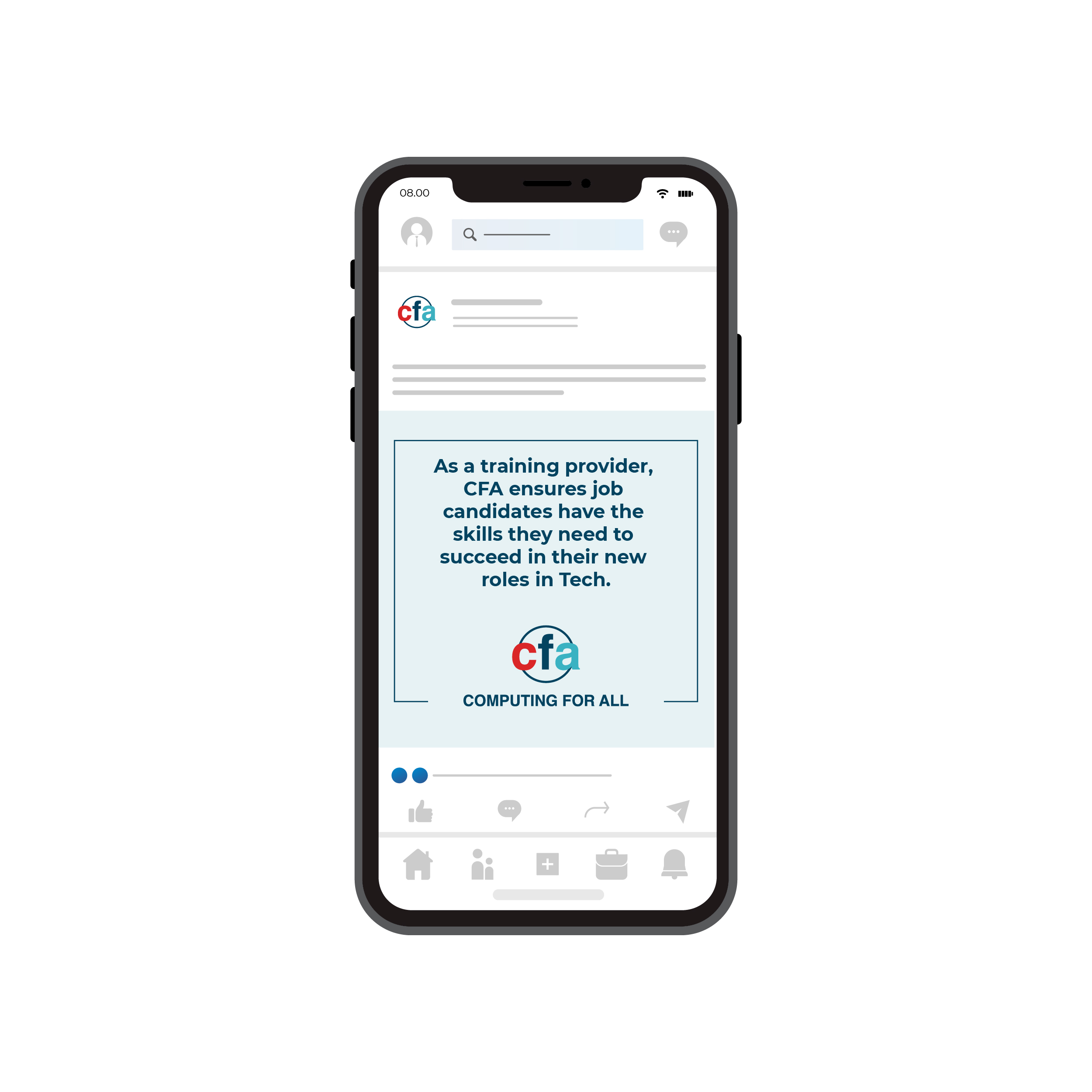
After CFA secured state and federal grants, the leadership decided to implement a new marketing campaign and I was approached by their marketing manager (a former co-worker), who asked for my help with creative strategy, asset creation and best practices on execution.
One of my first tasks was to do a design audit and make recommendations, based upon their updated marketing strategic plan. This meant I audited their websites, styleguides and any other assets they used in their materials.
I met with stakeholders and figured out their pain points, as well as conducted exploratory ideas.
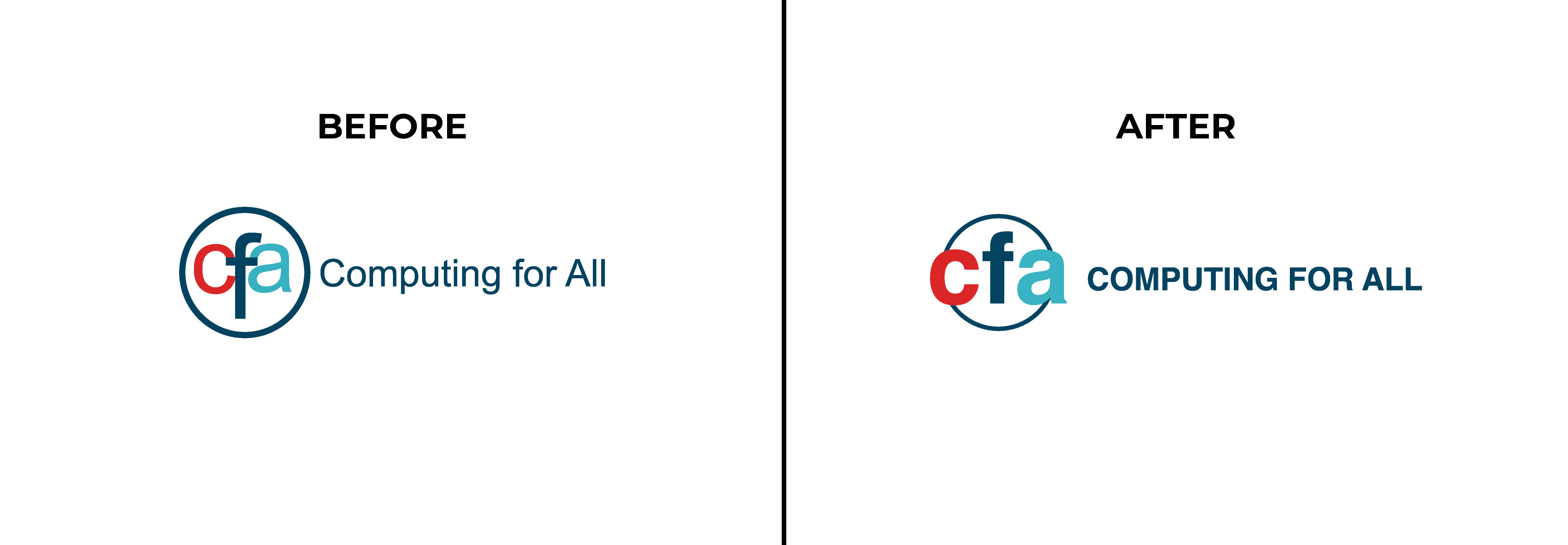
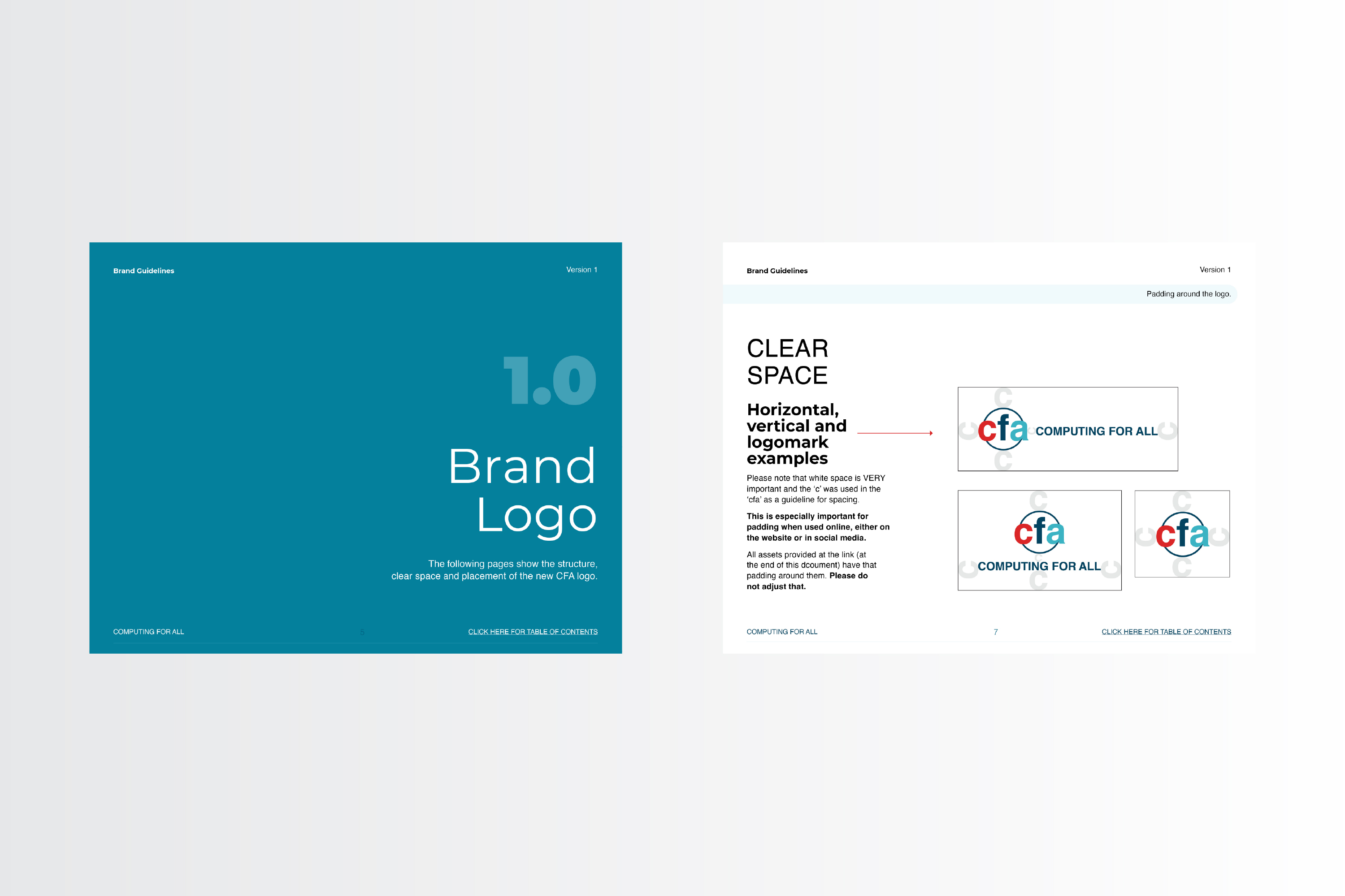
While there was some discussion of re-doing the entire logo system, leadership decided that a logo refresh was more optimal for the time being, due to budget and time restraints.
I kept the circle, to convey CFA's role in connecting employers to tech students. I cleaned up the typography and kept the font--Helvetica--but made the title in all caps, to indicate CFA's authority in the tech world.
Below are the before and after versions of the CFA logo. Note that the updated version is more legible and more flexible for other channels, such as the website and social media.
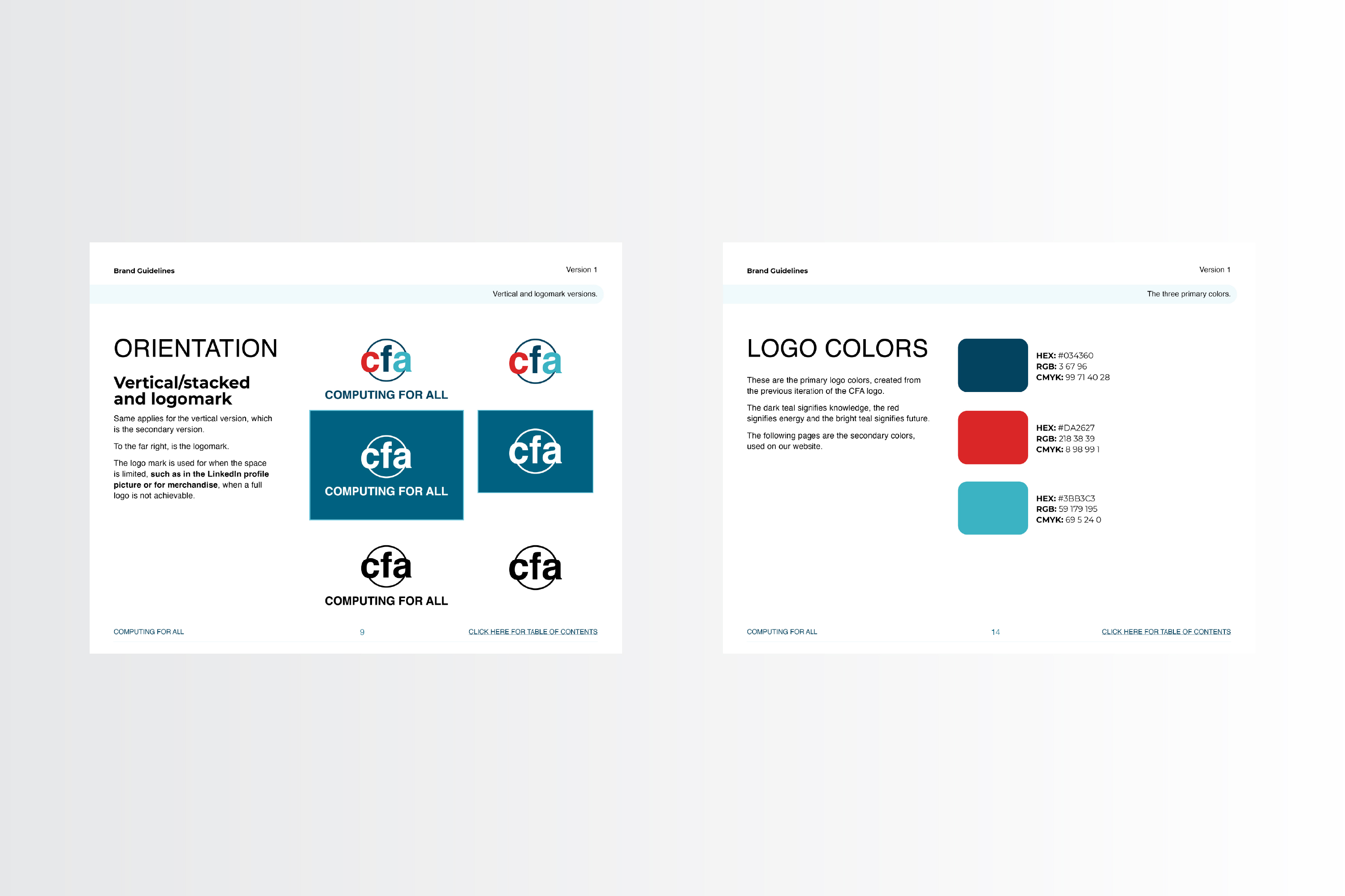
Below are the final logos and their variations, including a quick micro animation that we had planned to use as an end card for future social posts.
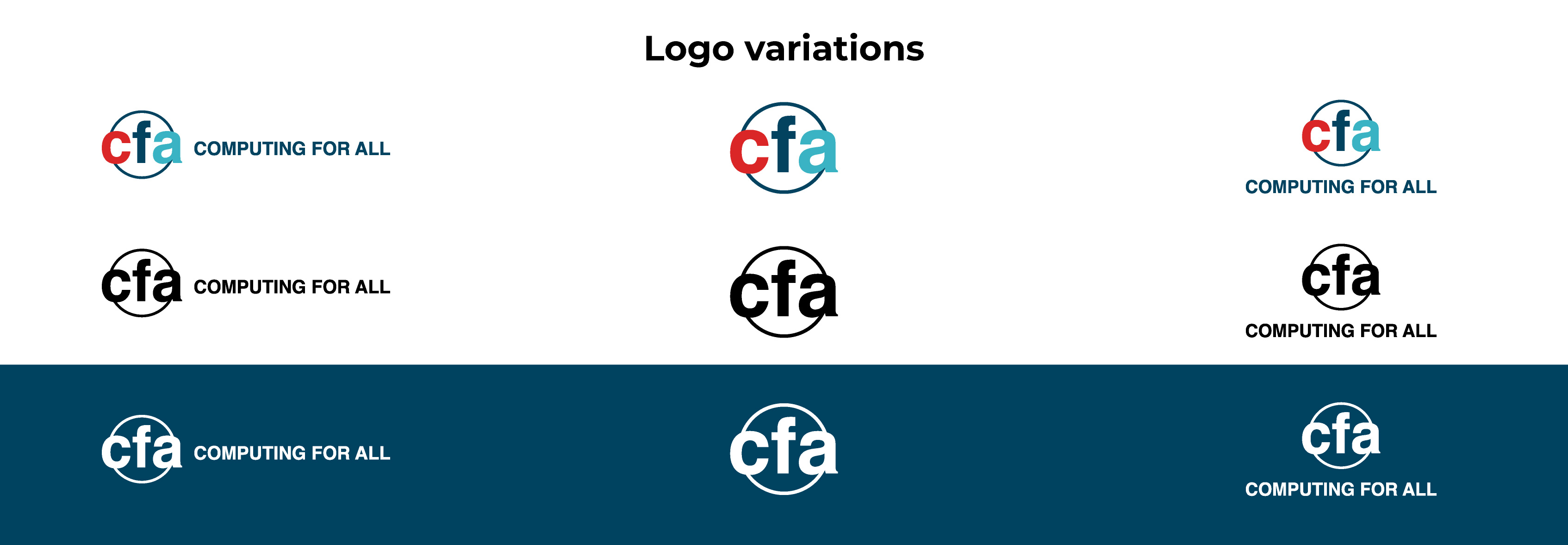
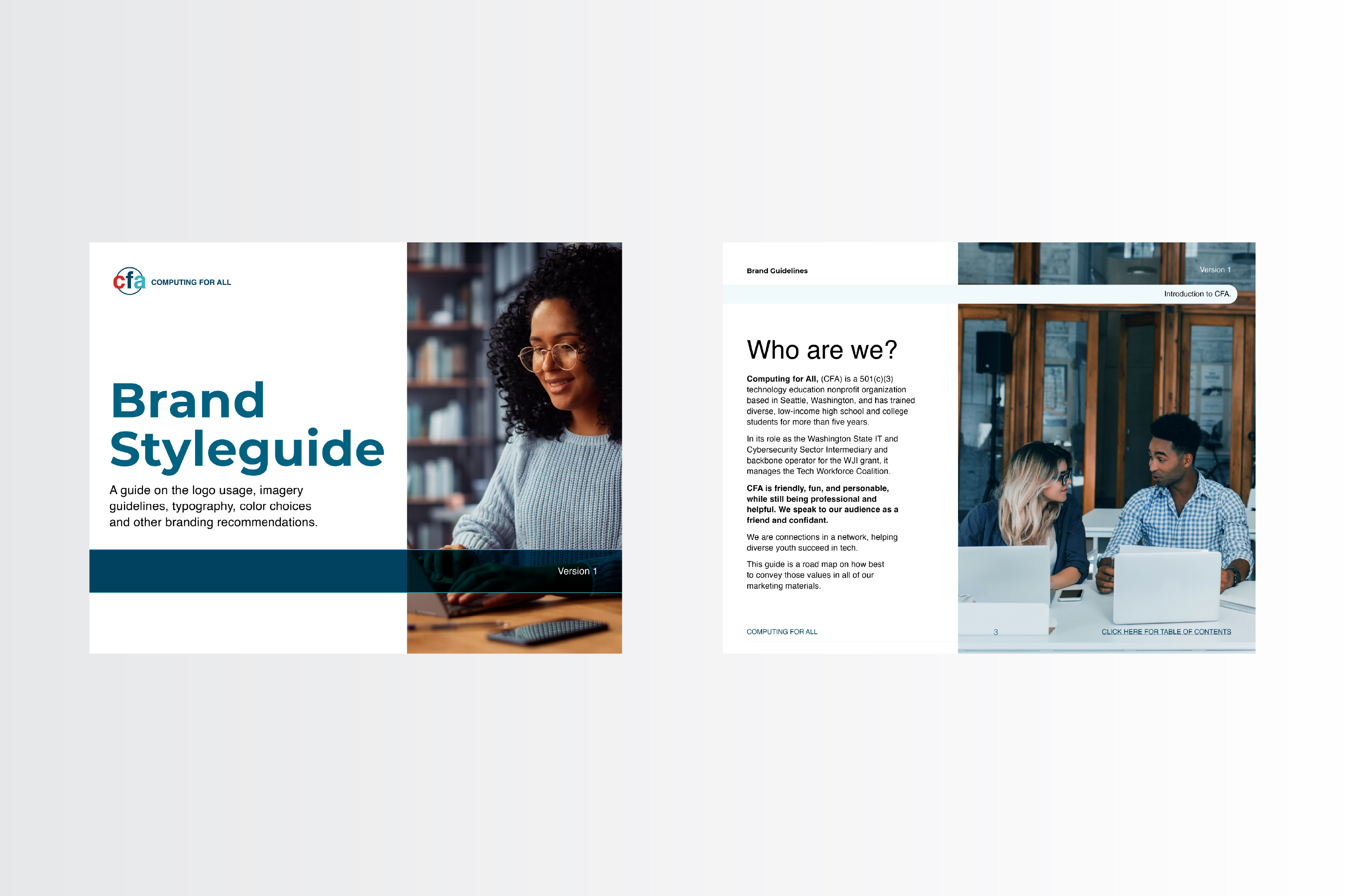
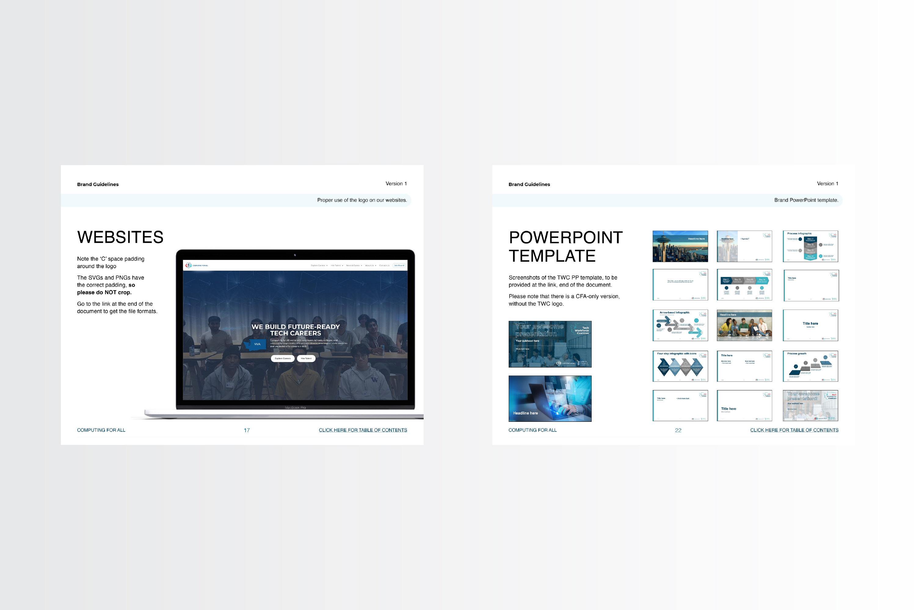
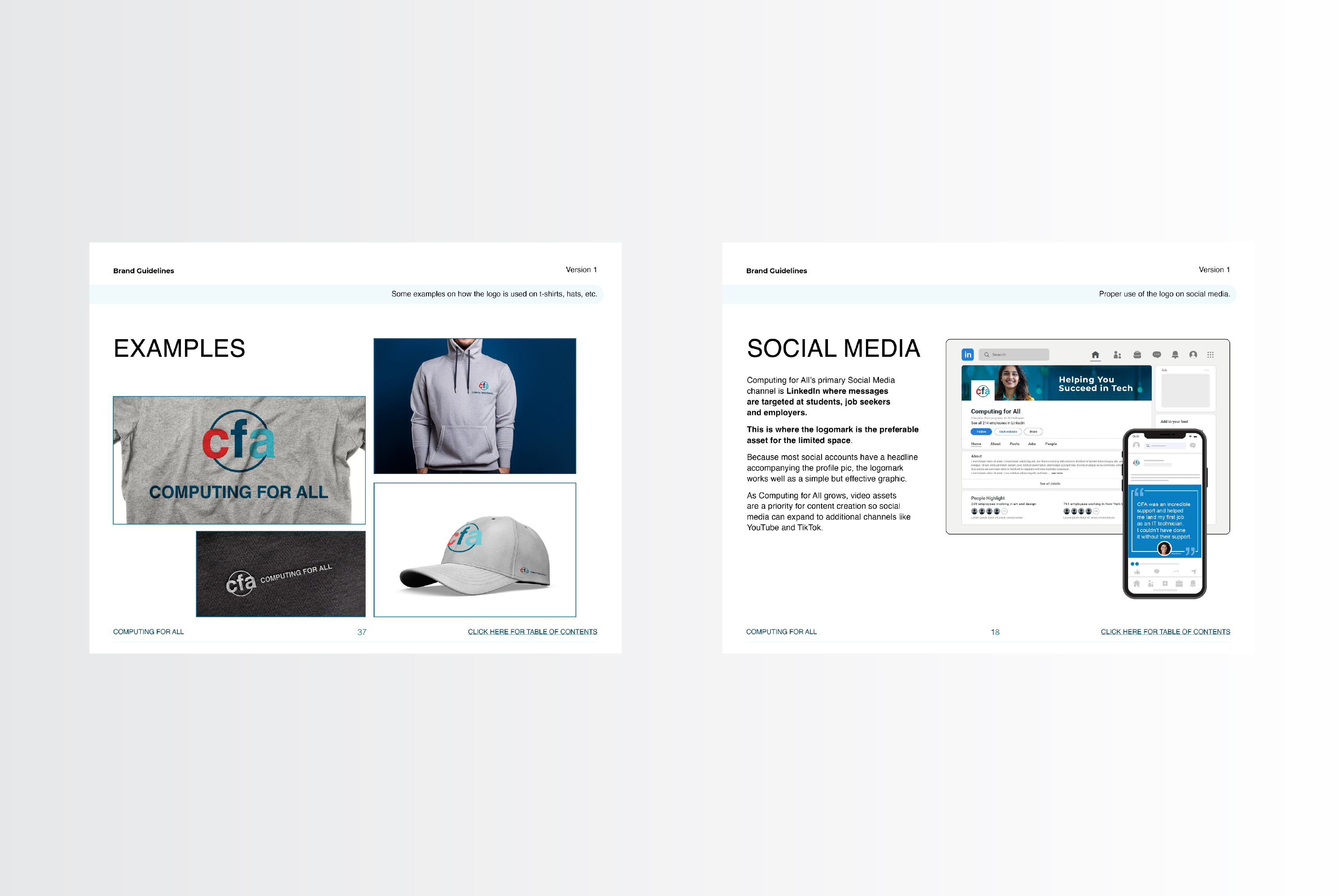
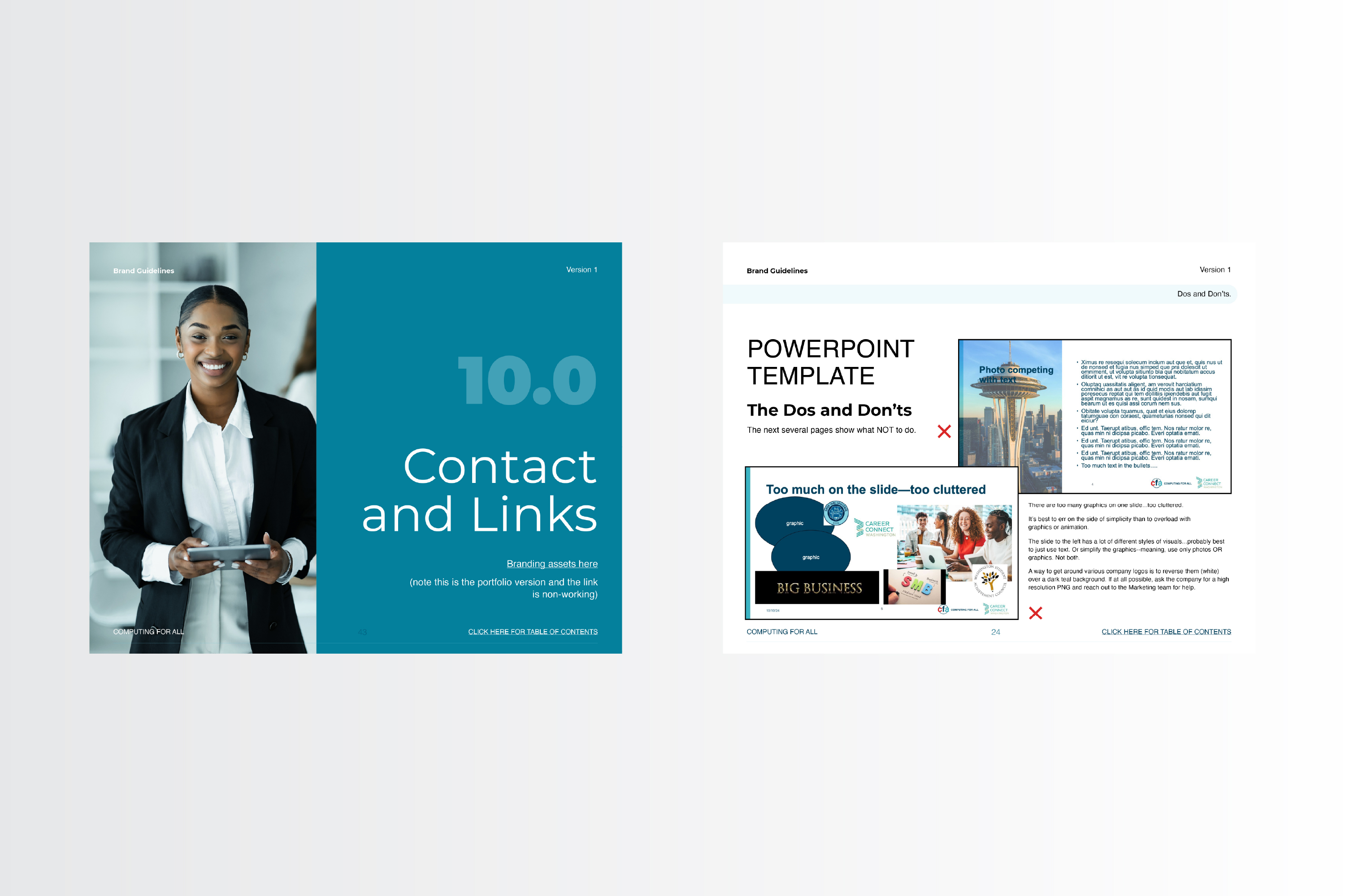
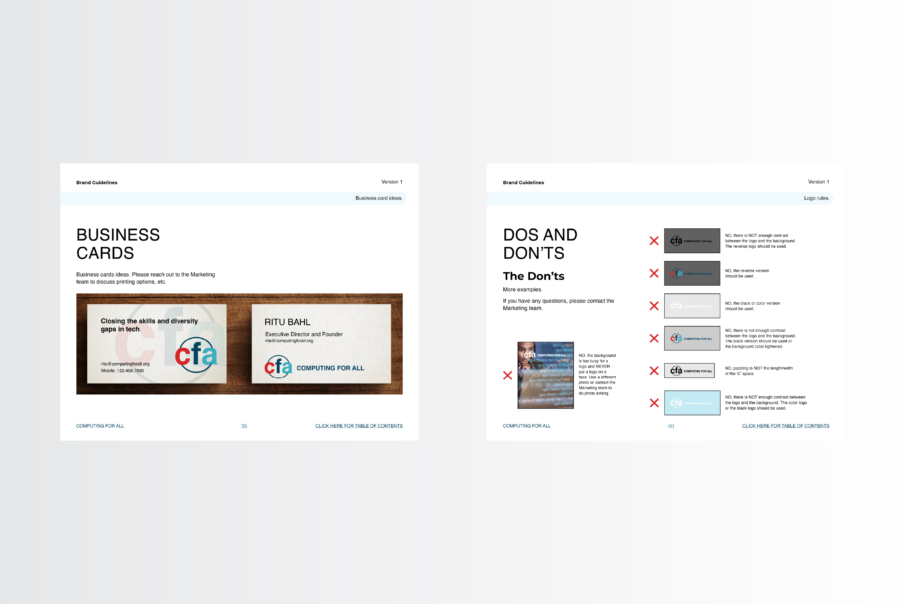
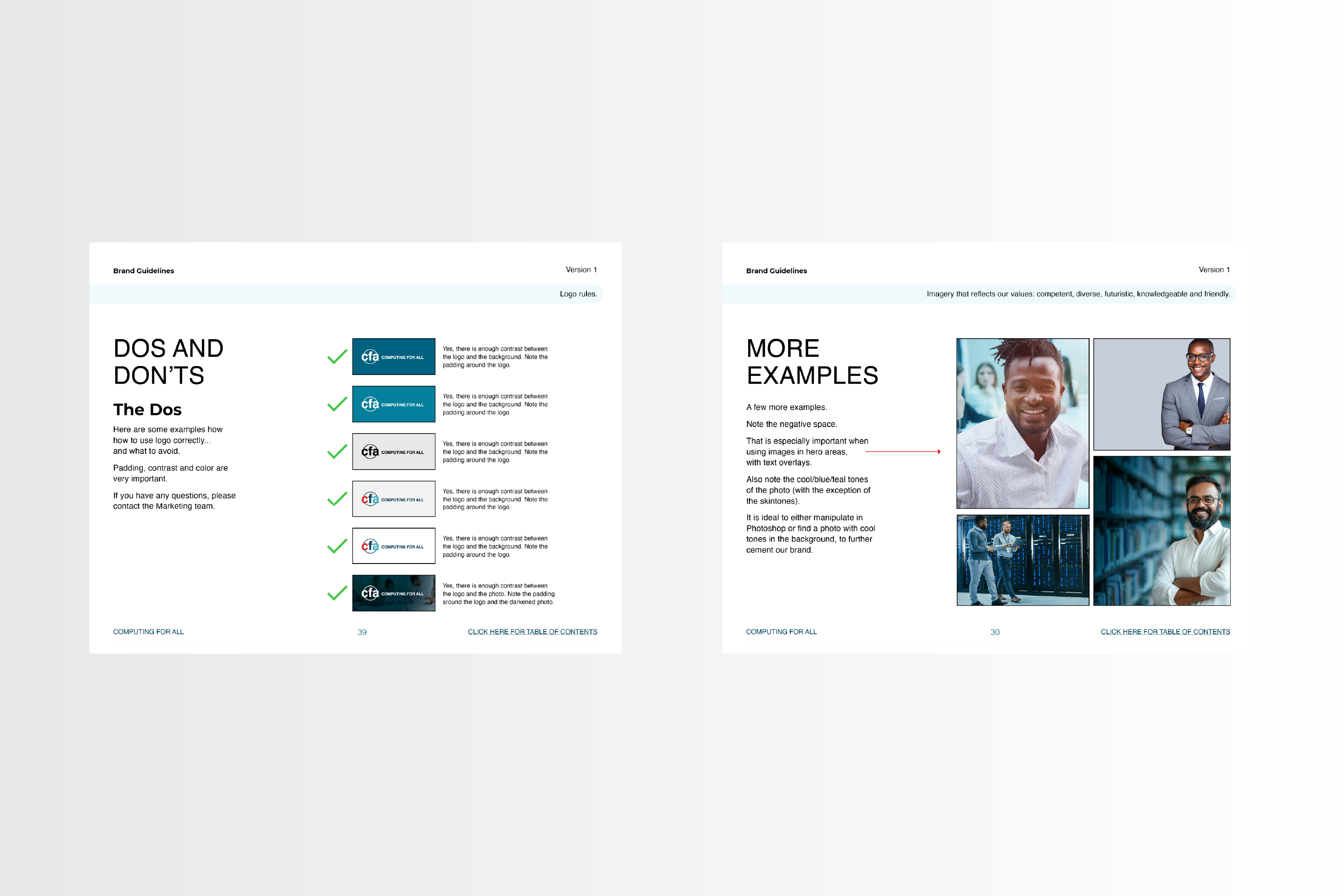
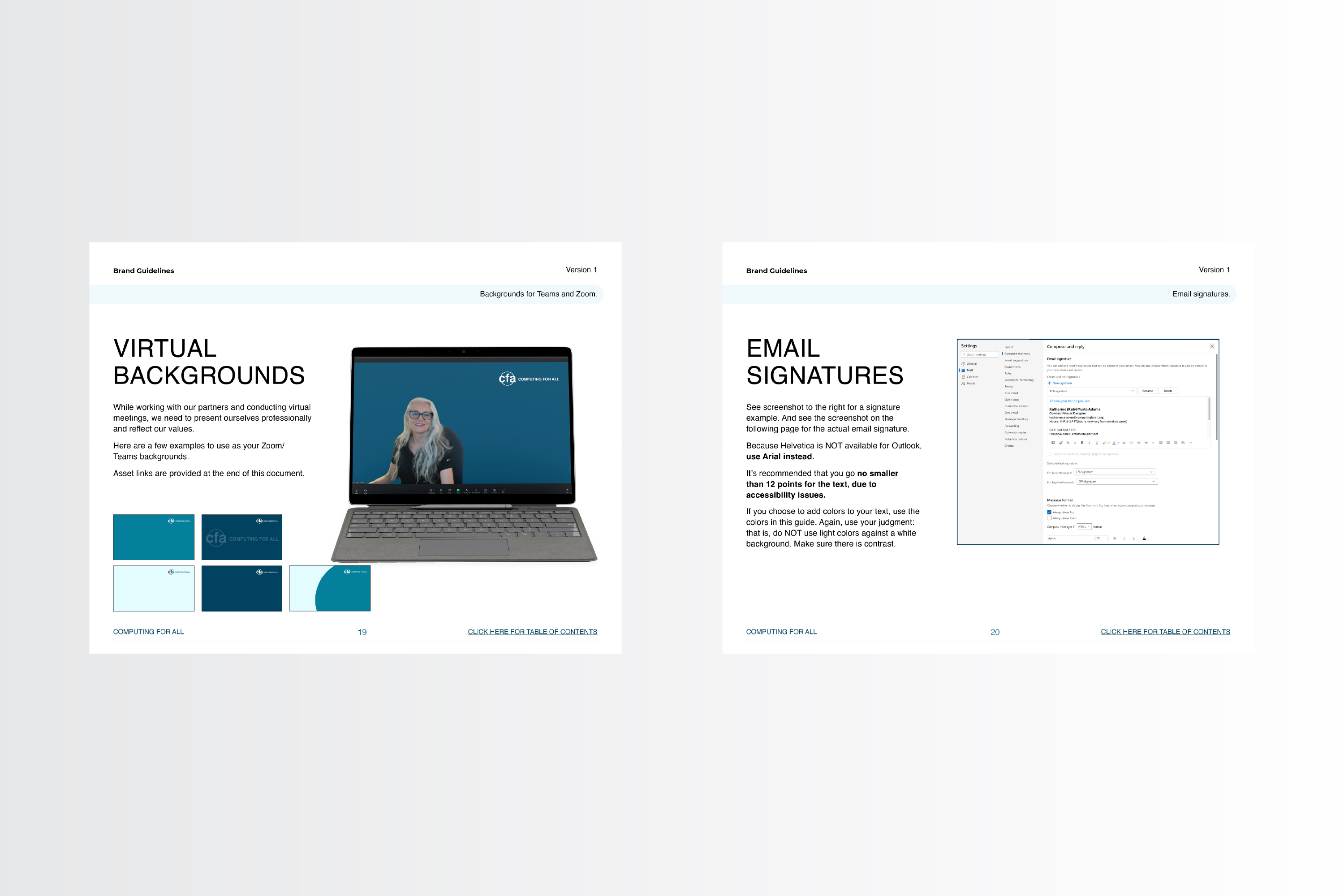
With an updated logo came a need for an updated styleguide. So I provided an interactive PDF (using Adobe InDesign) with updated colors, fonts, imagery and examples on how to best implement the new direction, as well as other guidelines. I uploaded the new guide to the Microsoft Teams channel for all employees to use.
Below are a few screenshots. If you would like the interactive PDF, please contact me at the below form.
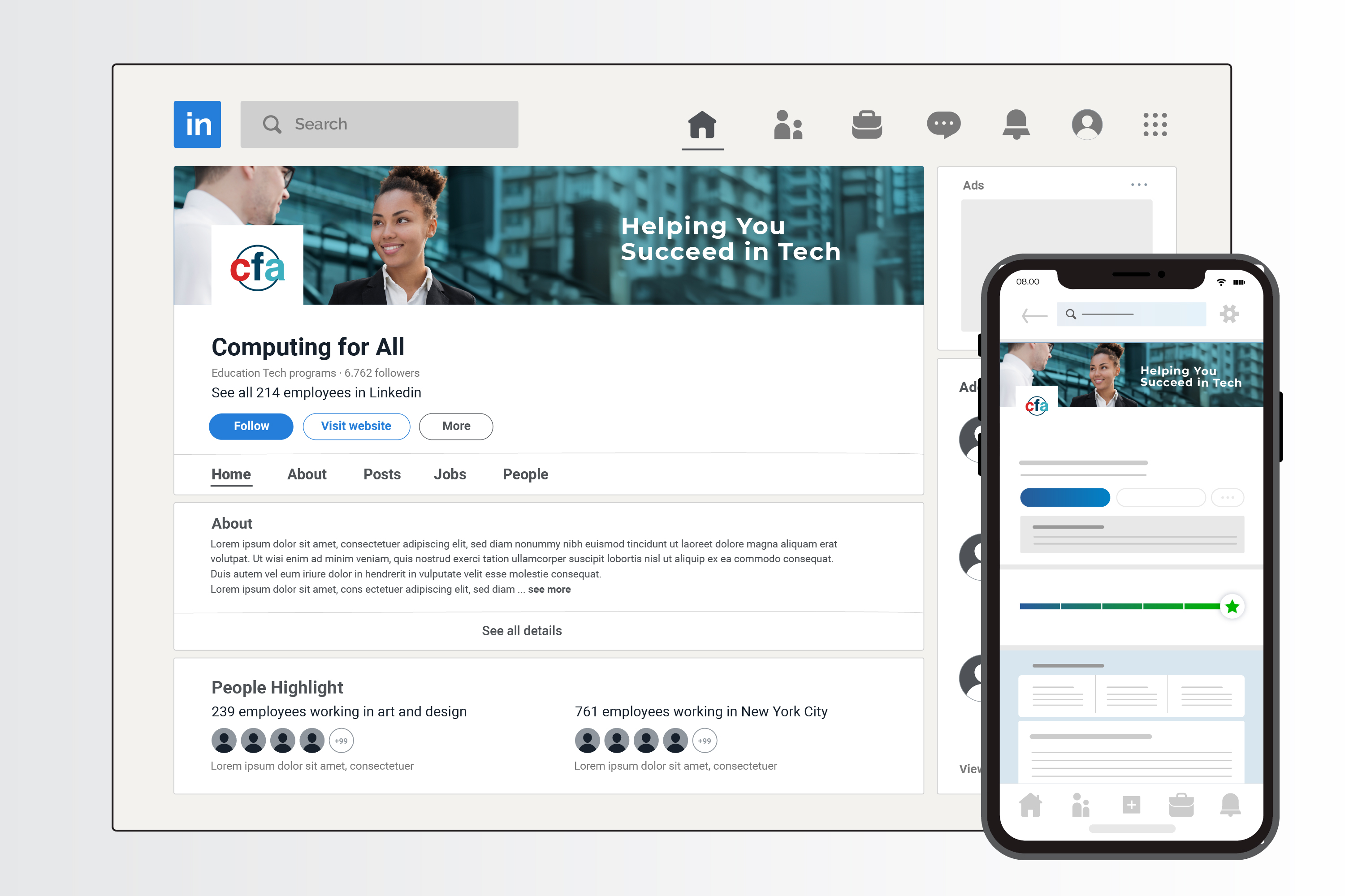
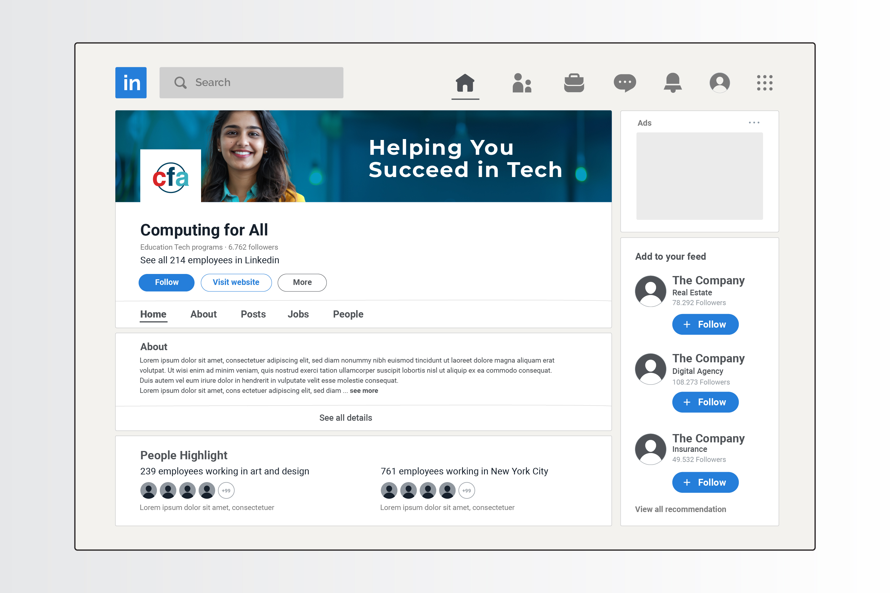
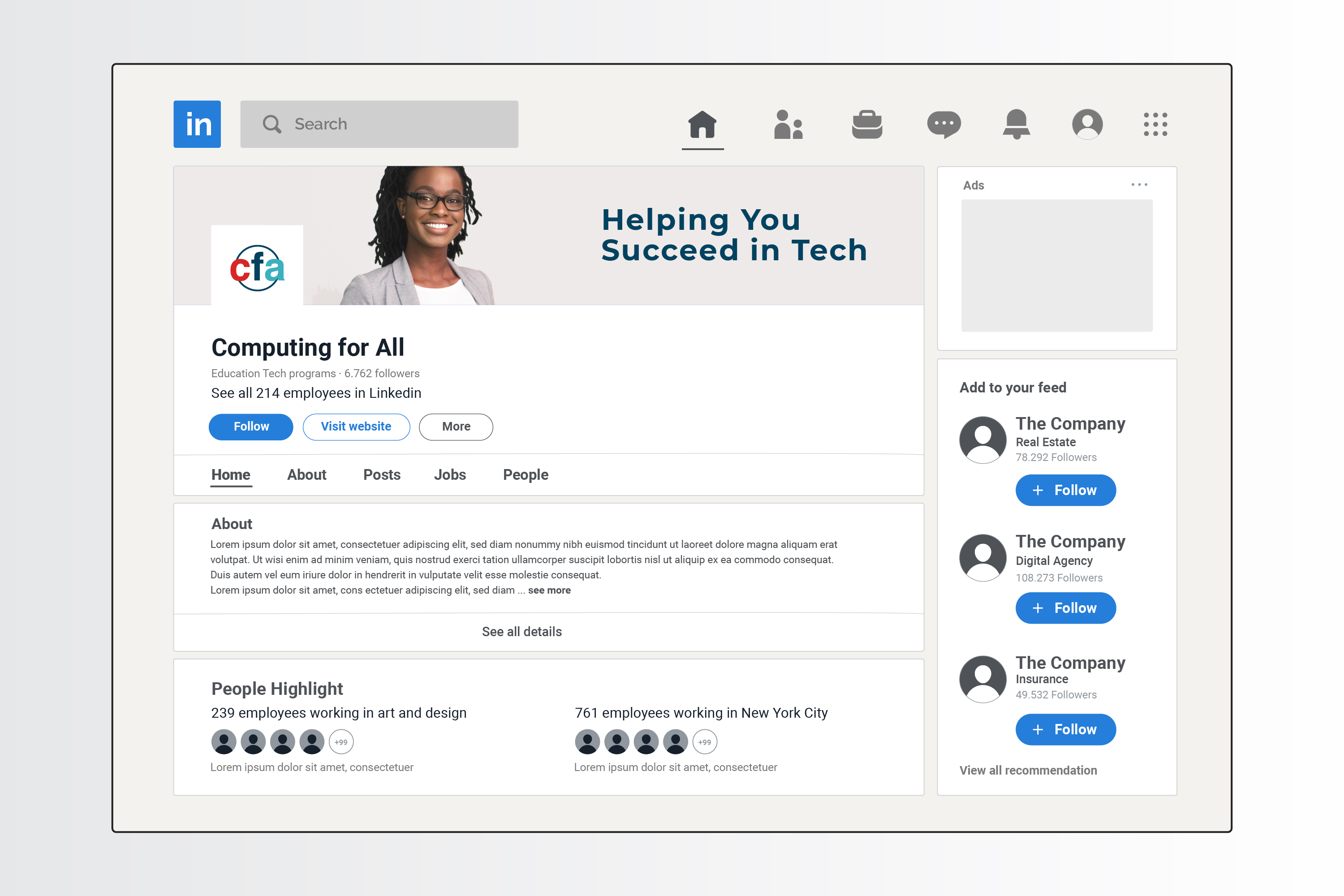
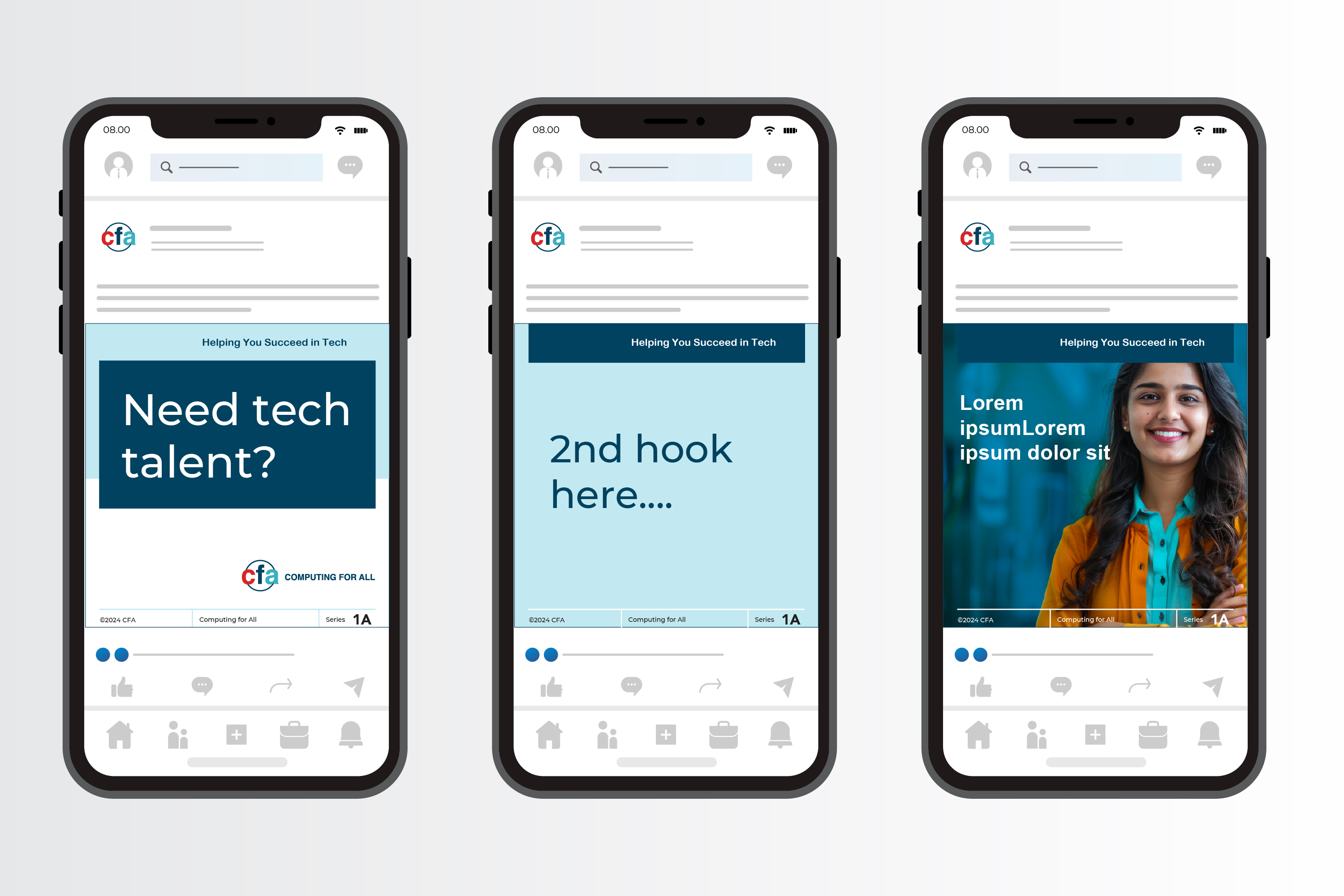
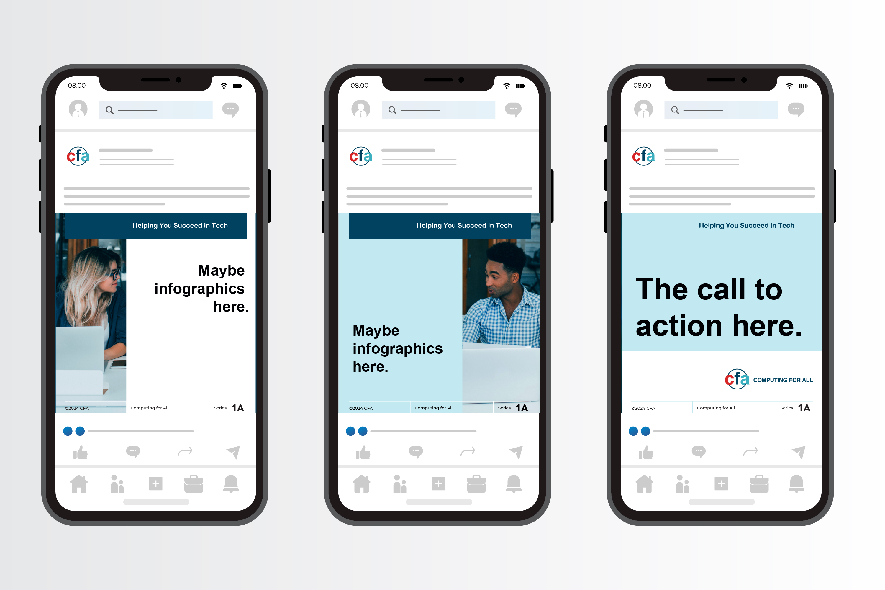
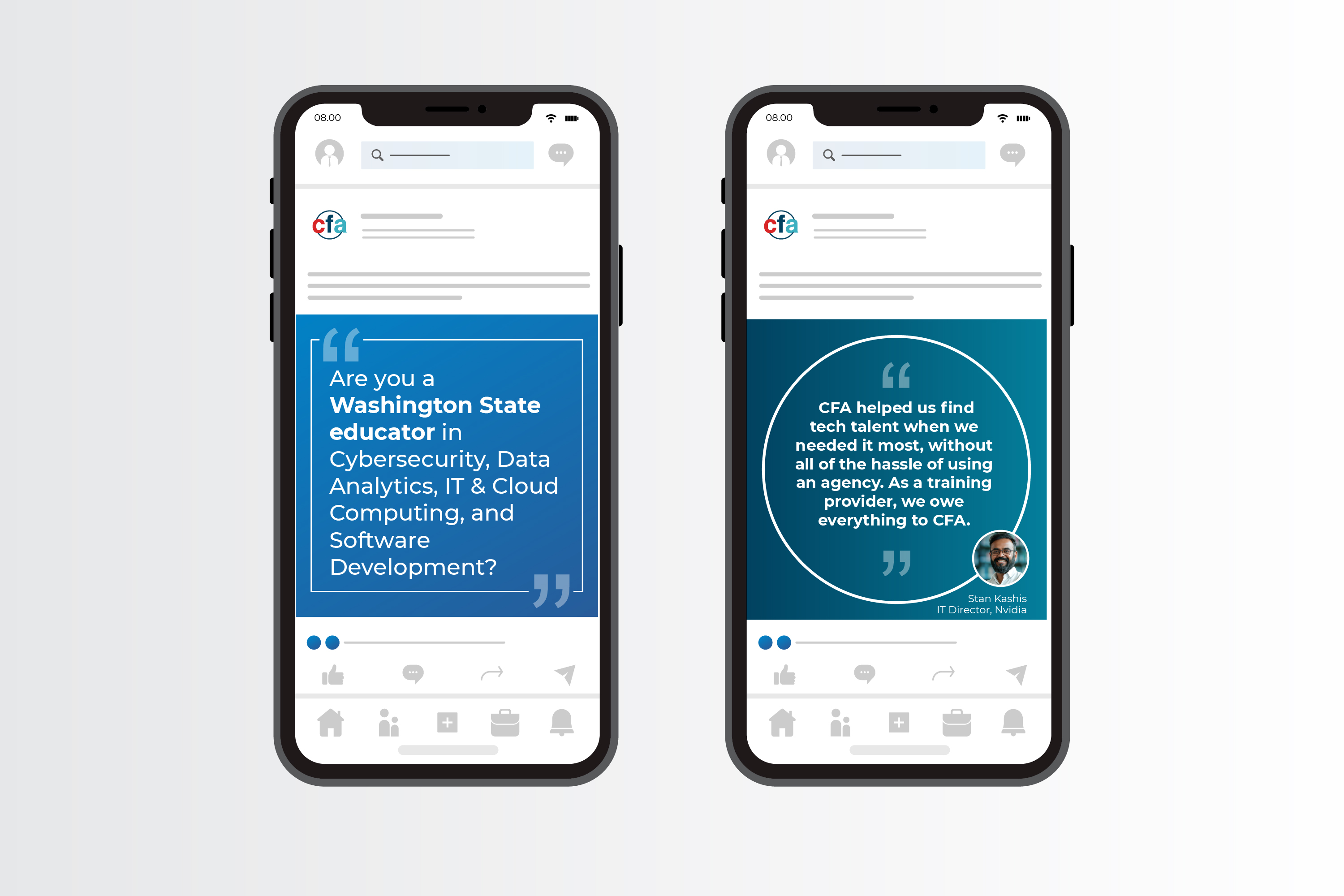
After updating the logo, I wanted to implement the new direction on the main social media channel, LinkedIn. Below are a few mockups, using brand-consistent imagery and the new logomark.
In order to sell the concept to the leadership team, I mocked up the CFA's LI company profile, as well as a few ideas on testimonial posts and carousel PDFs.
As a result of updating the LI company profile and using new assets for LI posts, (I worked very closely with a content person), we were able to increase CFA's followers by several hundred and increased engagement by 40%.
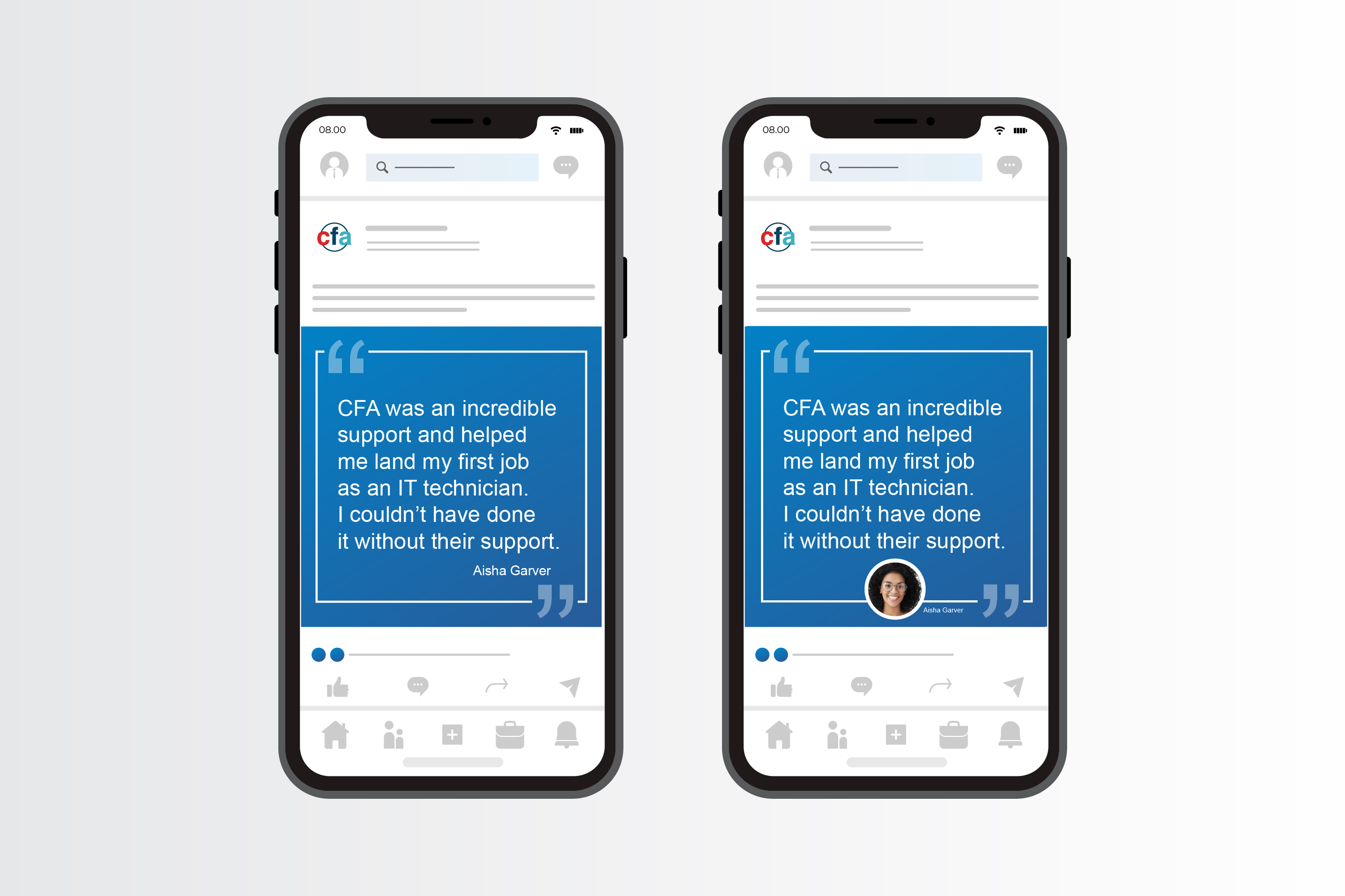
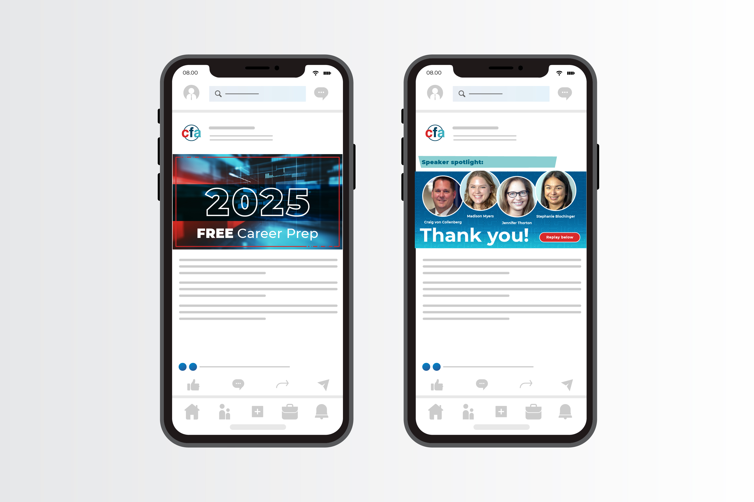
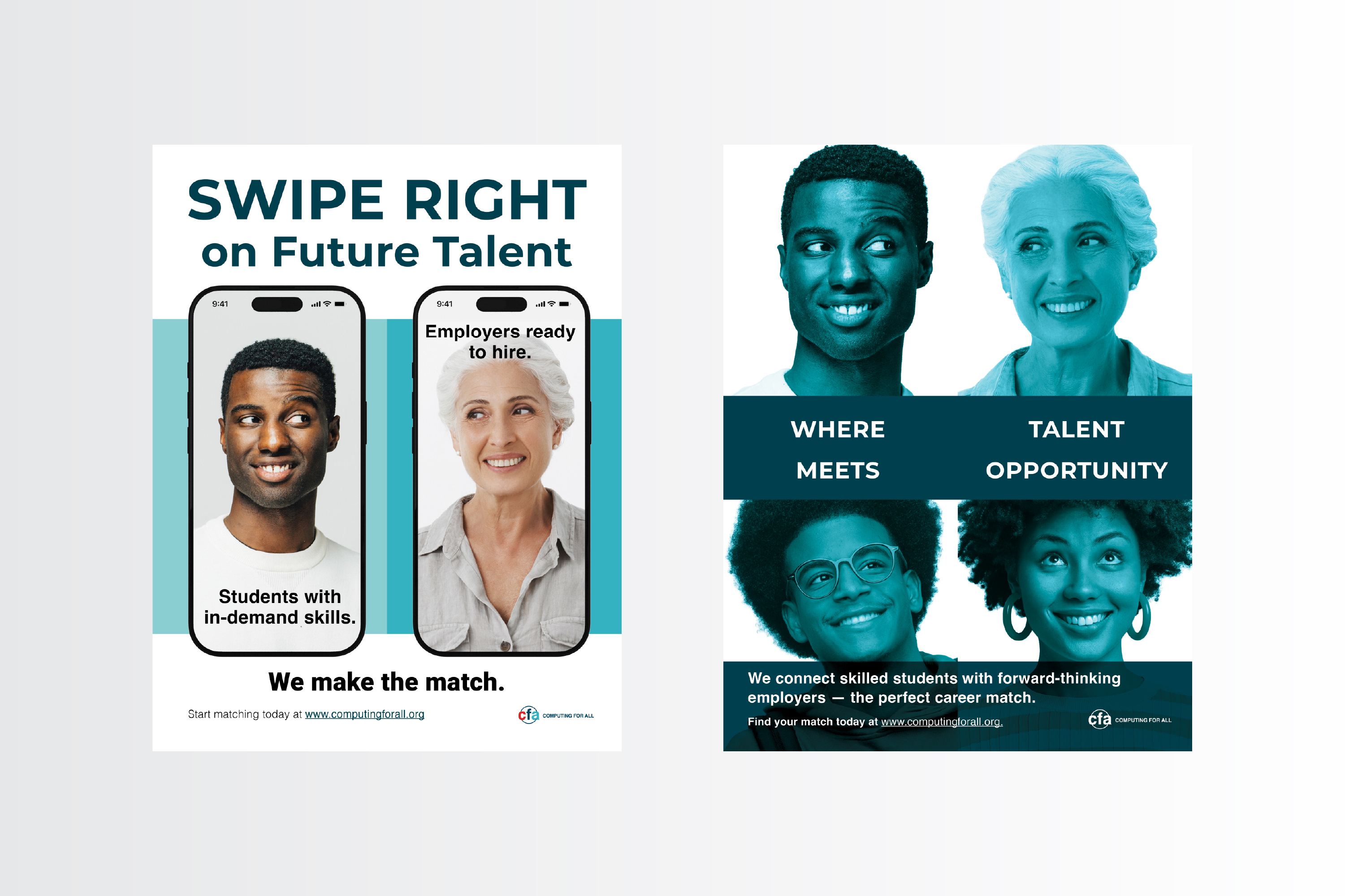
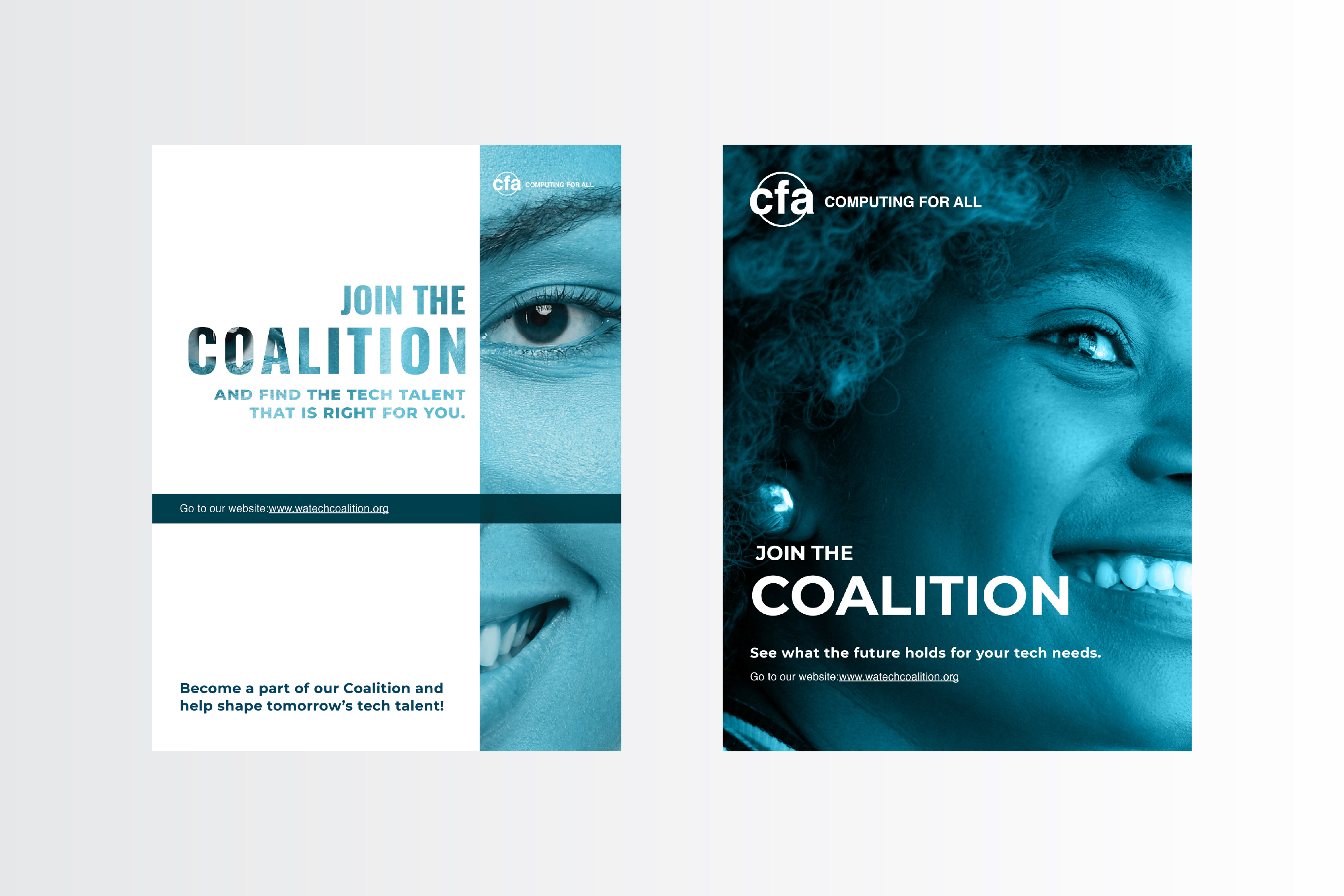
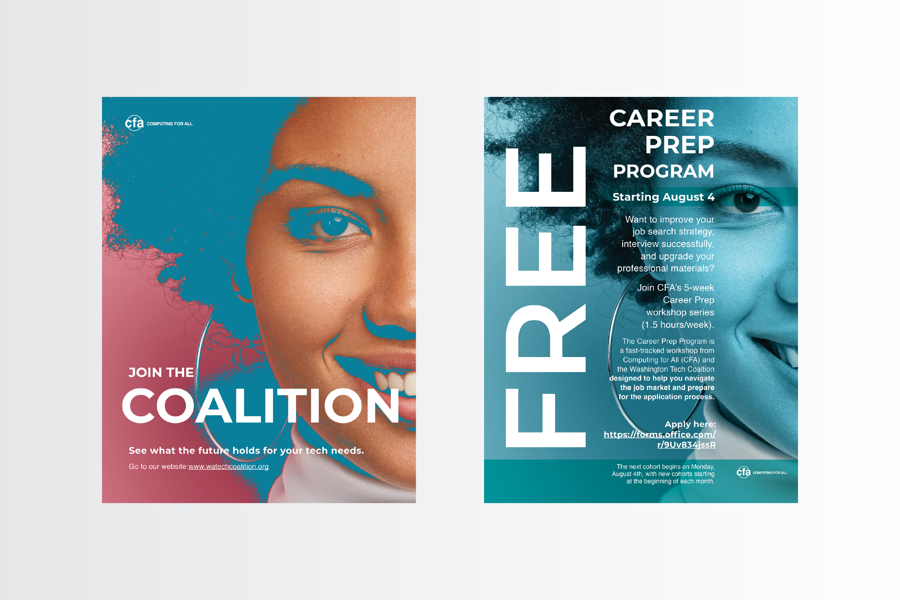
Once the new brand direction was approved, I got busy creating different LI assets, advertising off-site events, holidays, and other announcements; driving traffic to computingforall.org and their sister site, watchcoalition.org.
Within months, CFA's LI engagement increased substantially and the increased brand awareness helped extend CFA's reach to training partners and potential employers.
Below are a few examples, some mocked up. I used the different orientations and the multi-page carousel option. While I fought to keep the graphics very simple and eye-catching, there were some announcements that required a fair amount of text.


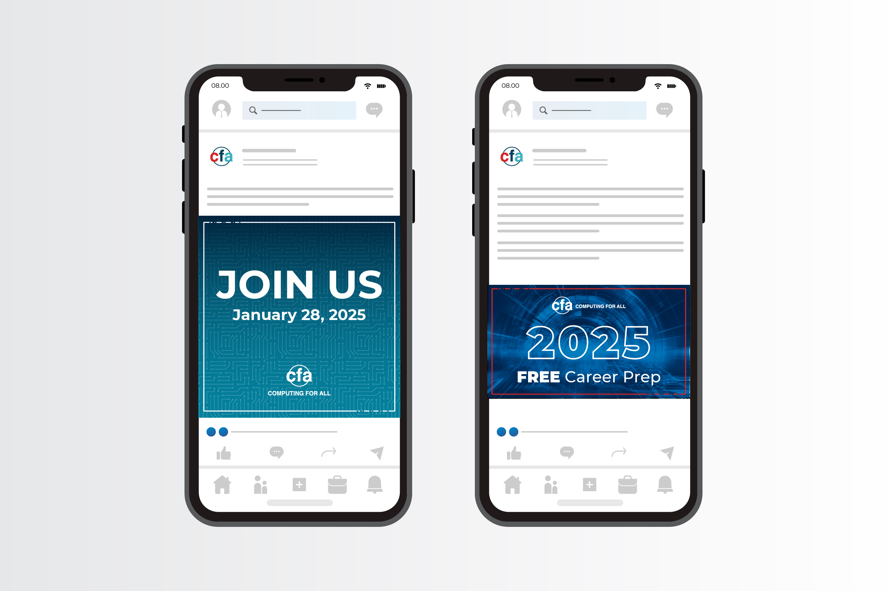


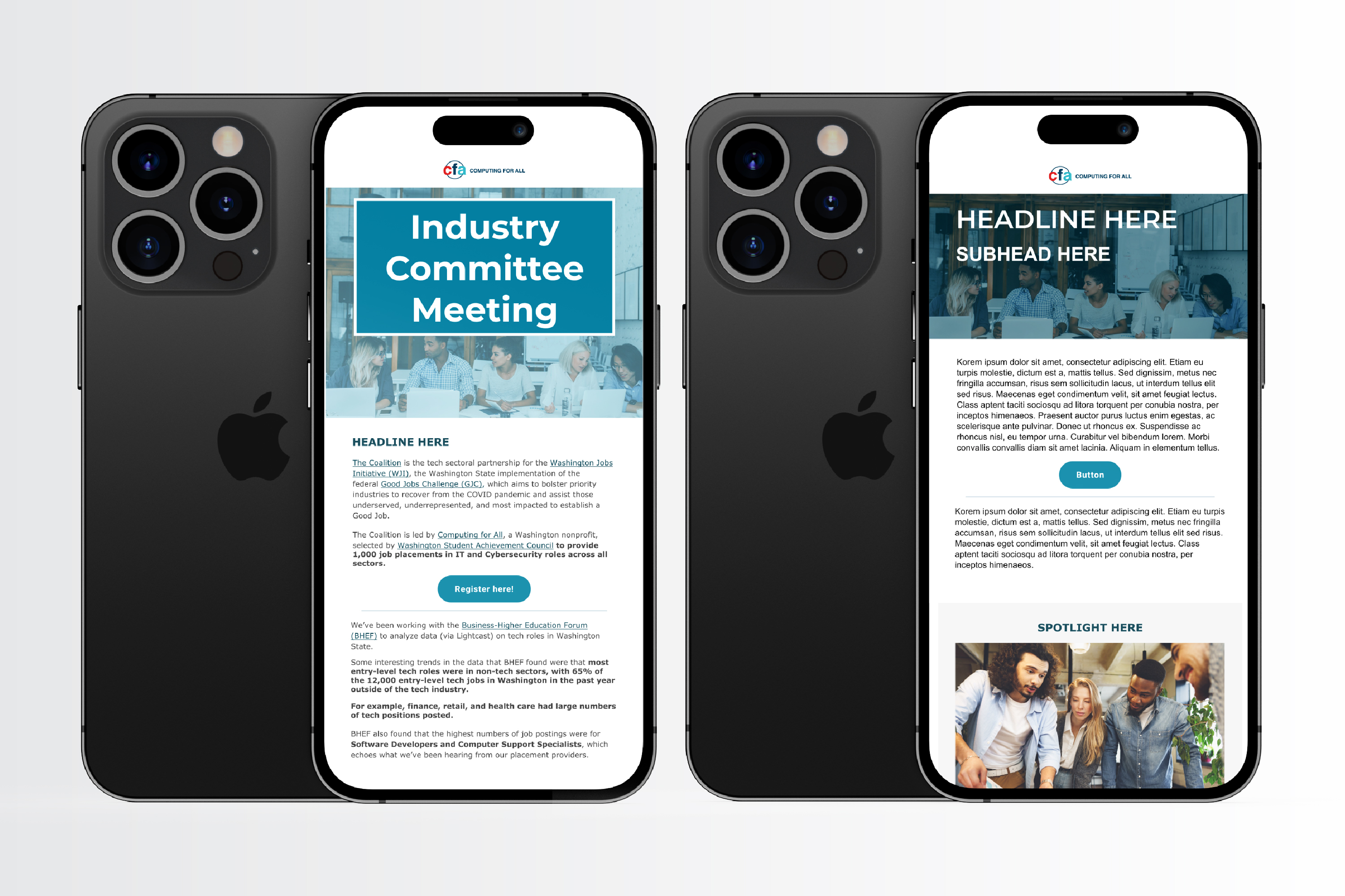
CFA does a lot of off-site events and the program directors work very closely with educators--so providing printable and digital flyers helped increase CFA's program awareness and provided crucial info for prospective candidates.
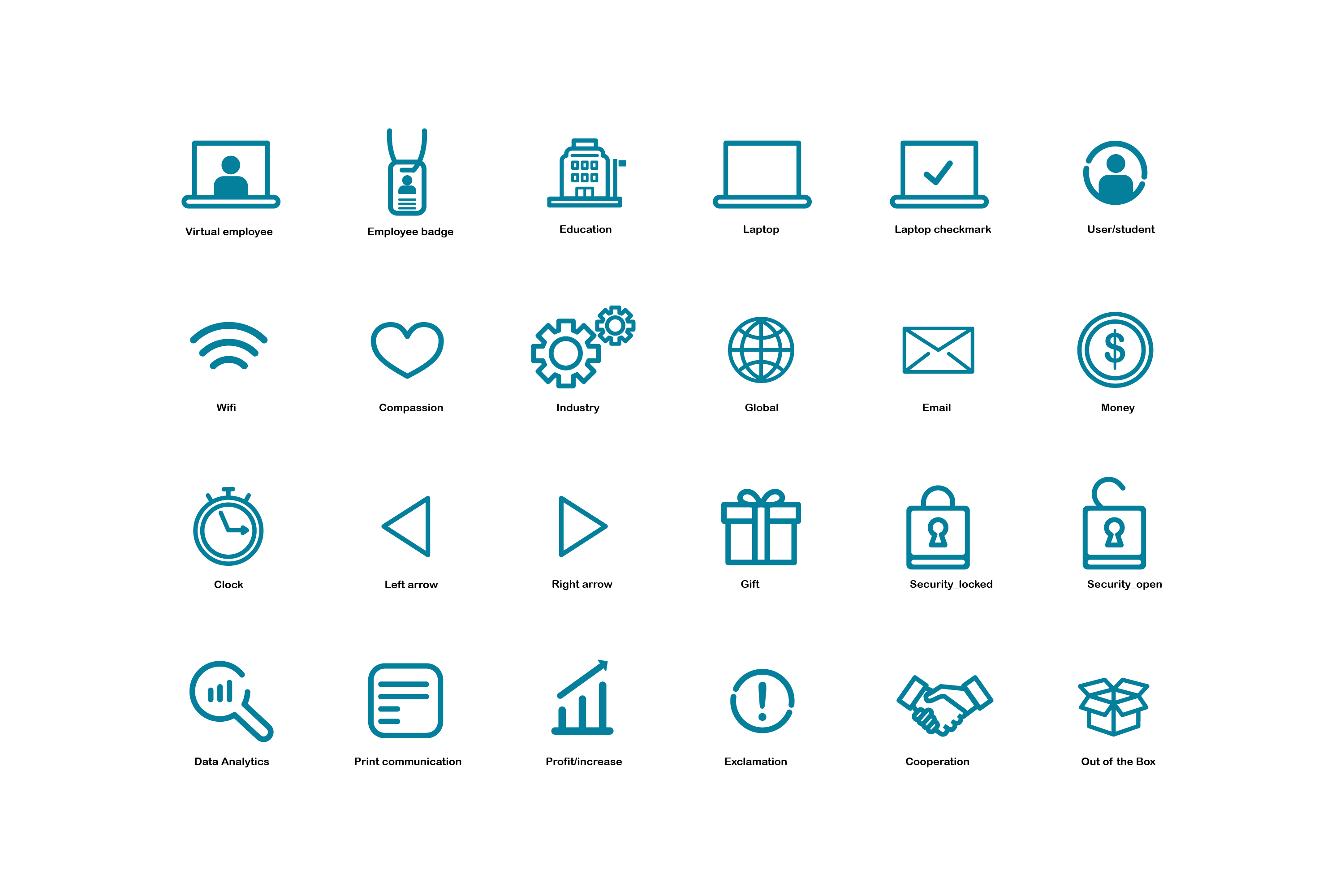
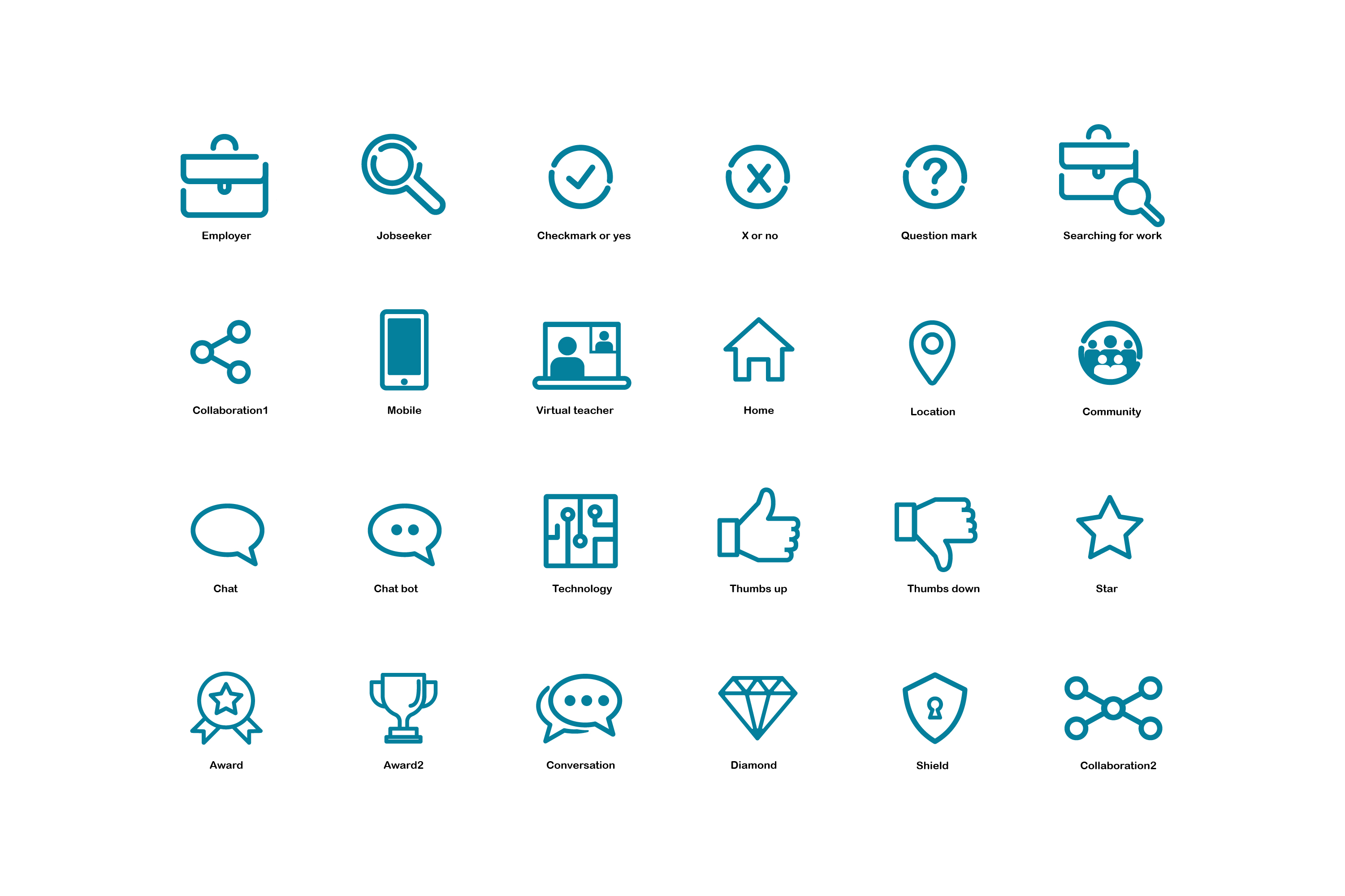
I also created a family of icons, meant to be folded into the brand styleguide and used on the website. It was decided, at some point, the icons would be used solely for flyers and other non-website assets.
Also below are a couple of dummy email mockups, done in Figma and executed in Microsoft Dynamics, for their email marketing campaigns and event annoucements.

Every year, I participate in the #Inktober social media challenge: do an ink drawing, based on a daily prompt. It's for fun and for free. And, I get to not only exercise my drawing skills but my thinking skills as well. I find my personal work really enhances my professional work.
Below are my favorites. I often use my doggies as inspiration for some of the prompts.
Certain functionality should be added, such as GPS capabilities to find art tours within the location of the smartphone, a user flow for an art lover who chooses not to have an account and a more robust search function that allows for filters.
I would also like to present this app to museums' board of directors and gallery owners as an option for art attenders, as well as local government visiting bureaus. Tor-a can be helpful for tourists and local residents alike, searching for great art.
Surface pattern design is a passion of mine so creating a few patterns that could be used for package design made complete sense for this project. Also, I wanted to display a typical sign for potential franchise owners.
Below are my favorite Inktober drawings.
Because this was an Instagram challenge, I didn't do any rough sketches or any preliminary work. As previously stated, there was NO time for research or preliminary fact-finding of the target demographic. Below are my favorite boards.
A few more assets....Farmers Insurance Open graphic, Coupa signage, Signal social asset, Learn From Experience web graphic, and HR infographic.

Click on the below links to navigate through the projects.

