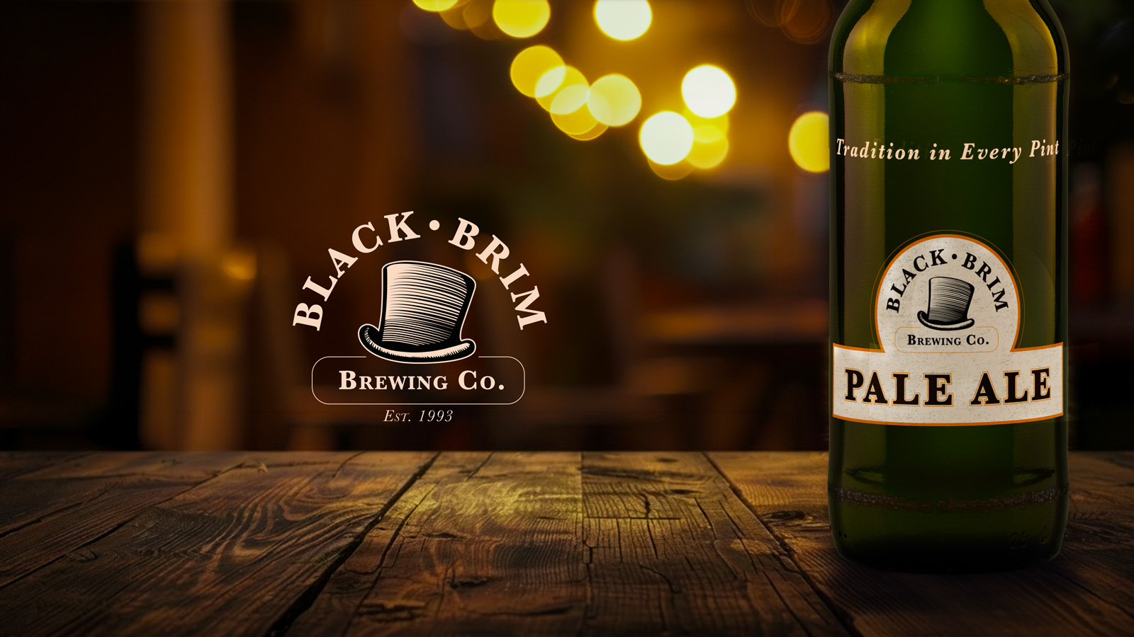
Create a distinctive brewery identity rooted in family tradition and small-batch craftsmanship, with enough flexibility to grow from a local taproom to a broader retail audience.
I developed a vintage-inspired identity around the Black Brim top-hat mark, then extended it across Pale Ale, Porter, and Stout packaging, signage, print collateral, and taproom applications.
A cohesive, flexible brand system with an old-world personality, clear product differentiation, and enough range to work across bottles, merchandise, environmental graphics, and future distribution.
Black Brim Brewing Co. is a self-initiated identity and packaging case study built around a fictional family brewery founded in 1993 — a story of love, family, and tradition behind every pint.
Johanne and Gunthar Johnson had always dreamed of opening a brewery, inspired by a family tradition that began with Gunthar’s grandparents in Sweden. When they inherited a parcel of land on the outskirts of Modesto, California, they finally had the opportunity to build it.
From the beginning, Black Brim was meant to stay small, local, and connected to the Central Valley community. The brewery focused on three core beers—Stout, Porter, and Pale Ale—and built its reputation around craft, tradition, and a neighborhood-pub sensibility.
But the beer developed a following beyond Modesto. Black Brim eventually opened a second pub in San Francisco’s Noe Valley neighborhood and, in the story behind the brand, is now exploring nationwide distribution.
The visual identity needed to honor that old-world brewing heritage without feeling stuck in the past: distinctive enough for a local taproom, flexible enough for retail packaging, and memorable enough to grow with the brand.
When I first started my career at Farmers, our Creative Services department worked on internal projects for employees and agents (long-form documents, flyers, program IDs, illustrations, internal motion graphics, etc.) within Corporate Communications/Internal Communications.
After a leadership change, we transitioned to the Marketing Department and shifted our focus to customers. Our work included marketing campaigns—direct mail, email, social posts, animated and static display ads, and motion graphics—as well as illustration and web design. I collaborated closely with account executives and content managers on strategy, messaging, and the final design of deliverables intended to increase brand awareness and generate leads.
I also worked with our in-house printing department to deliver production-ready assets and accelerate speed to market. I partnered closely with Farmers Strategic Partnership account managers to gather data and determine which deliverables resonated with the target audience.
We needed to increase engagement in the Learn From Experience section of farmers.com, so we created a short, fun video called “Summer Maintenance Tips.” We also shared the video on YouTube and Instagram.
Statistics show that users are more likely to stop scrolling for video than for static images. I worked with a content manager who developed the script, and I created a quick storyboard. After receiving approval from the client, an internal stakeholder, I created the graphics using Adobe Illustrator and Adobe AfterEffects. The client was delighted with the result, and we increased the click-through rate by 10%.
The video is below but here is the link to the Farmers website: https://www.farmers.com/learn/plan-and-prep/summer-home-maintenance-tips/
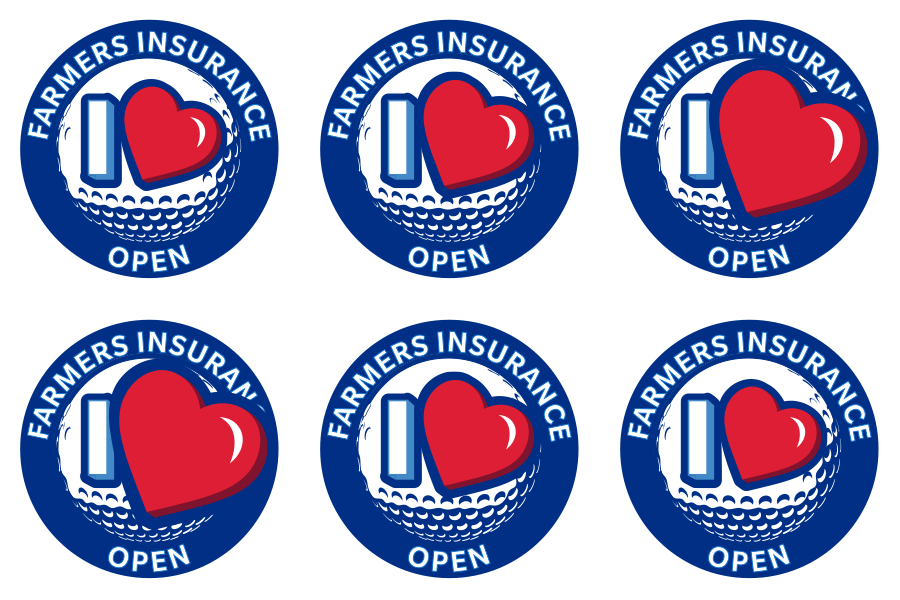
When I was the lead designer for the annual Farmers Insurance Open, I was tasked to create various assets: below are a few GIPHY stickers used for Instagram Stories. Those stickers are still searchable in Instagram Stories under "Farmers Insurance Open." I used both Adobe Photoshop and Adobe AfterEffects to create the stickers.
I also created microanimations proposed for farmers.com as a way to entice users to click through to the homeowners and renters sections of the site.
For our internal teams/employees, I created 'Snacks' : short videos that were posted on the company's internal Facebook, known as Workplace. These were informative, fun snippets of data about Farmers target customers: Value Driven Millennials and Confident Planners. Once posted on the Marketing channel on Workplace, we encouraged employees to comment and give feedback. I used a combination of video and vector art. Below are two I created.
As part of Farmers Insurance’s acquisition of MetLife, we had to quickly rebrand thousands of assets from MetLife to Farmers within one quarter. Because I am familiar with HTML5 animations, I handled the bulk of the banner ads.
Due to versioning, I produced about 200 different ads and I rebuilt them in Tumult HypePro, cleaned up the code in Visual Studio Code, and tested them for Google Ads submission. “Parking” (below) increased the click-through rate by 23% and brought more traffic to farmers.com. Because of the sheer volume of ads, I created HTML5 Google Ads submission documentation for fellow designers, improving team efficiency by 25%.
View the HTML5 Google Ads submission guide here.
Our team created stylescapes (elevated mood boards, made popular by fellow ArtCenter Alum and the Futur founder, Chris Do) for a brand evolution that grew out of design thinking strategy sessions. We wanted to stretch our brand guidelines and test new ideas quickly in sprints.*
Our team had about two weeks to create stylescapes and mockups. I created two stylescapes and combined them into one mockup.
*There was no data research or user feedback when we started designing due to time constraints.
This is called 'Value Millennial.' Grayscale was more emphasized, with touches of color. Also, line art was used for the illustration style, versus the previous solid, flat style.

This one is called 'Optimistic Blue.' I wanted to use a more mid-blue color (versus Farmers 287 blue) as the main theme, with touches of green. I also added a more personal font, Brandon Text, in addition to Farmers brand font, Slate Pro. The presentation was well received by Marketing leadership.

Using elements from both stylescapes, I created the final mockup. We tested it with the target audience and received positive feedback.

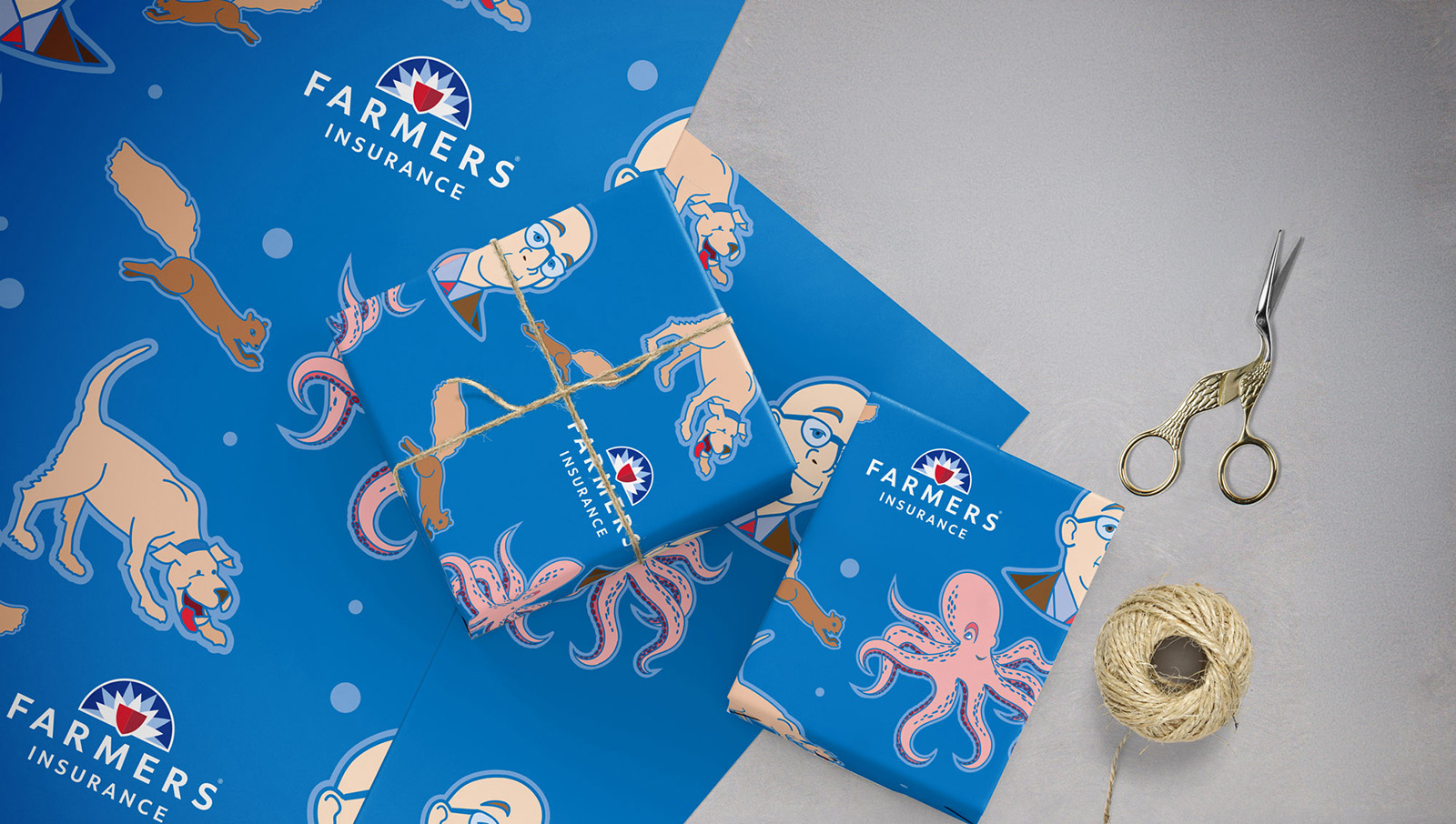
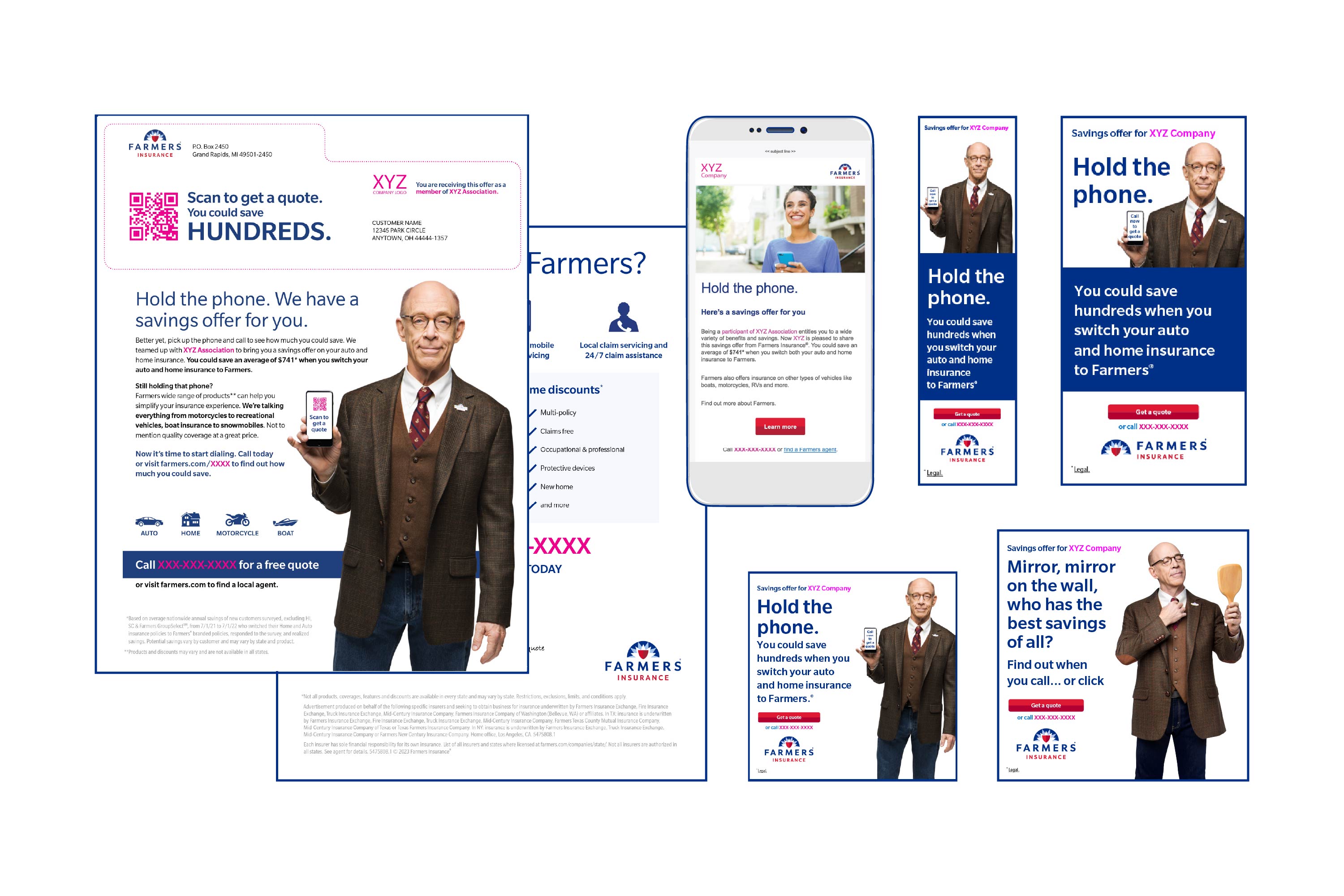
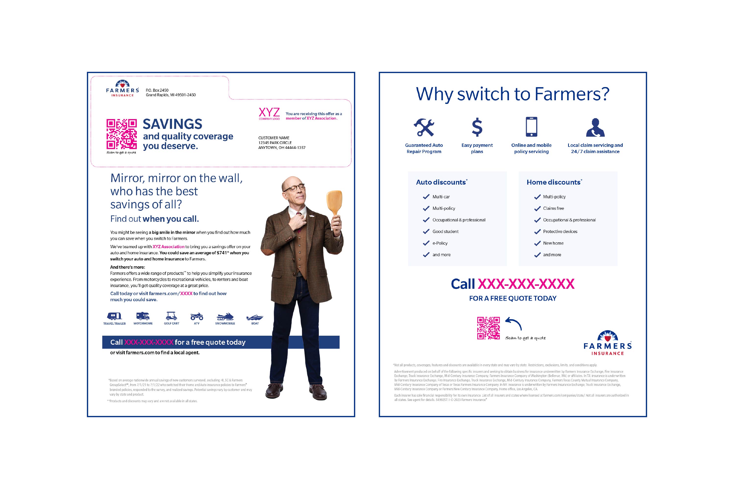
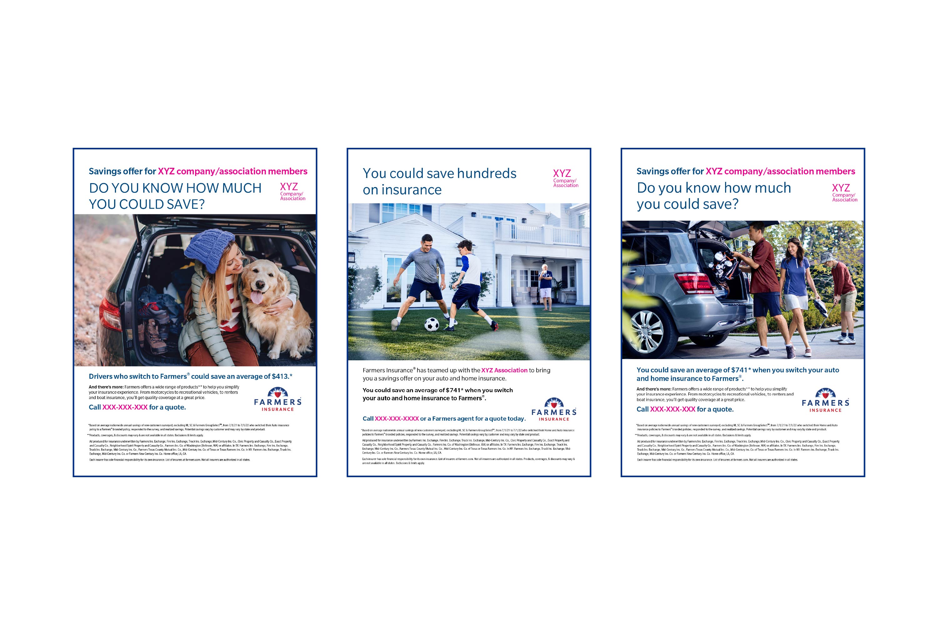
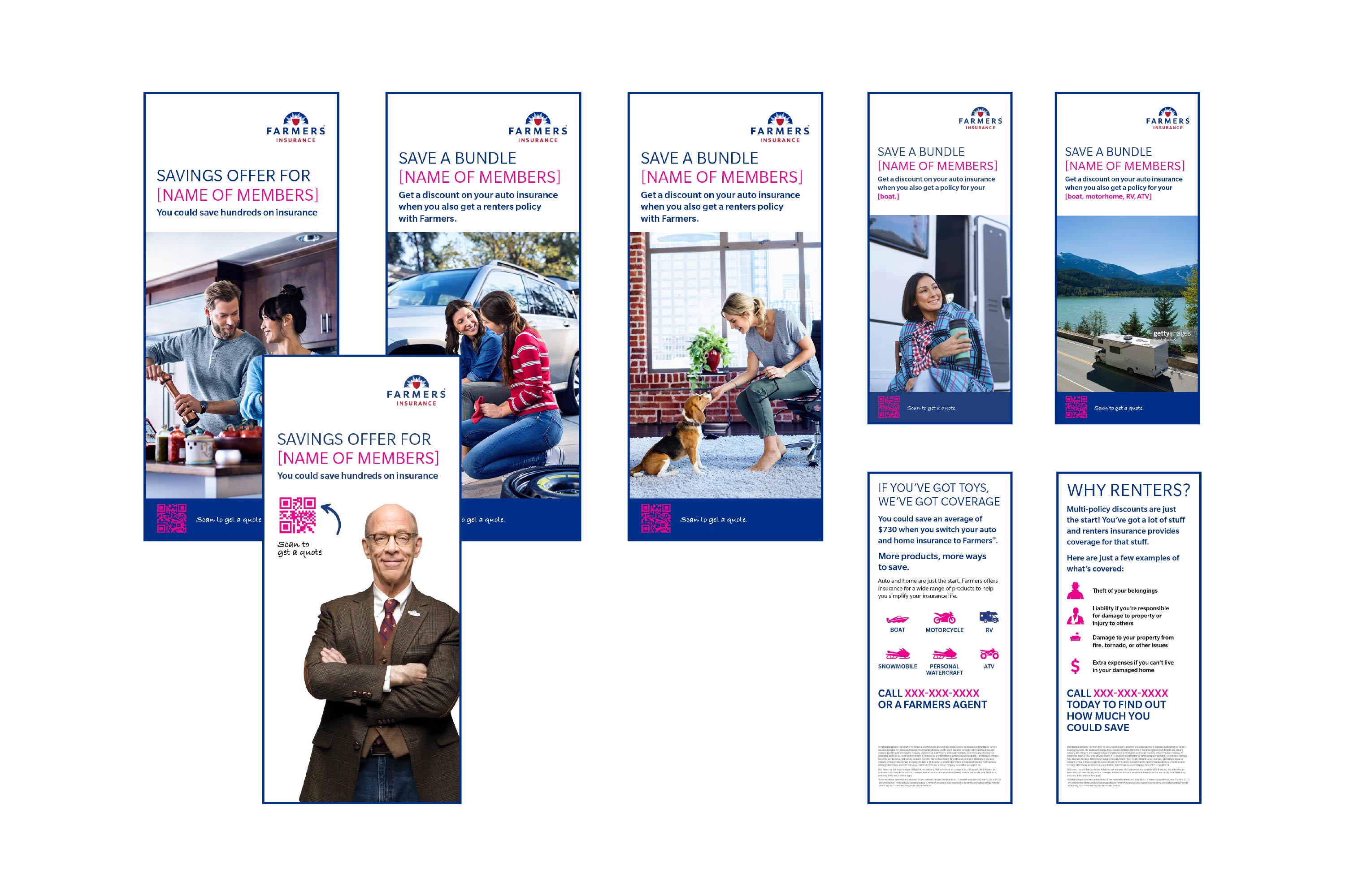
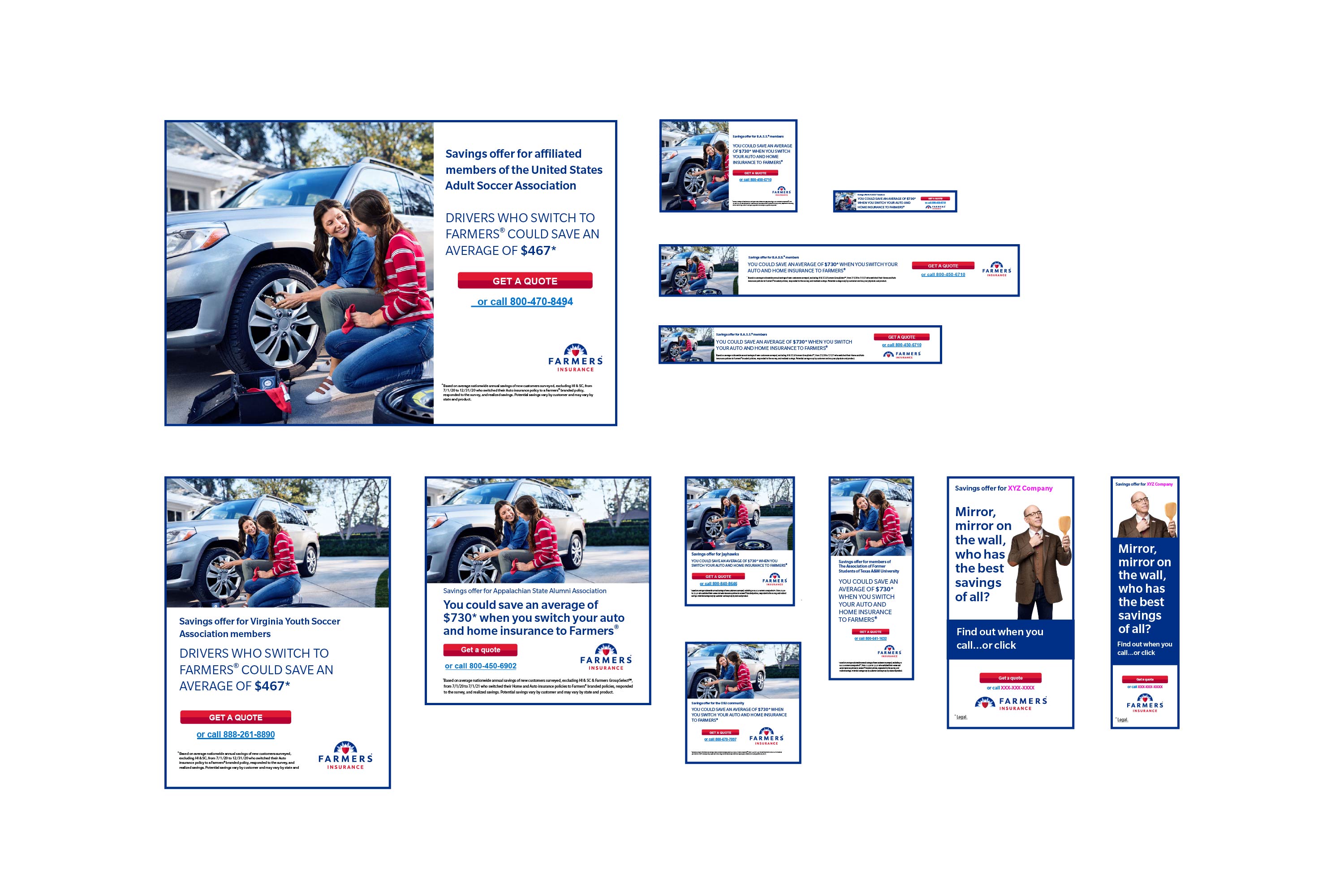
When Farmers acquired MetLife’s Auto & Home divisions, we gained Affinity and employer groups—another channel for marketing our products. This meant creating and delivering templates to clients who worked directly with Strategic Partnerships. I created templates for direct mail, buckslips, print ads, email, social posts, and banner ads using Adobe InDesign, Photoshop, Illustrator, and Figma.
The work featured the now-former brand spokesperson, Professor Burke (actor J.K. Simmons), along with stock and brand photography. I collaborated closely with the account executive and content manager while accounting for variable elements, shown in pink. The digital assets increased brand awareness, lead generation, and click-through rates by 10% among the target demographic through Affinity groups and employer-sponsored channels.
Scroll through the images by clicking on the numbers/arrows below.
This is a collection of PowerPoint presentations, interactive PDFs created in Adobe InDesign, and infographics created in Adobe Illustrator for employees and agents. Also included are Procreate illustrations for social media, to reach customers.
Scroll through the images by clicking on the numbers/arrows below.


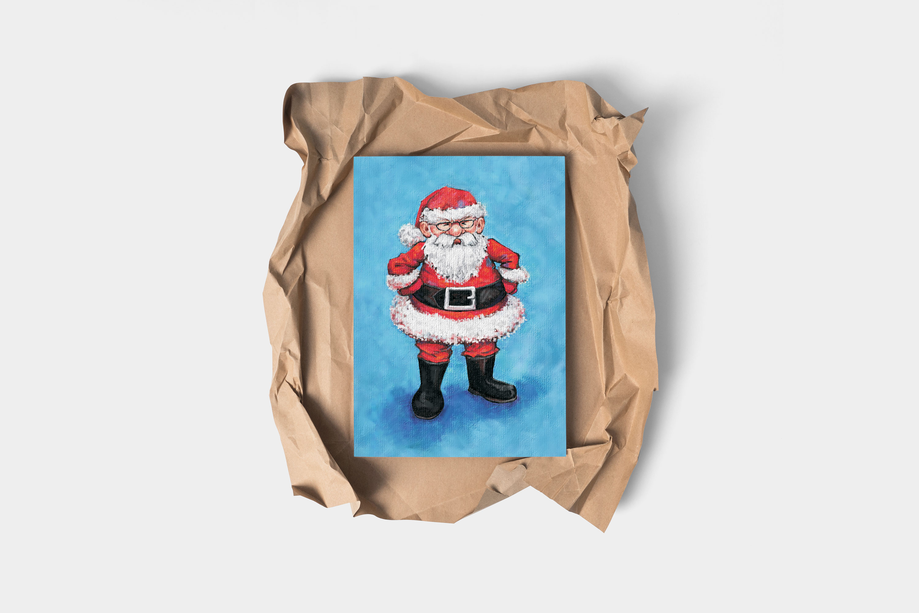
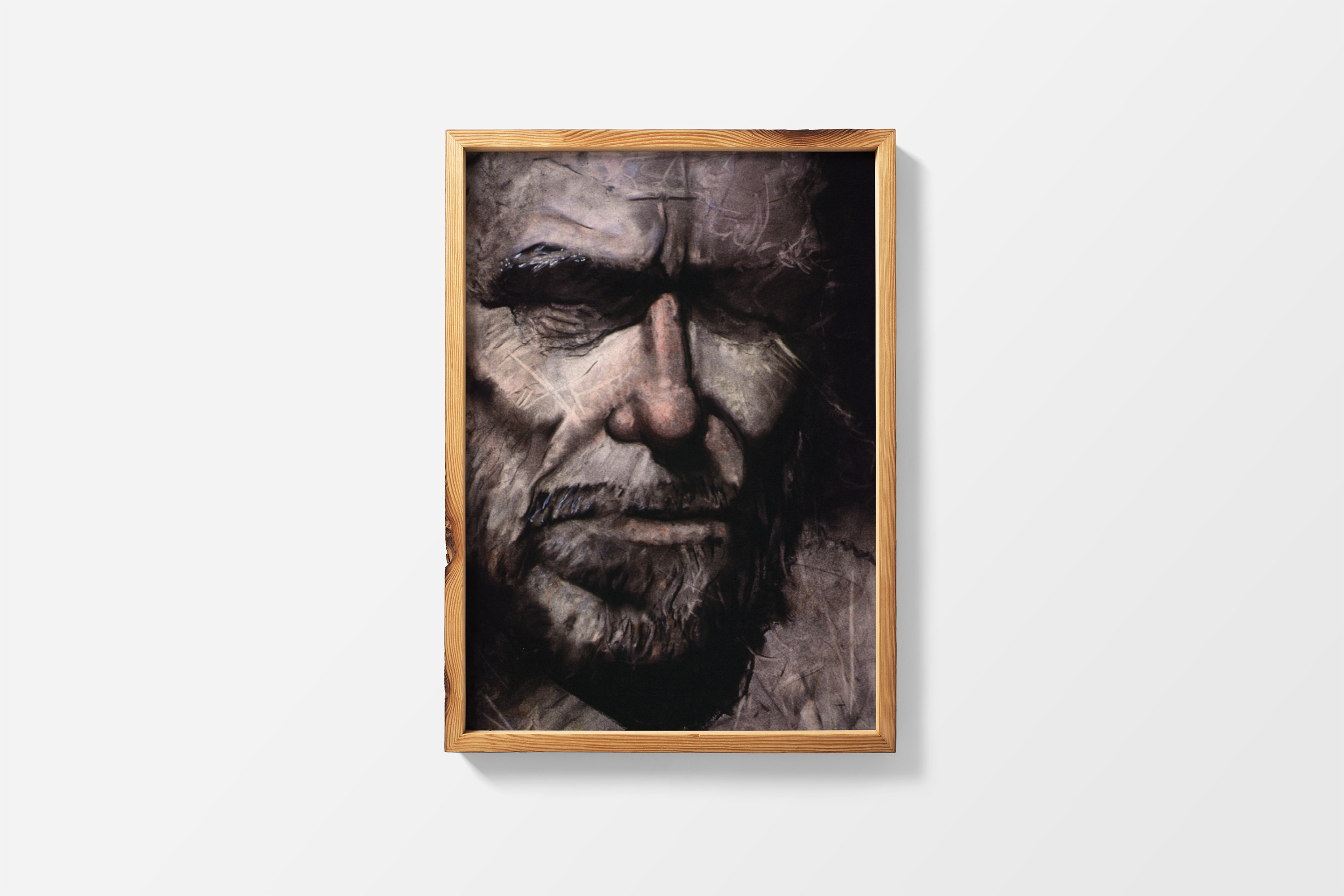
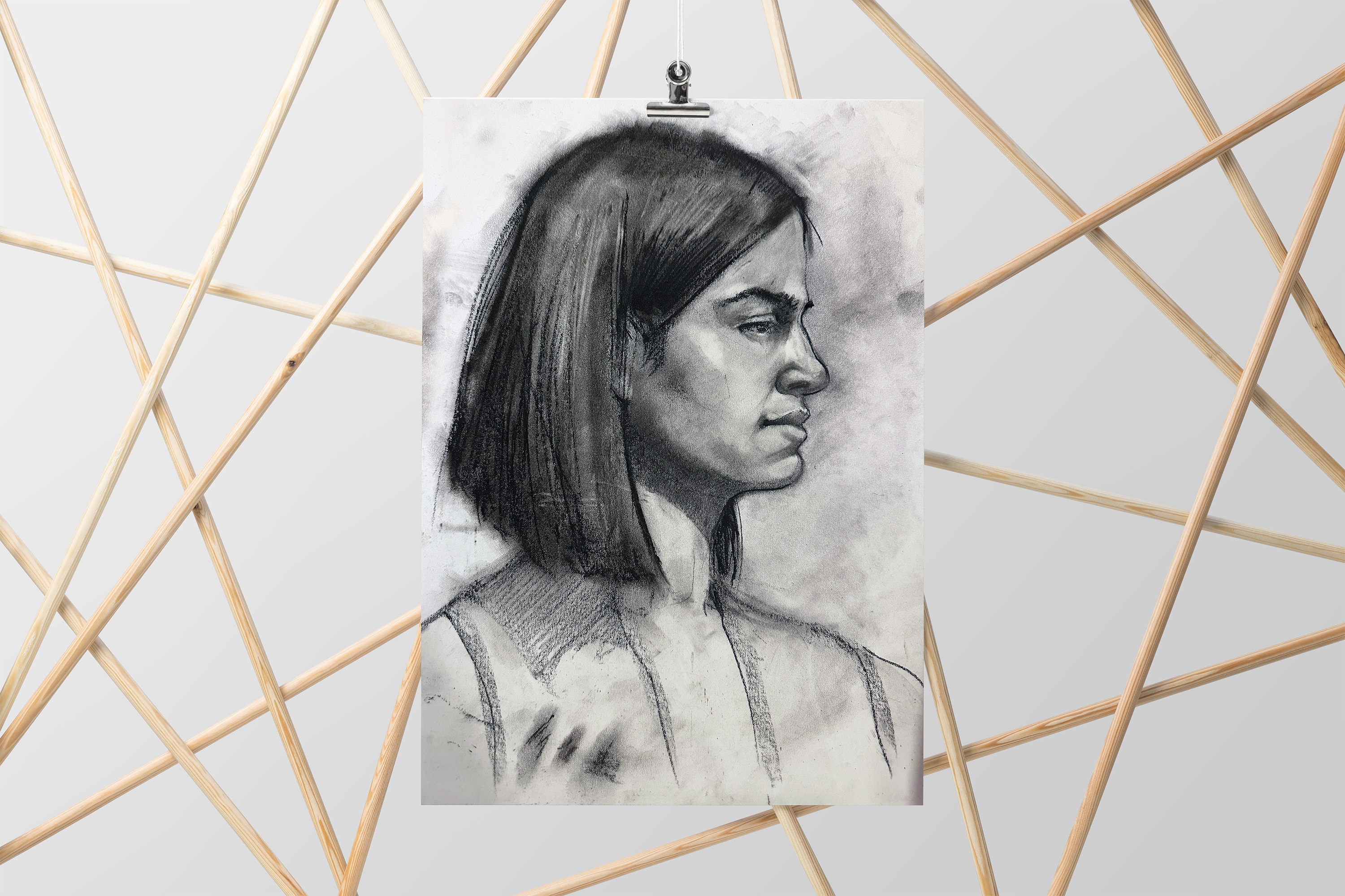
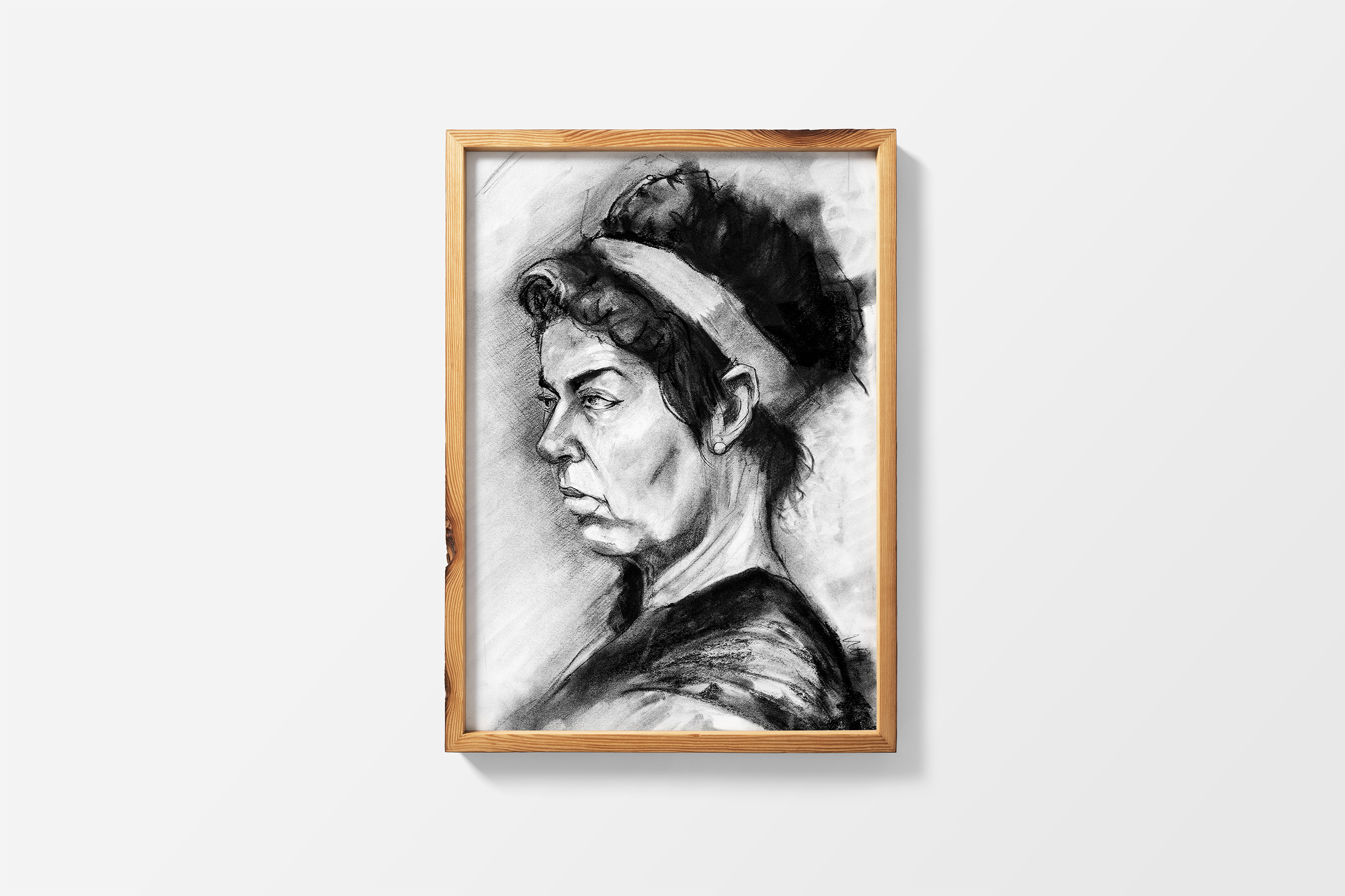
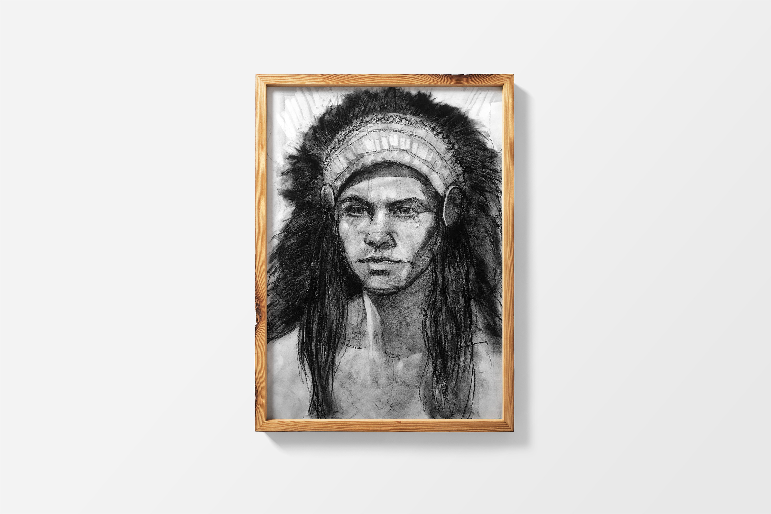
I love creating mockups of my artwork because they help clients visualize how a piece might look in their space. The art below was created in Procreate on the iPad; some pieces are in color, while others are black and white.


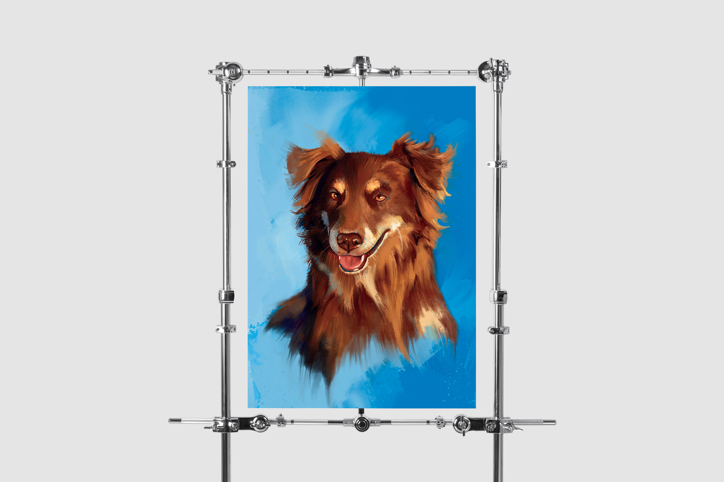
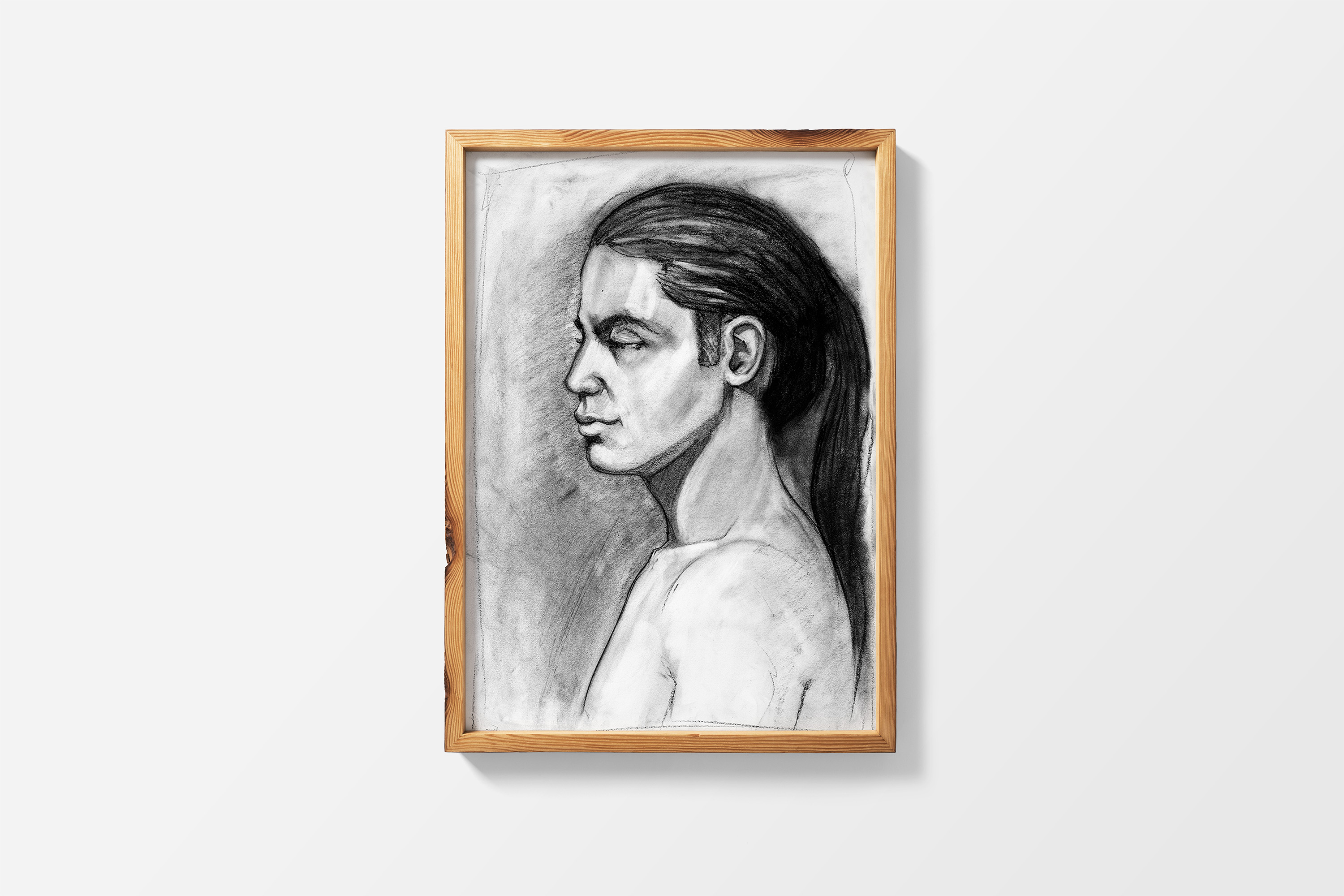
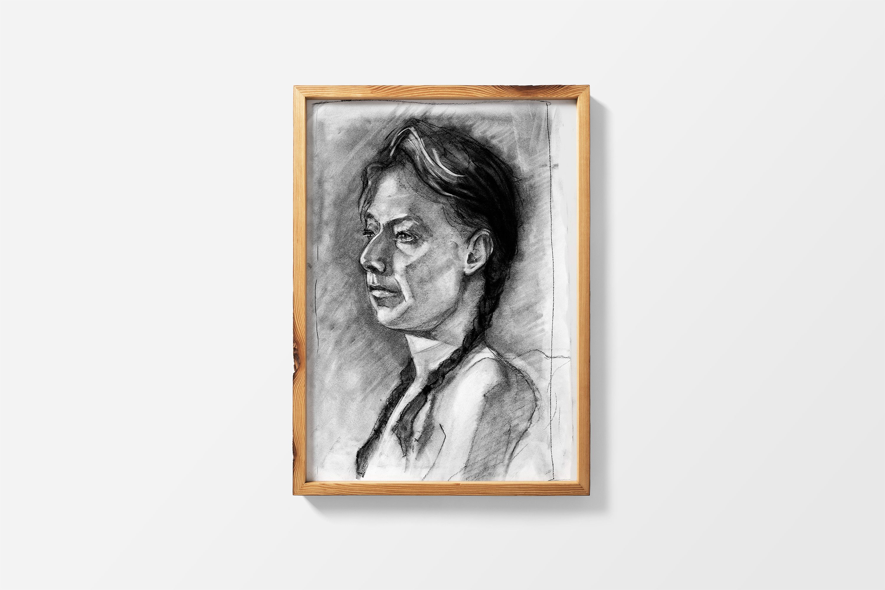
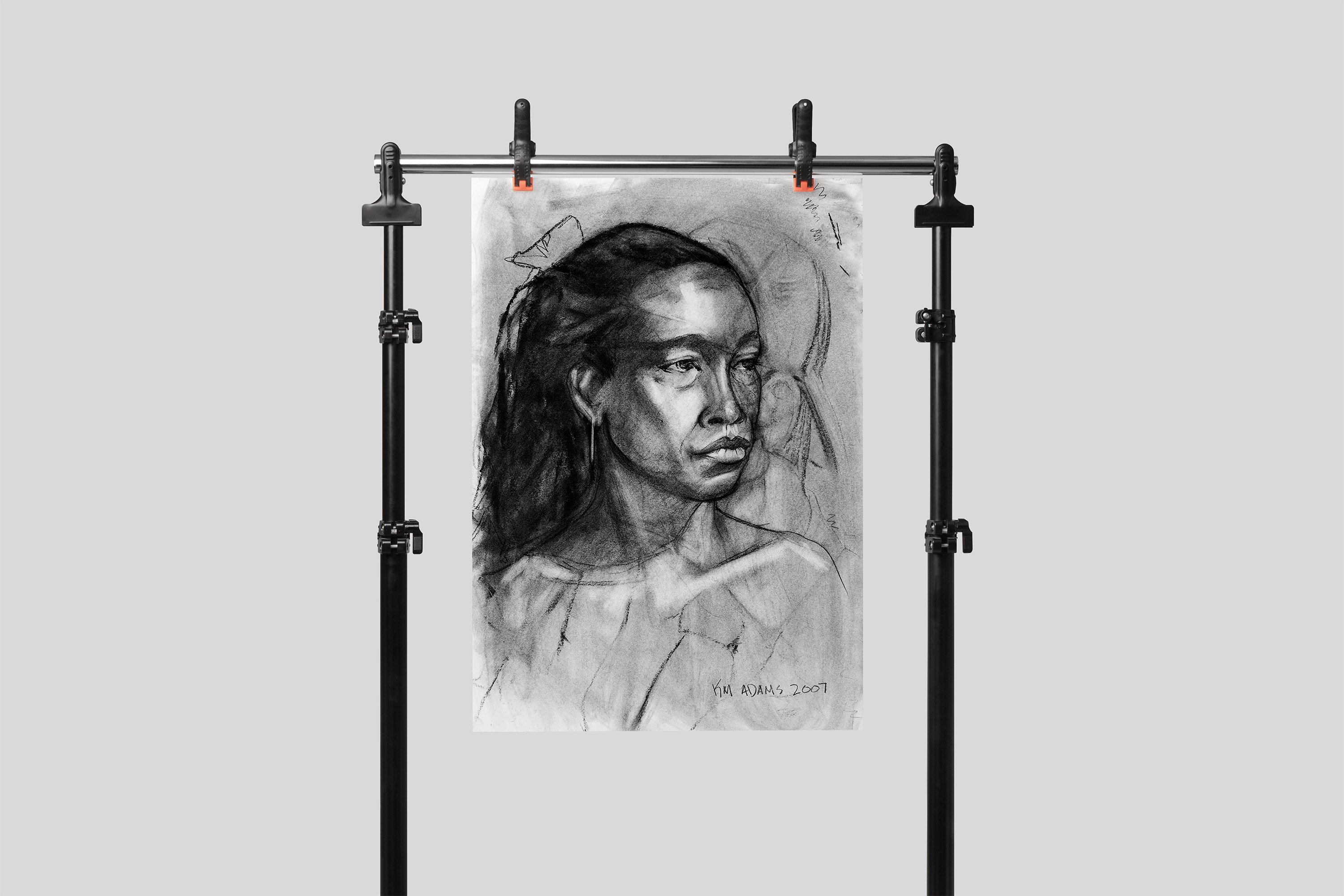
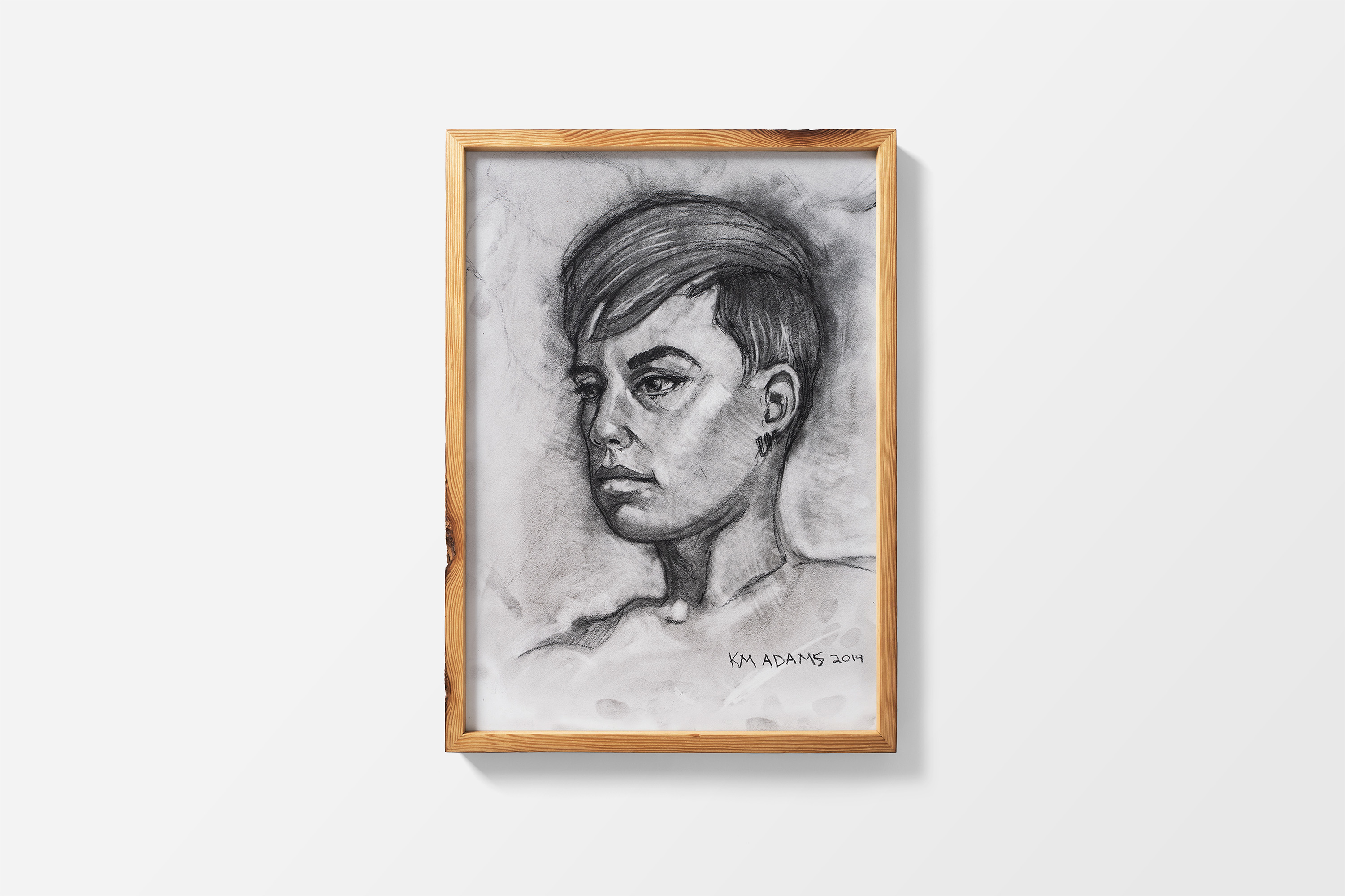
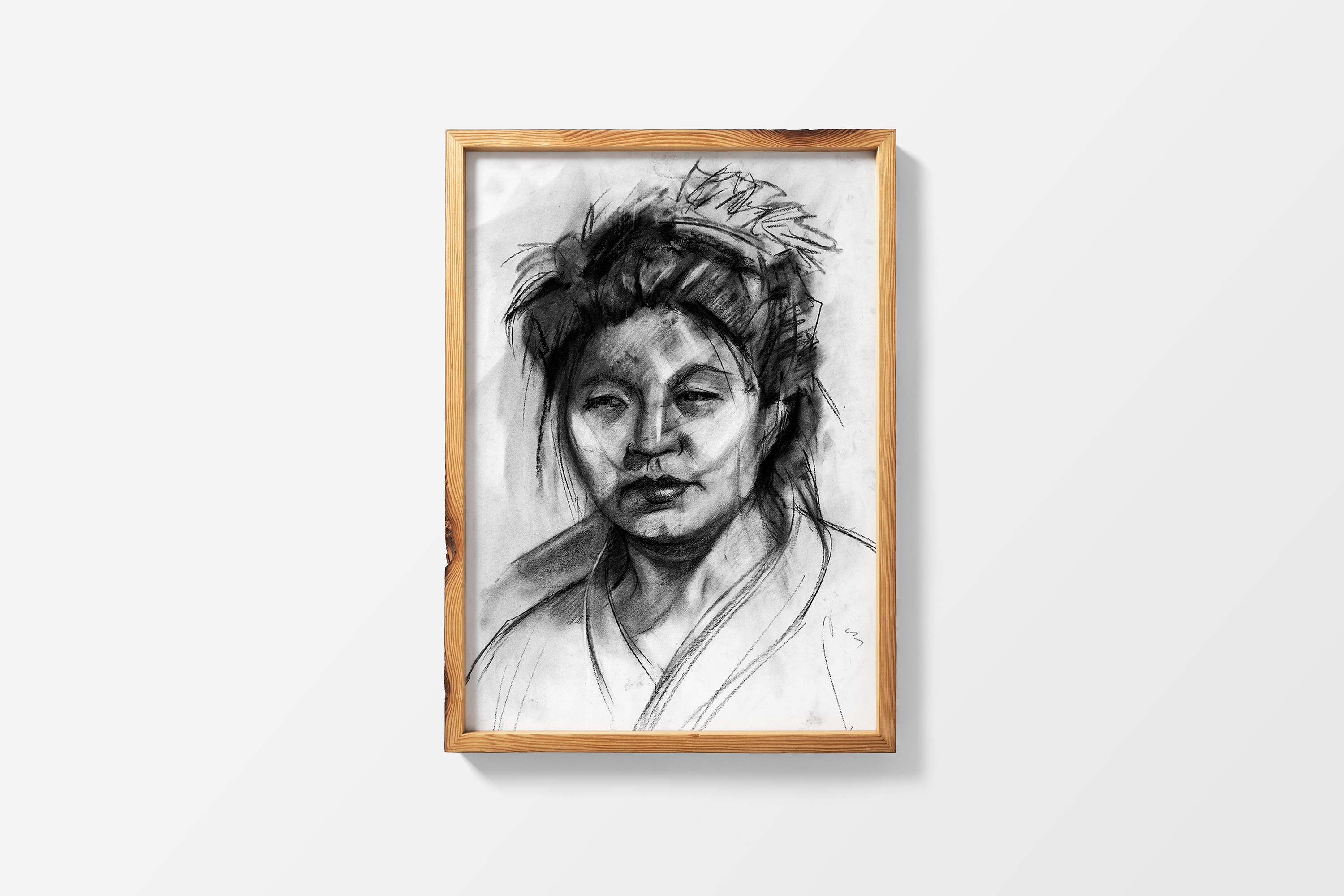
Below are portraits I created using traditional media.
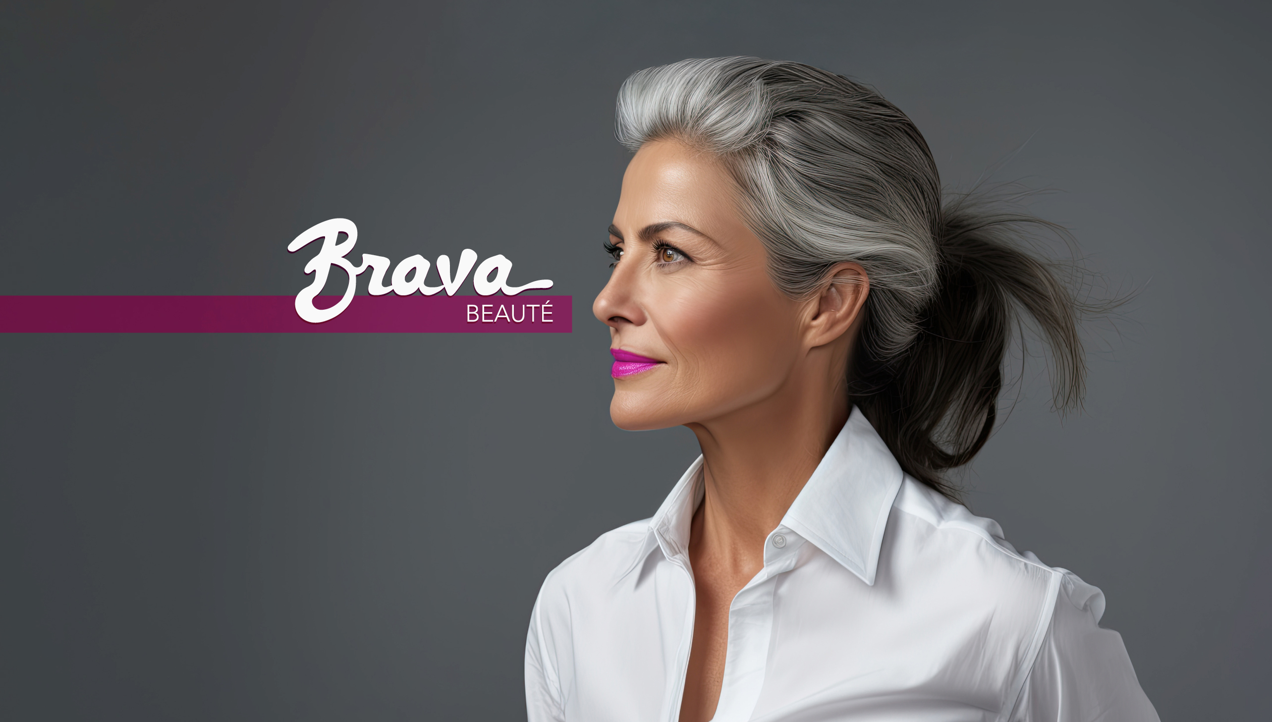
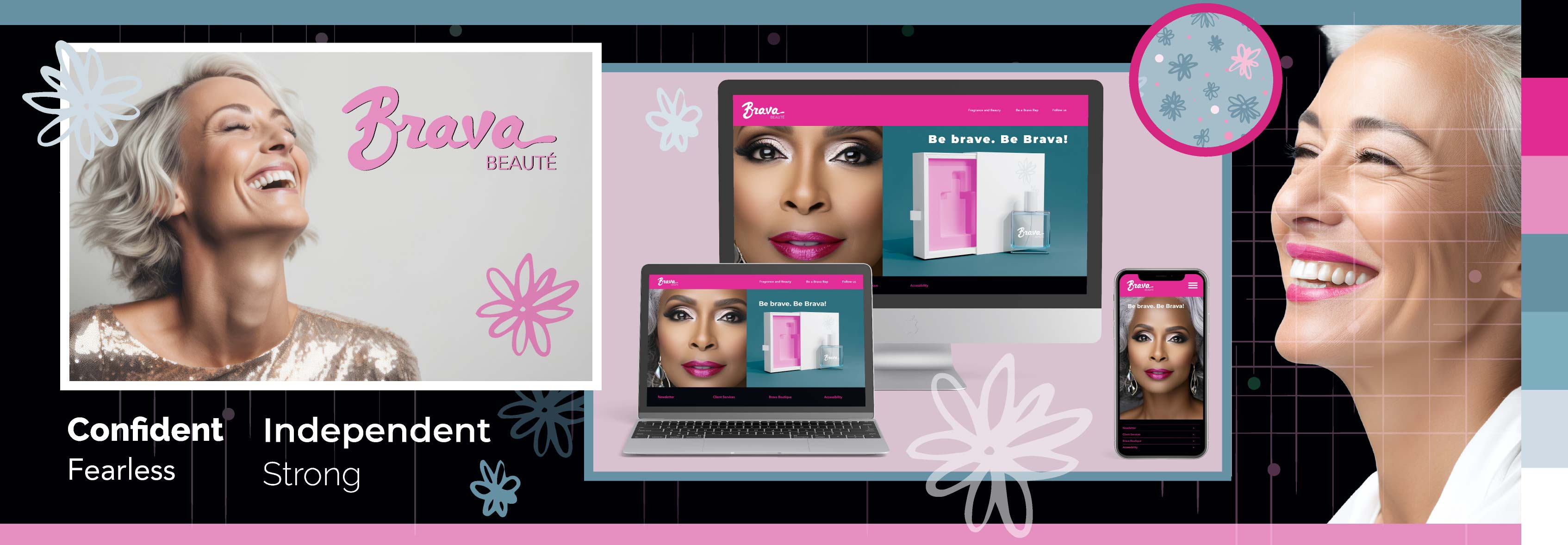
To address the needs of Baby Boomer women, I created a comprehensive beauty brand system that included a logo, email and website design, stylescapes, content, packaging, and supporting assets. The system was designed to build the brand online and make purchasing easy for tech-savvy customers who research products before buying. Scroll down to see the preliminary research.

In response to this challenge, I developed an array of Brava Beauté products designed for purchase online—through an app or website—or in high-end retail stores.
Scroll through the images by clicking on the numbers/arrows below.


This is perhaps my favorite portfolio piece.
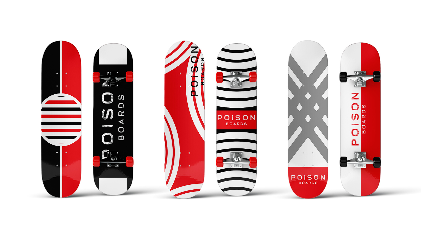
My supervisor at the time, Cliff Singontiko, told me about a 30-day skateboard challenge started by Chris Do, founder of the creative agency Blind and the online design school The Futur.
Chris Do provided the Photoshop mockup template and encouraged all participants to post on Instagram with the hashtag #30DaySkateboardChallenge. Cliff knew I loved a challenge so I dove in.
I used my art to create the designs: vector art I had created in Adobe Illustrator from personal projects, pixel art from my digital paintings (as well as traditional paintings I had scanned in), and various textures that I either created or got from stock image banks.
Once a theme emerged, I used Broadwell Distressed for my font and took it from there.
I had a blast.
And I went creatively nuts. I blended textures with slick graphics to design something magical. I created art. Cool, funky art.
Although my work commute at the time was horrible and I became sleep-deprived, I couldn't wait to get home and design another board. I often found myself working until past midnight, just to get the board right.
So, let’s hear it for Instagram challenges—and for awesome bosses who encourage us to explore our creativity!
Scroll down to see the final designs.

Scroll through the images by clicking on the numbers/arrows below.


Before I did any designs/sketches, I researched more about the buying power of Baby Boomer women.
An estimated 39 million Baby Boomers are women, so this demographic cannot be ignored. Which is why we see more and more mature women in commercials, print magazines, etc. Marketing to this demographic is a no-brainer for any beauty product line.
The Baby Boomers in general has been the demographic engine driving social change in the U.S. for the past fifty years. Within this large cohort, significant numbers of Baby Boomer women earned college degrees, entered the labor force, and began to maintain their own households during the 1980s. Women born in the late 1950s and early 1960s were the first group to overtake men in the completion of college degrees.
In 1990, when Baby Boomer women were between ages 26 and 44:
• Women made up 45 percent of the labor force.
• Just more than one-quarter of working women had college degrees.
• Women were 17 percent of physicians and 22 percent of lawyers—up from less than 3 percent of lawyers in 1970.
Purchasing style of Baby Boomer women:
•Baby Boomer women have more disposable income and money to spend.
•Boomers trust their Google moves more than social media marketing and videos.
•Boomer women’s influence account for a significant chunk of consumer purchases.
•Boomer women feel invisible and misunderstood by marketers and businesses.
•Woman empowerment and the environment are hugely important for Boomer women in terms of purchase decisions and brand loyalty.
Sources:
https://www.americanprogress.org/article/fact-sheet-4-generations-of-american-women/
Tor-a helps art lovers find, book, and check in for museum and gallery tours. Users can add amenities such as parking, access tickets through a QR code, review tours, and connect with other art lovers.
Scroll down to see the complete project: the research behind the design.


Final screens.
I began by defining what a successful tour-booking app needed to do and who it would serve. Interviews with frequent museum and gallery visitors revealed recurring friction around finding relevant tours, avoiding crowds, arranging accommodations, and checking in.
Tor-a's success will be measured by:
Tickets sold
Completed check-ins
App downloads
Our target audience:
Frequent museum and gallery visitors balancing work, family, and other reponsibilities
Ages 30-50, no gender preference, no orientation preference
Middle-to-upper income ($80k or more annual income per year)
Working as the sole UX designer, I conducted interviews, created personas, journey maps, and a competitive audit, developed low- and high-fidelity prototypes, ran two rounds of usability testing, and designed the Tor-a identity.

I recruited participants through social media, conducted interviews, and synthesized the findings into two personas, problem statements, user stories, and journey maps.
Research revealed four recurring pain points:
Art lovers want to book and check-in to a tour without large crowds
Gallery tours can be overwhelming and art attendees want to have choices and find their favorite artists
Calling a museum or gallery and writing down the tour info is cumbersome and confusing
Waiting in line is maddening and most art lovers want to check-in easily and quickly


Gemma, an art-loving parent, needs to book tours in advance and identify accommodations for her disabled son.
Davis, a busy editor and writer, needs a faster way to find tours featuring artists they follow.
I mapped Gemma’s experience from tour discovery through arrival, documenting her tasks, emotions, pain points, and opportunities. The exercise clarified where booking, accommodations, and check-in could be simplified.

I created several timed wireframe variations using insights from competitive reviews of LACMA, Los Angeles Art Gallery Tours, and Viator.

I translated the strongest sketches into a Figma prototype covering the primary user flow: account creation, tour search, selection, checkout, and QR-code check-in.
I conducted two rounds of unmoderated usability testing. The first included five participants completing six core tasks: creating or signing in to an account, searching for and selecting a tour, completing checkout, canceling, signing out, and retrieving a QR code.
The first round exposed unclear sign-in controls, weak search cues, confusing horizontal scrolling, and a hard-to-find sign-out function.
The second round showed that users also wanted digital-wallet tickets, editable dates, clearer tour-detail screens, and more consistent account controls.
The findings led to four priorities:
Make sign-in status clear
Provide stronger search cues
Keep cart and cancellation controls visible
Use consistent navigation across screens
I added parking and accessibility details to tour amenities, strengthened color contrast, simplified navigation, increased whitespace, and included a language option. Accessibility was integrated into the booking flow rather than treated as an add-on.
Please note I am still building out this project. Check back soon!
After CFA secured state and federal grants, the leadership decided to implement a new marketing campaign and I was approached by their marketing manager (a former co-worker), who asked for my help with creative strategy, asset creation, and best practices on execution.
One of my first tasks was to do a design audit and make recommendations, based upon their updated marketing strategic plan. This meant I audited their websites, styleguides, and any other assets they used in their materials.
I met with stakeholders and figured out their pain points, as well as conducted exploratory ideas.
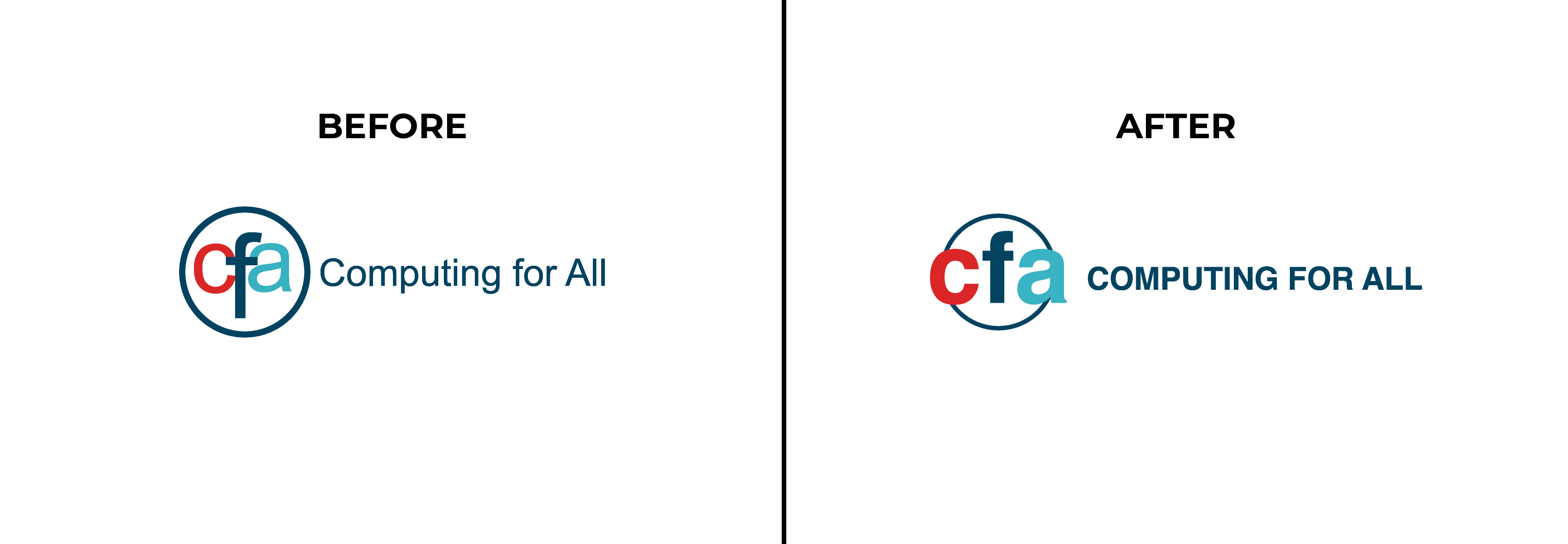
While there was some discussion of re-doing the entire logo system, leadership decided that a logo refresh was more optimal for the time being, due to budget and time restraints.
I kept the circle, to convey CFA's role in connecting employers to tech students. I cleaned up the typography and kept the font--Helvetica--but made the title in all caps, to indicate CFA's authority in the tech world.
Below are the before and after versions of the CFA logo. Note that the updated version is more legible and more flexible for other channels, such as the website and social media.
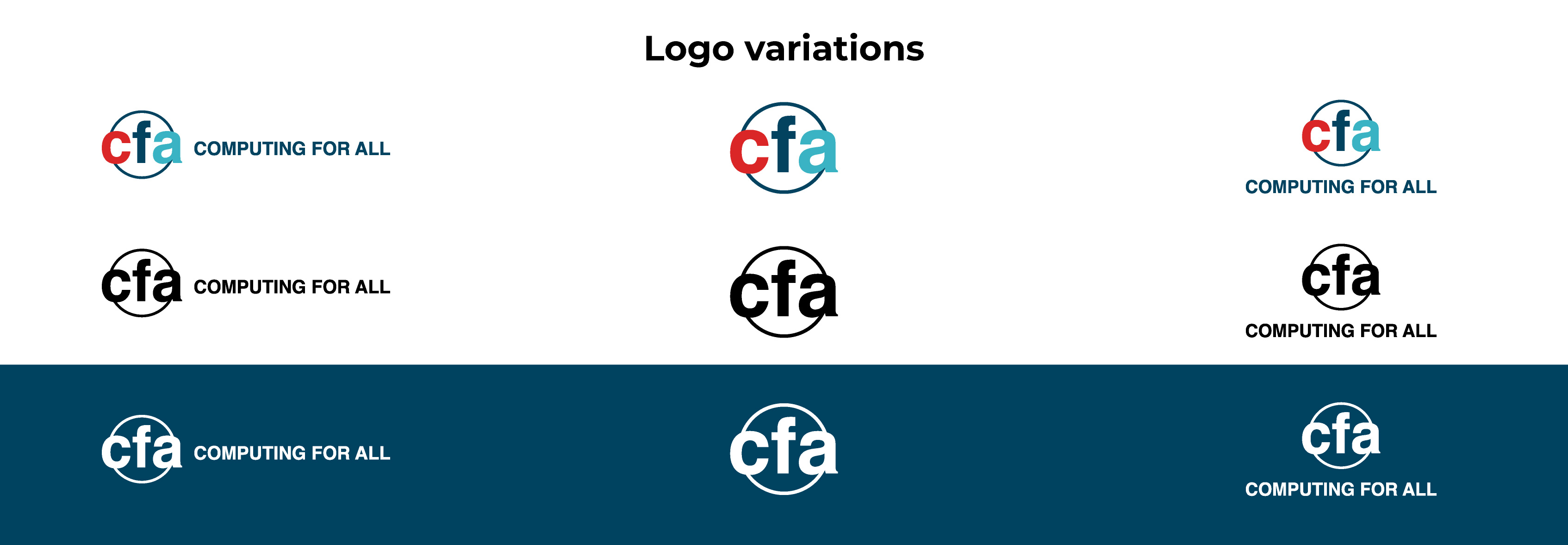
Below are the final logos and their variations, including a quick micro animation that we had planned to use as an end card for future social posts.
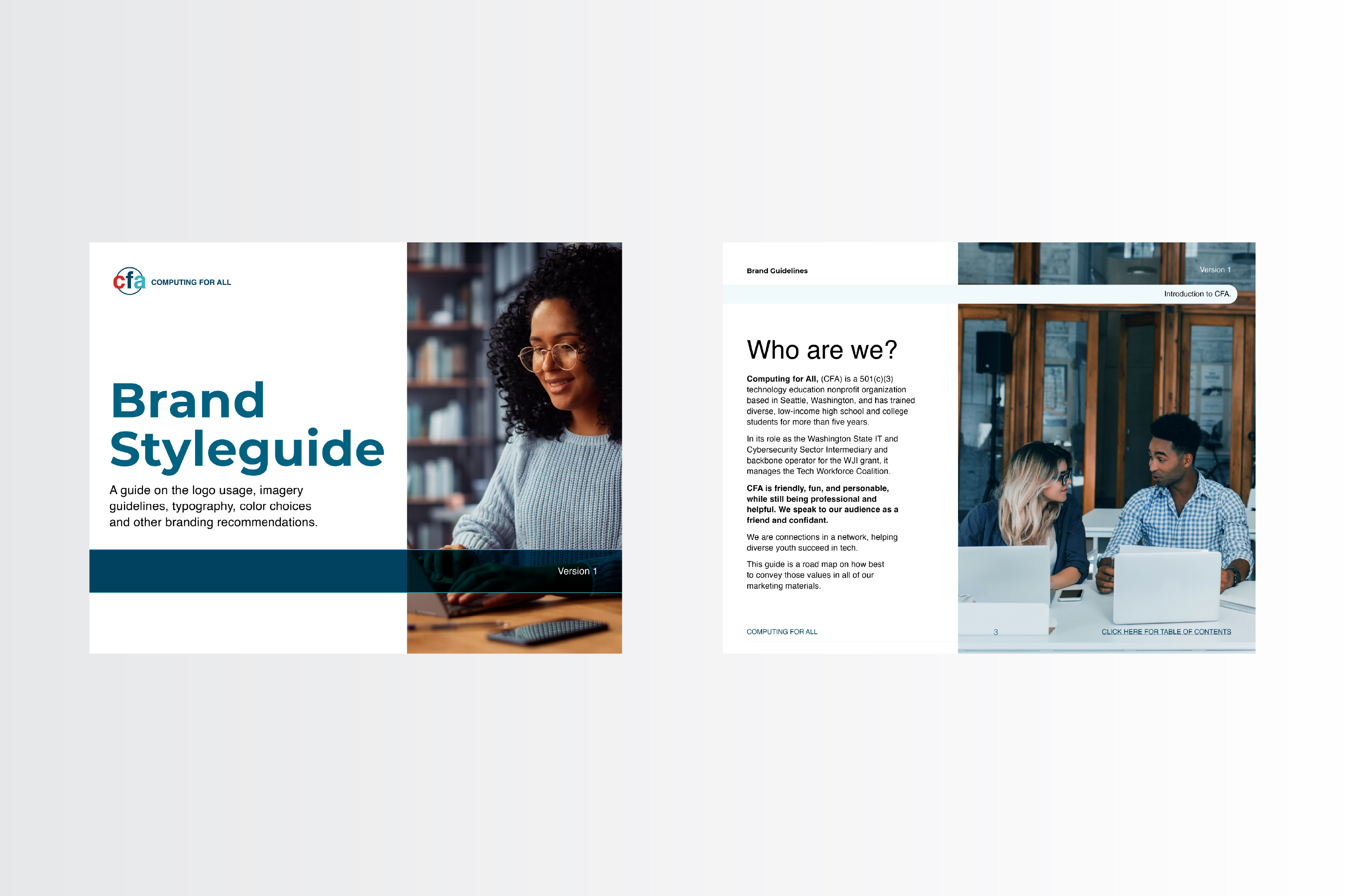
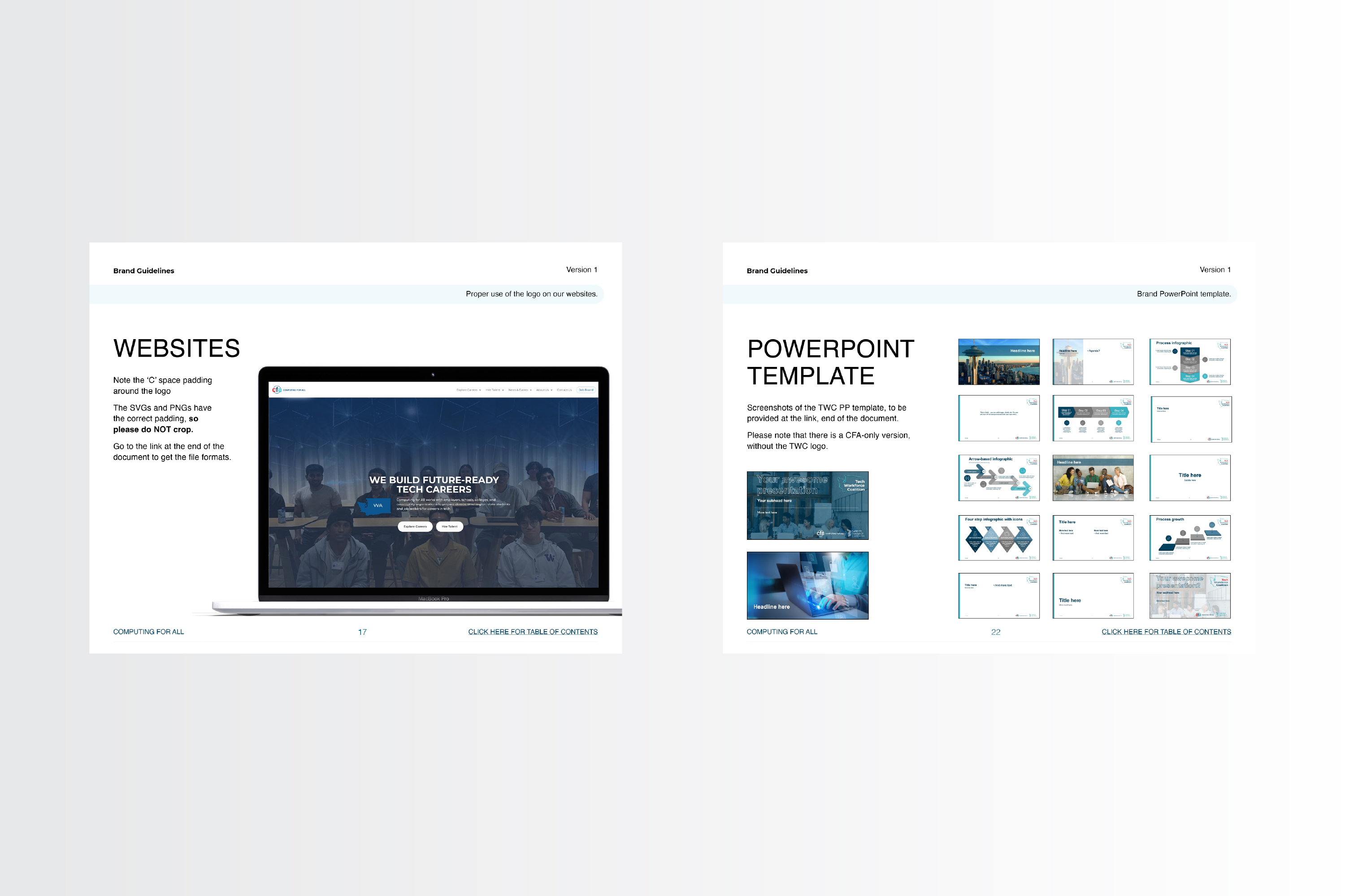
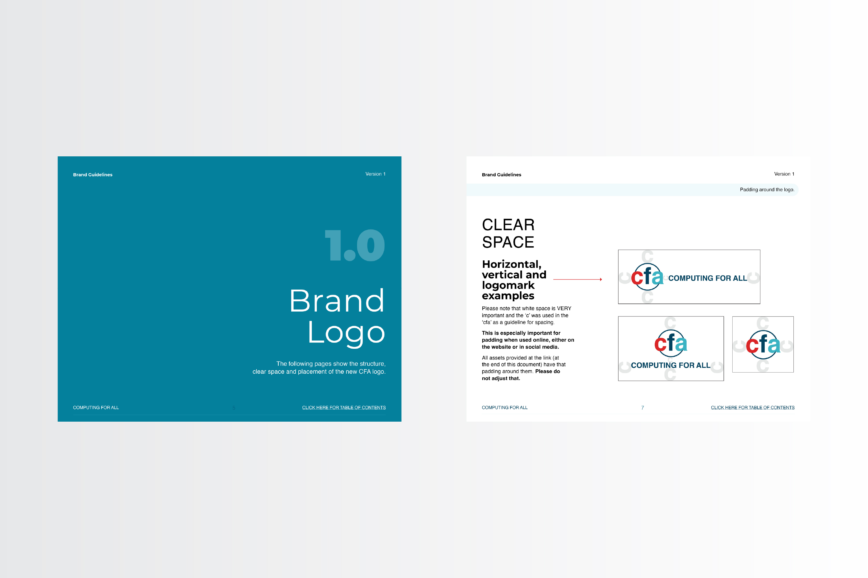
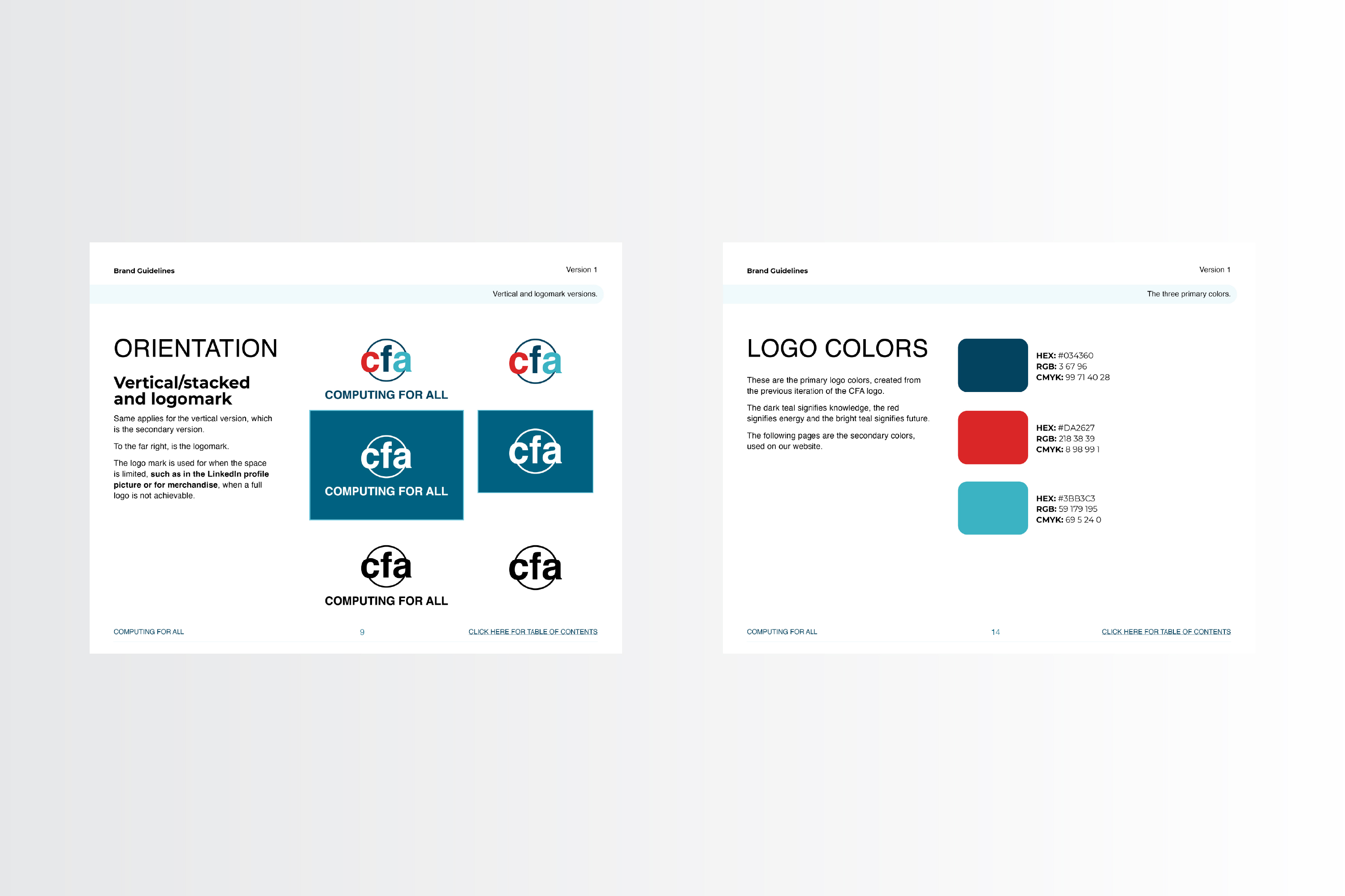
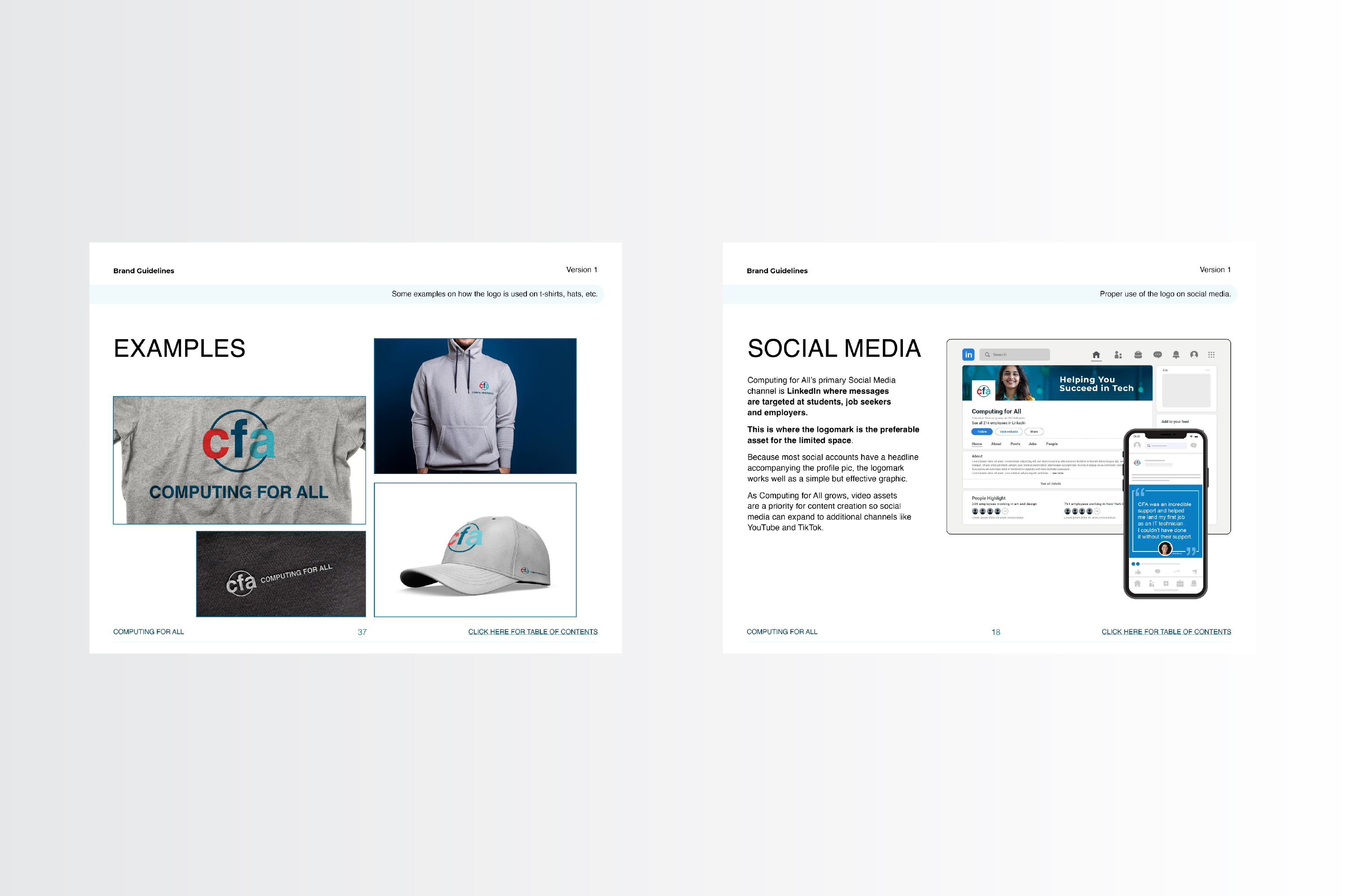
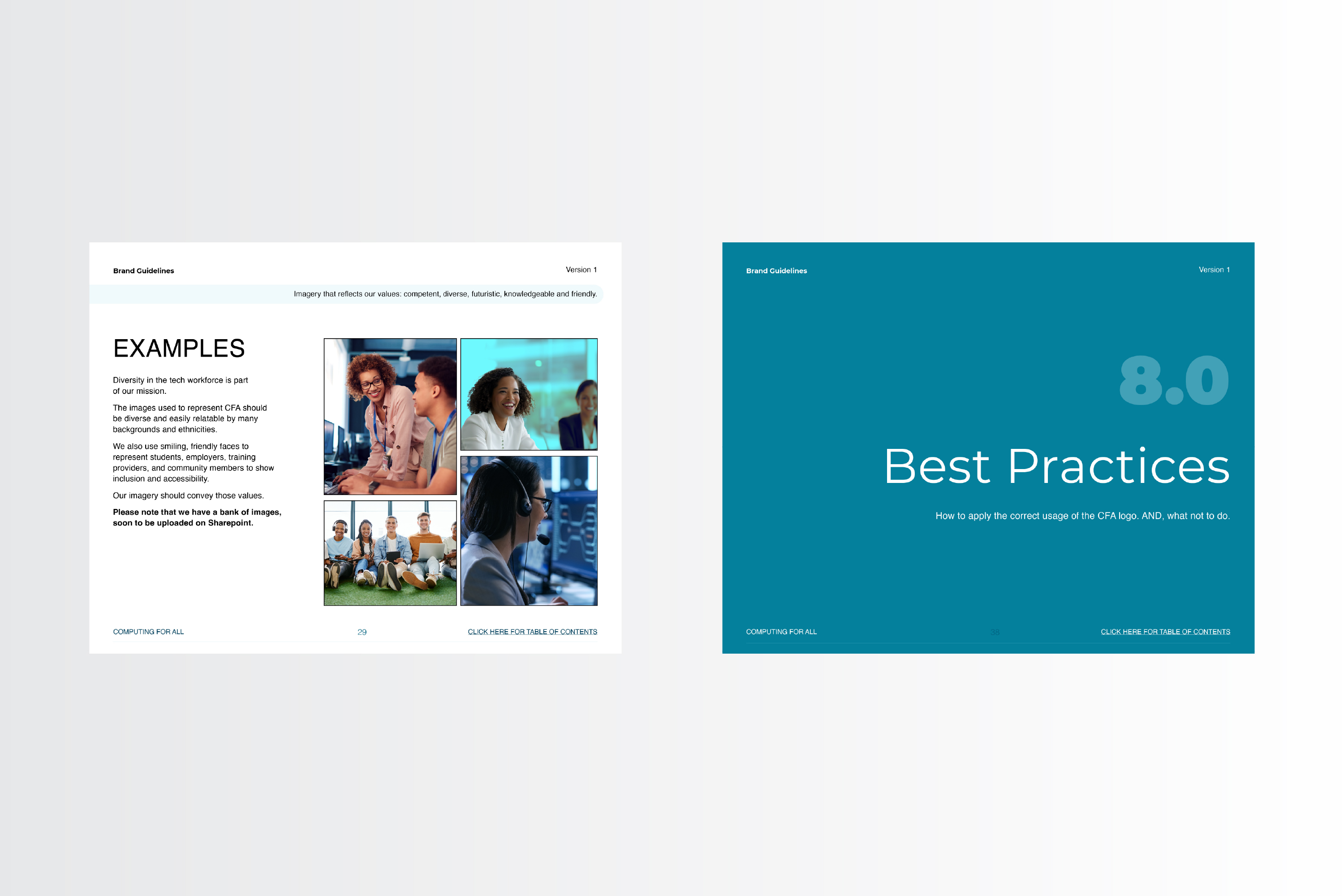
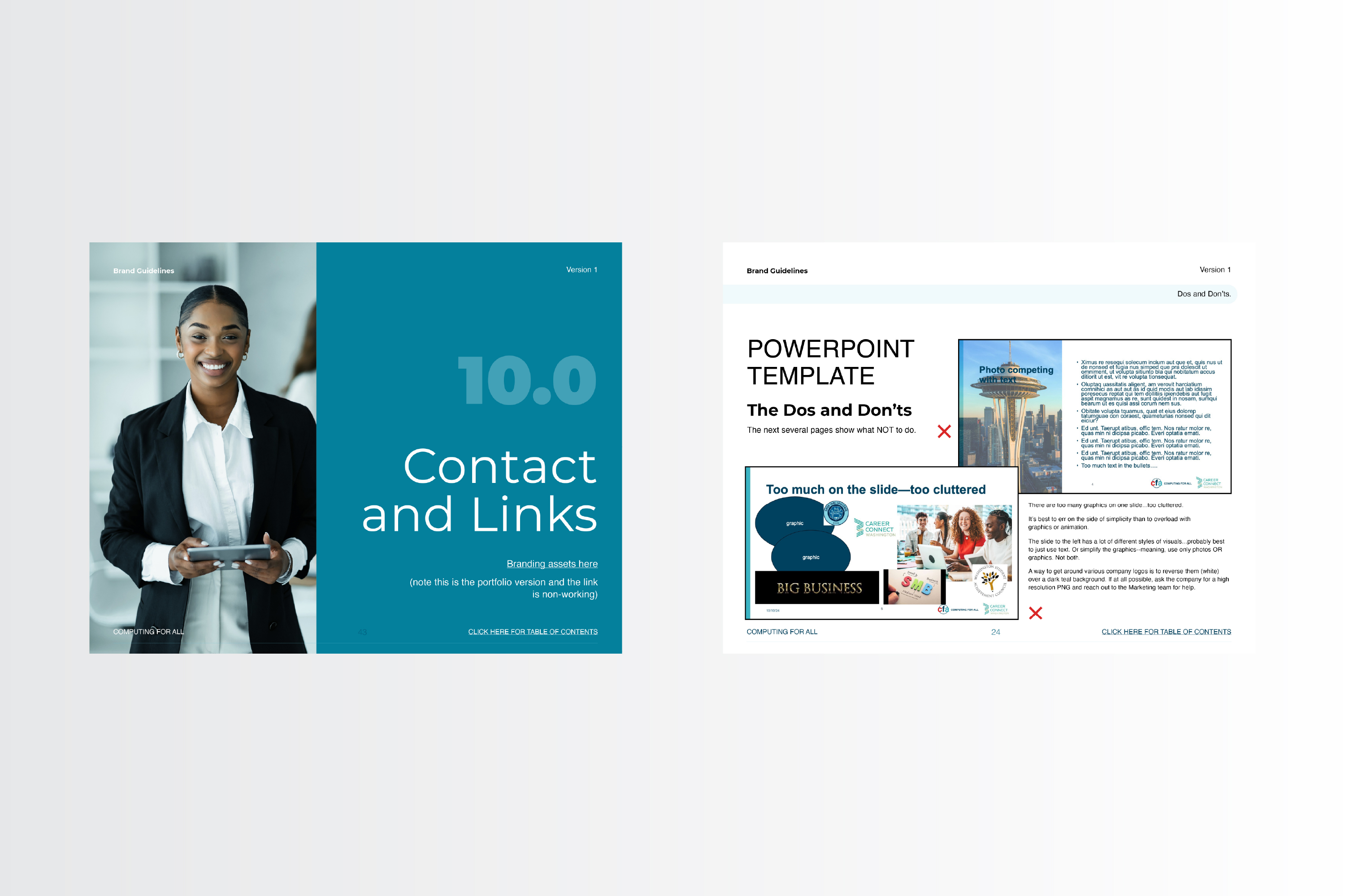
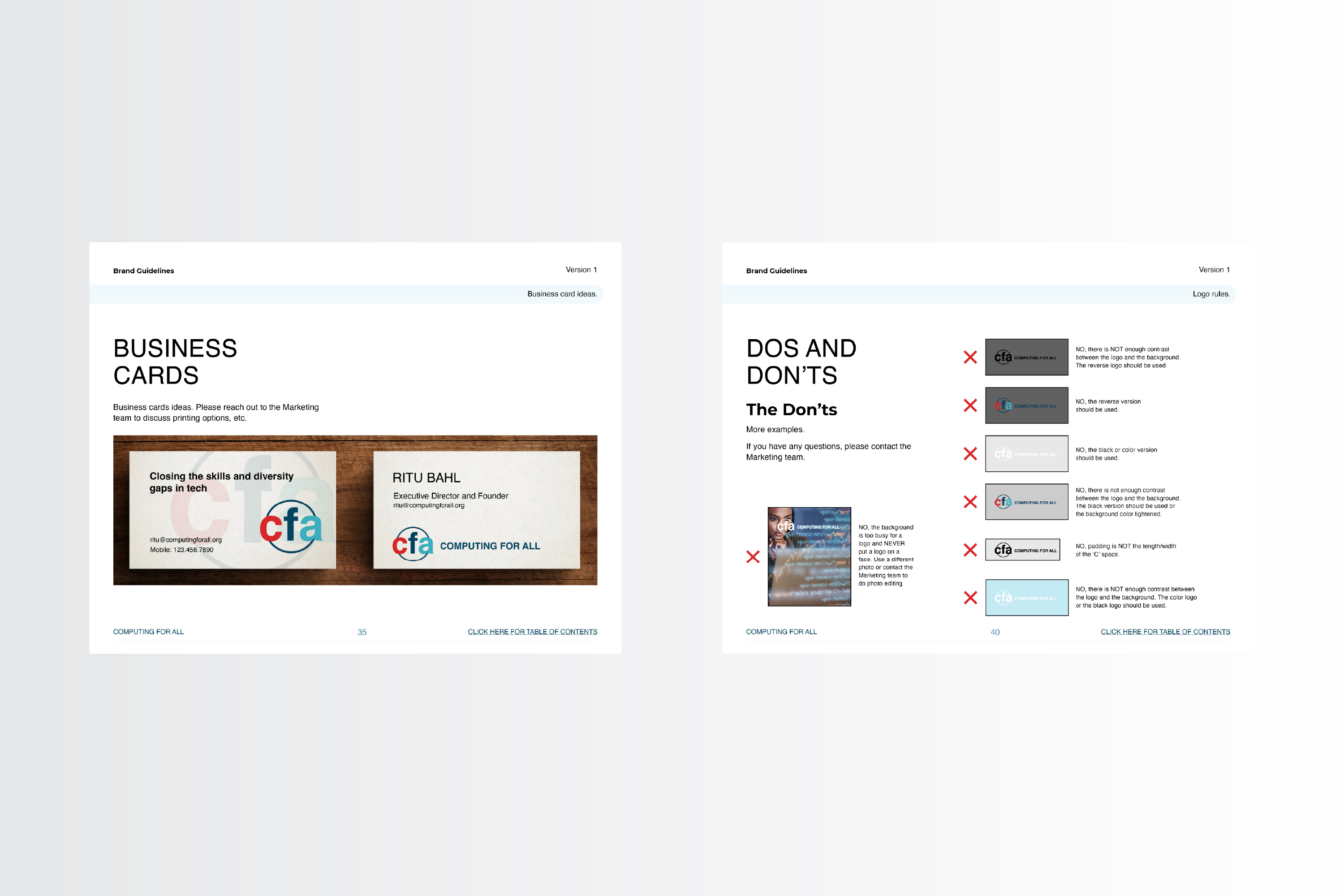
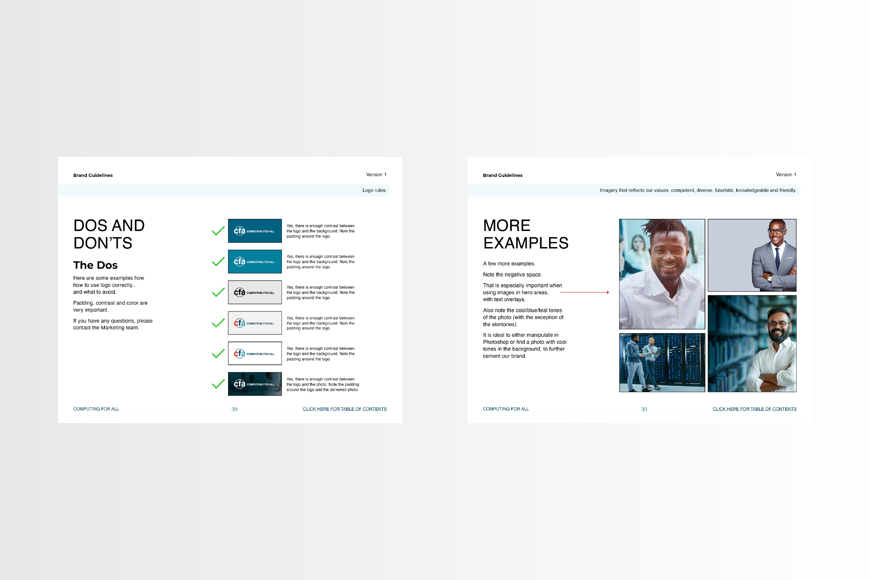
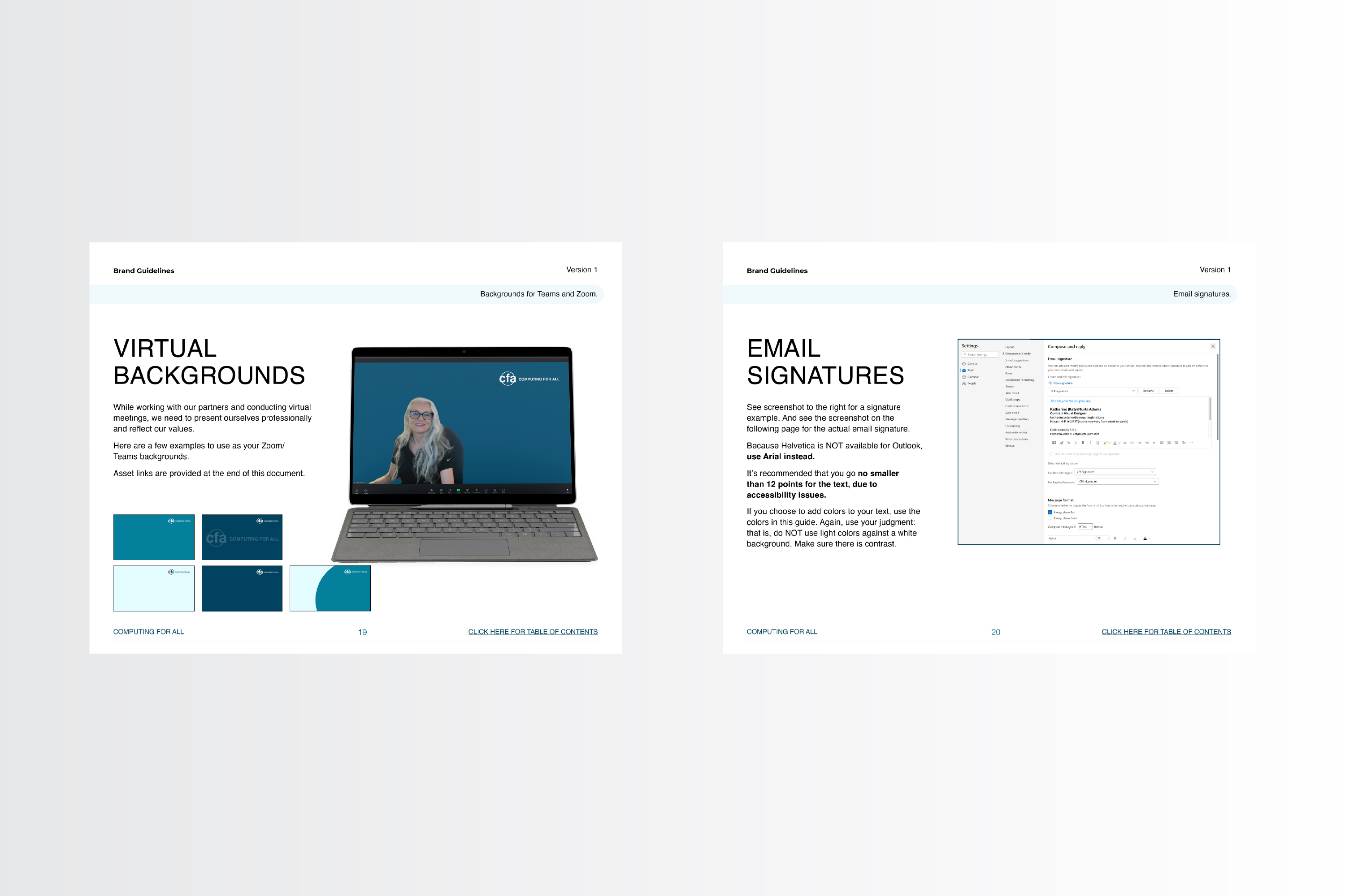
With an updated logo came a need for an updated styleguide. So I provided an interactive PDF (using Adobe InDesign) with updated colors, fonts, imagery and examples on how to best implement the new direction, as well as other guidelines. I uploaded the new guide to the Microsoft Teams channel for all employees to use.
Below are a few screenshots. If you would like the interactive PDF, please contact me at the below form.
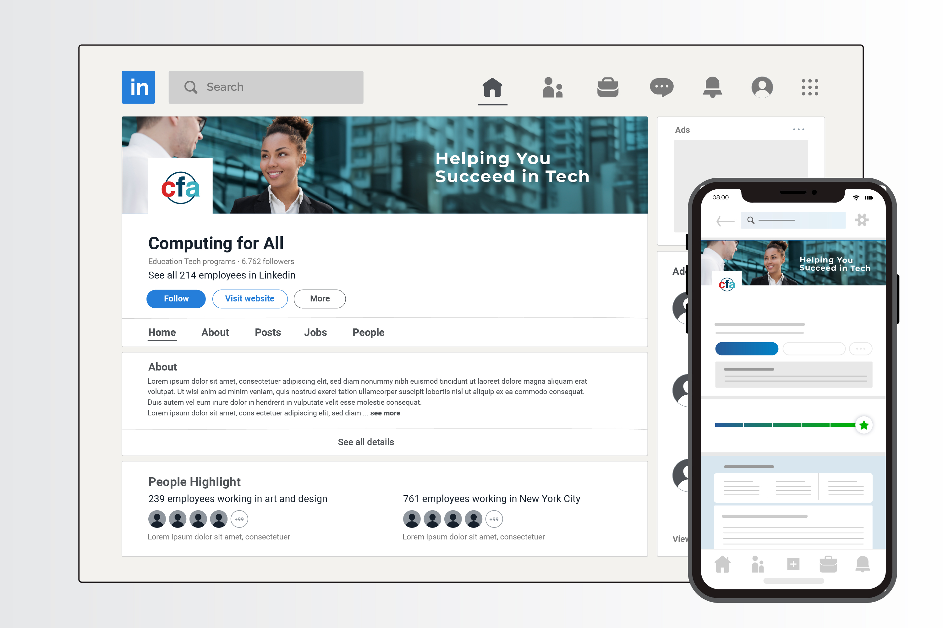
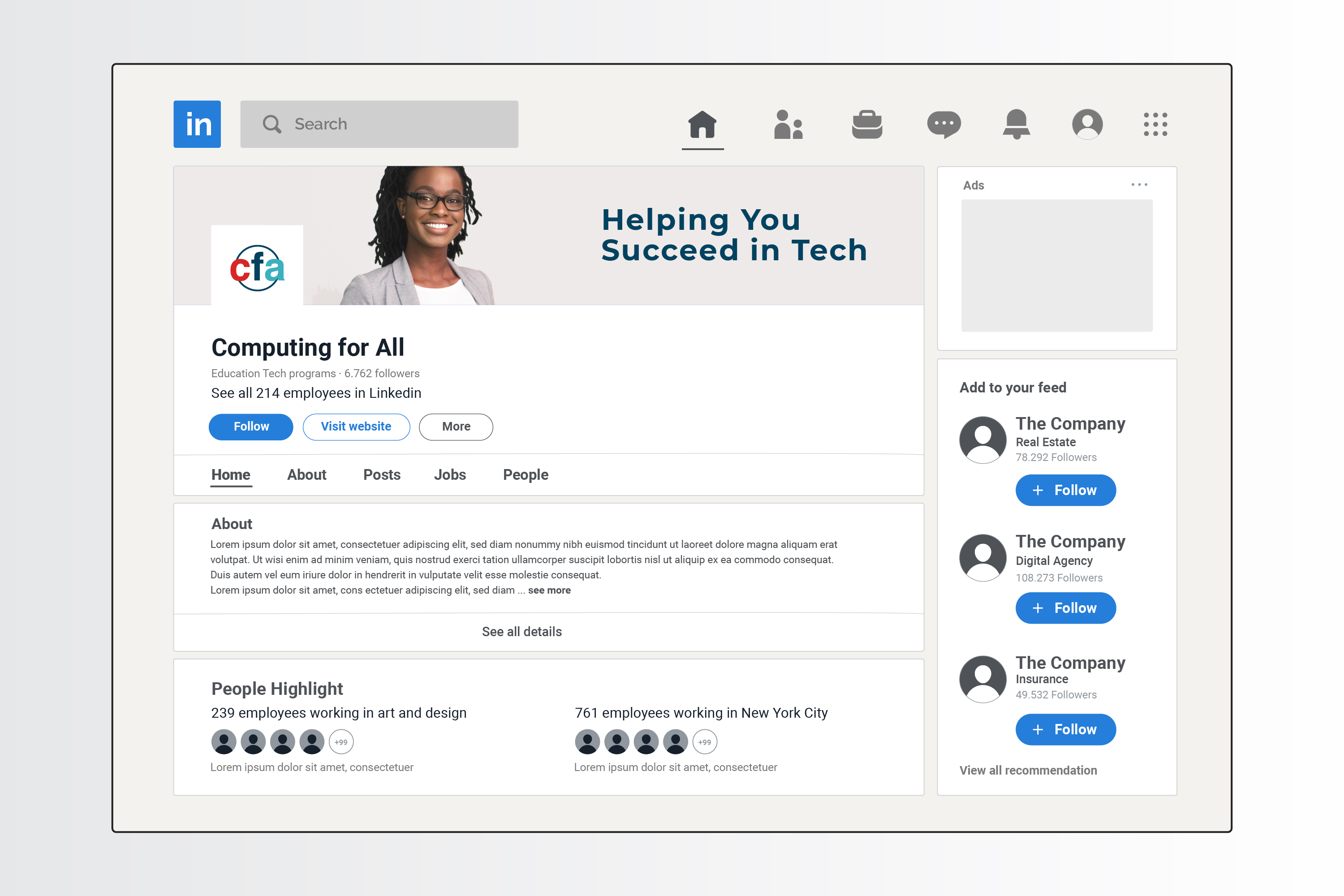
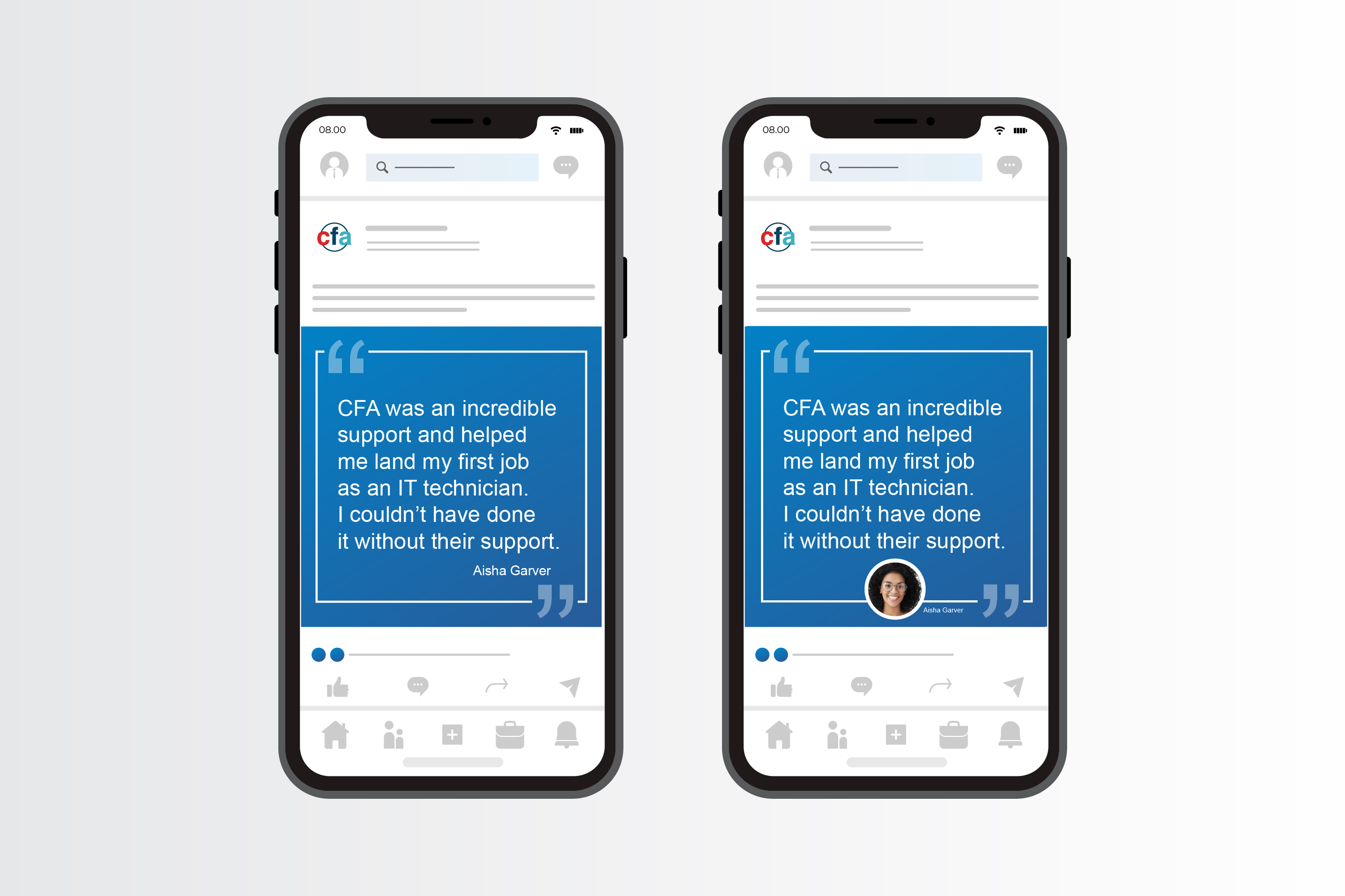
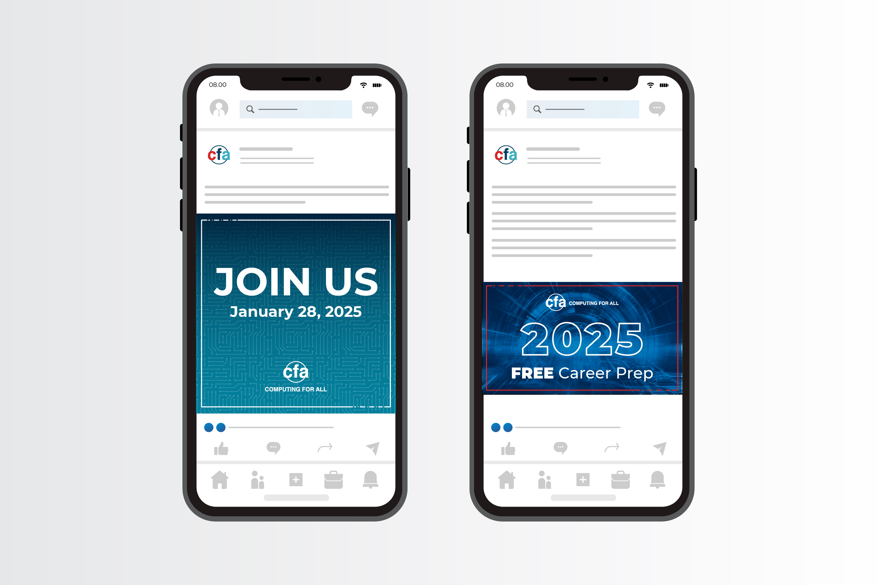
After updating the logo, I wanted to implement the new direction on the main social media channel, LinkedIn. Below are a few mockups, using brand-consistent imagery and the new logomark.
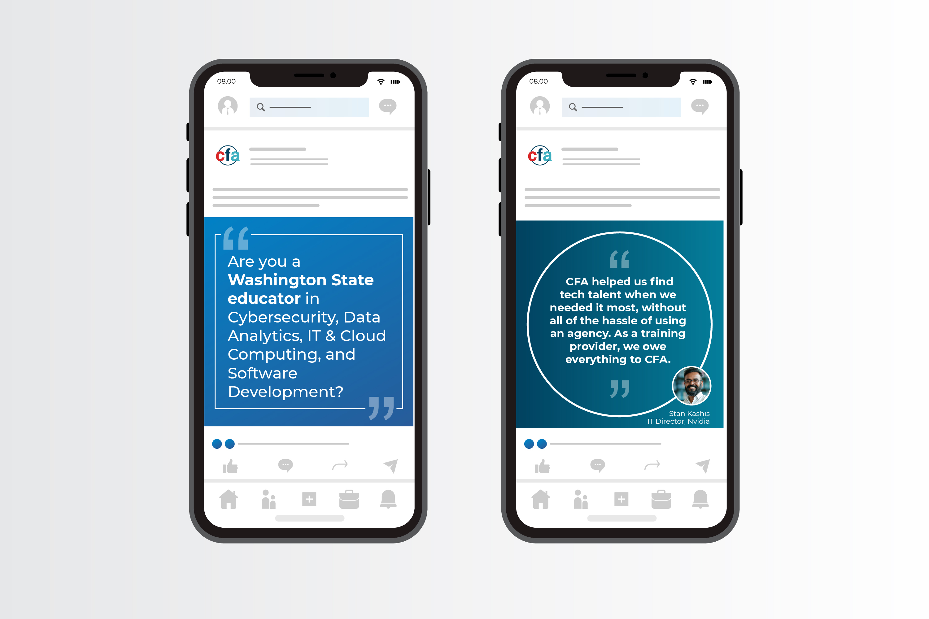
In order to sell the concept to the leadership team, I mocked up the CFA's LI company profile, as well as a few ideas on testimonial posts and carousel PDFs.
As a result of updating the LI company profile and using new assets for LI posts, (I worked very closely with a content person), we were able to increase CFA's followers by several hundred and increased engagement by 40%.
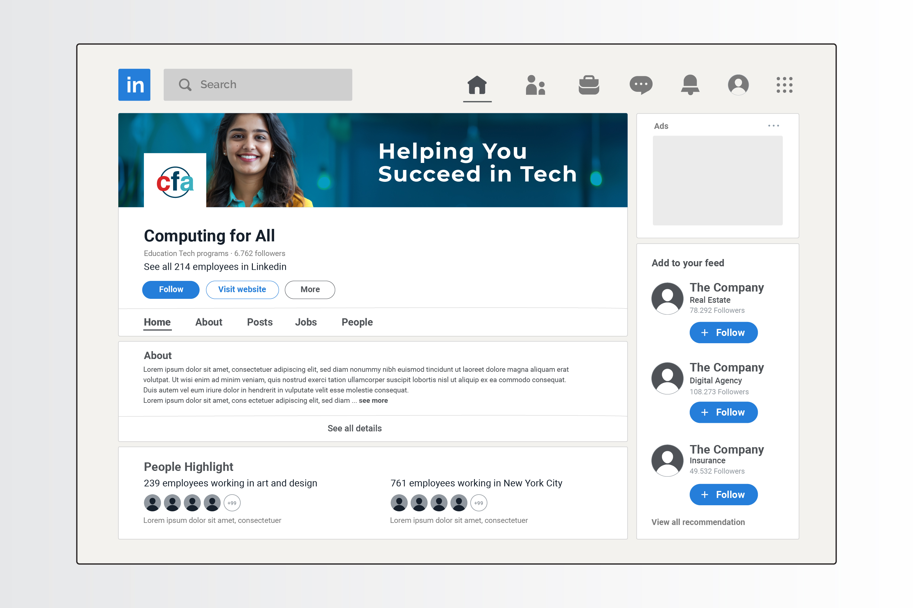
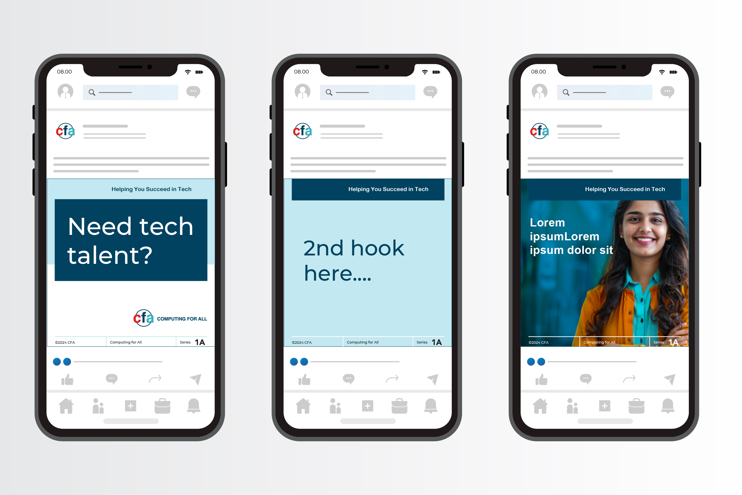
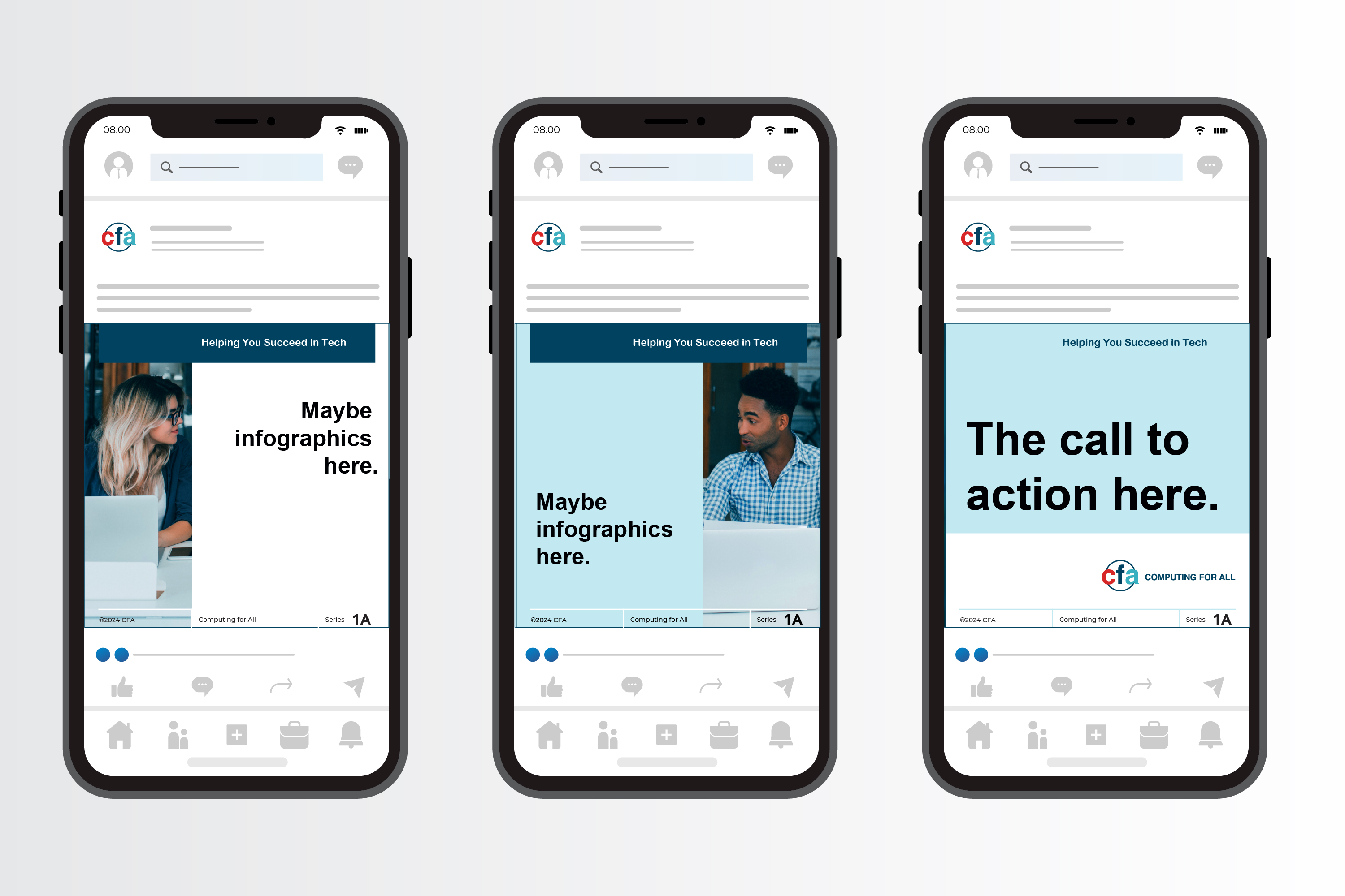
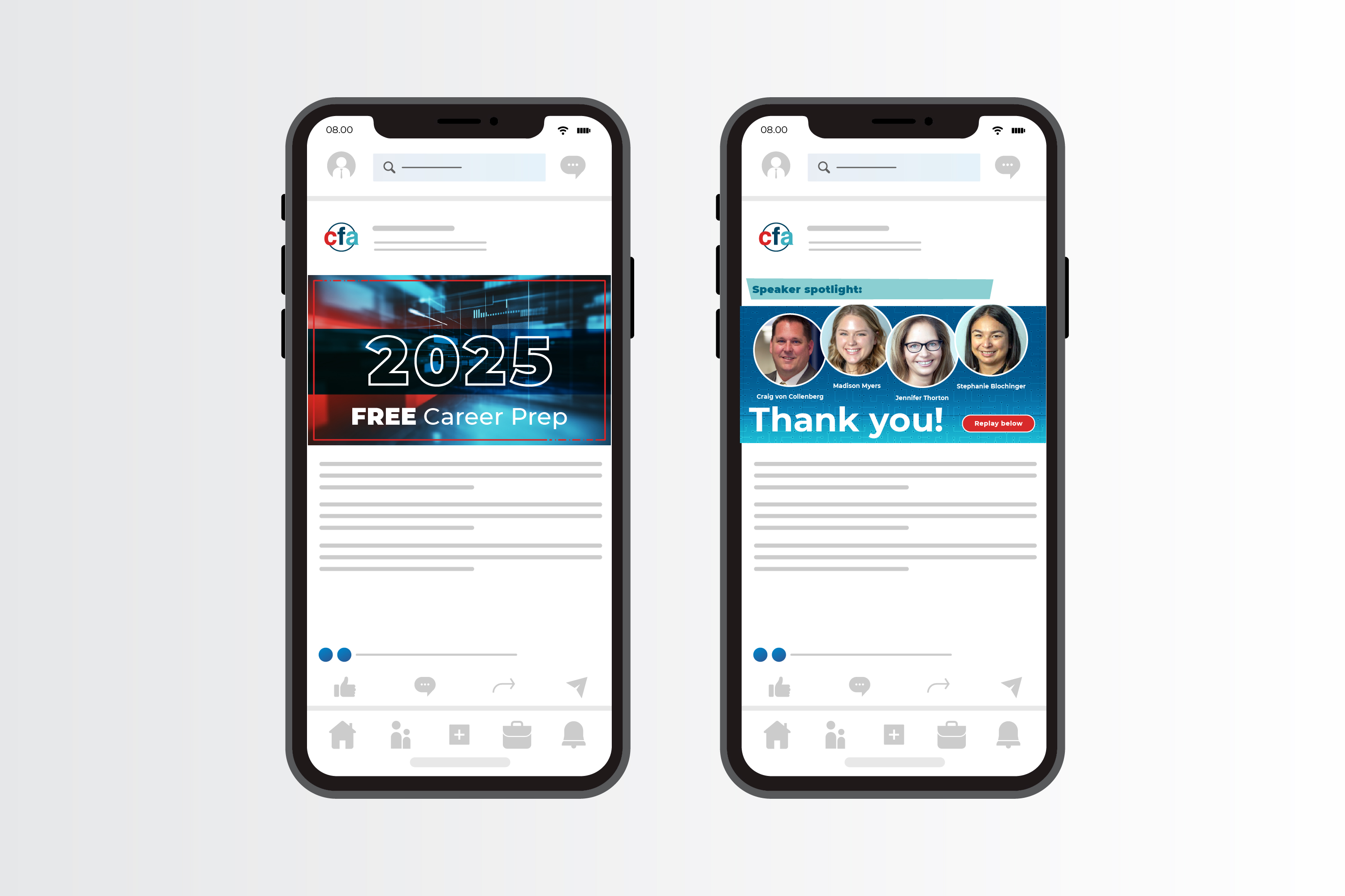
Once the new brand direction was approved, I got busy creating different LI assets, advertising off-site events, holidays, and other announcements; driving traffic to computingforall.org and their sister site, watchcoalition.org.
Within months, CFA's LI engagement increased substantially and the increased brand awareness helped extend CFA's reach to training partners and potential employers.
Below are a few examples, some mocked up. I used the different orientations and the multi-page carousel option. While I fought to keep the graphics very simple and eye-catching, there were some announcements that required a fair amount of text.




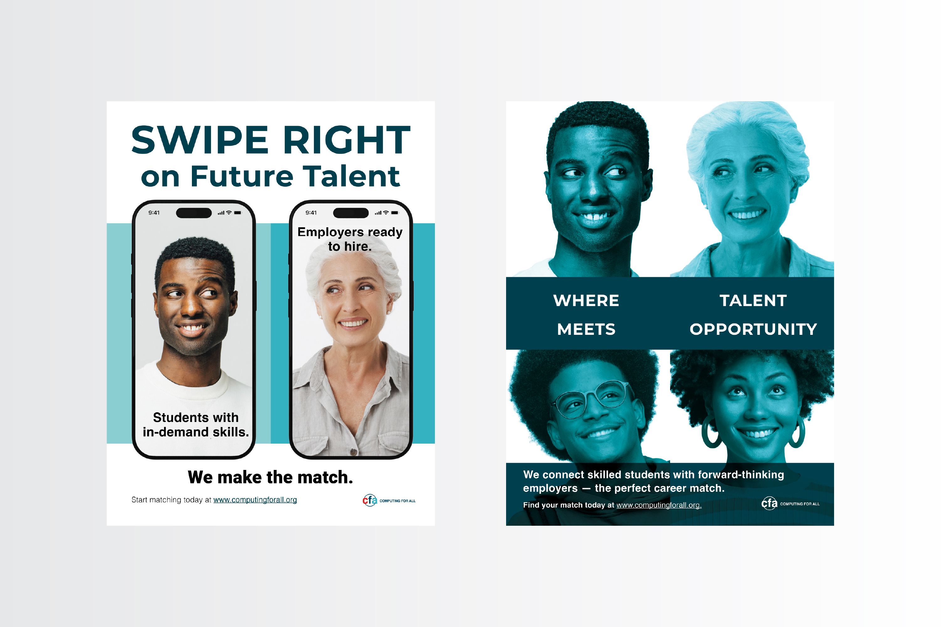
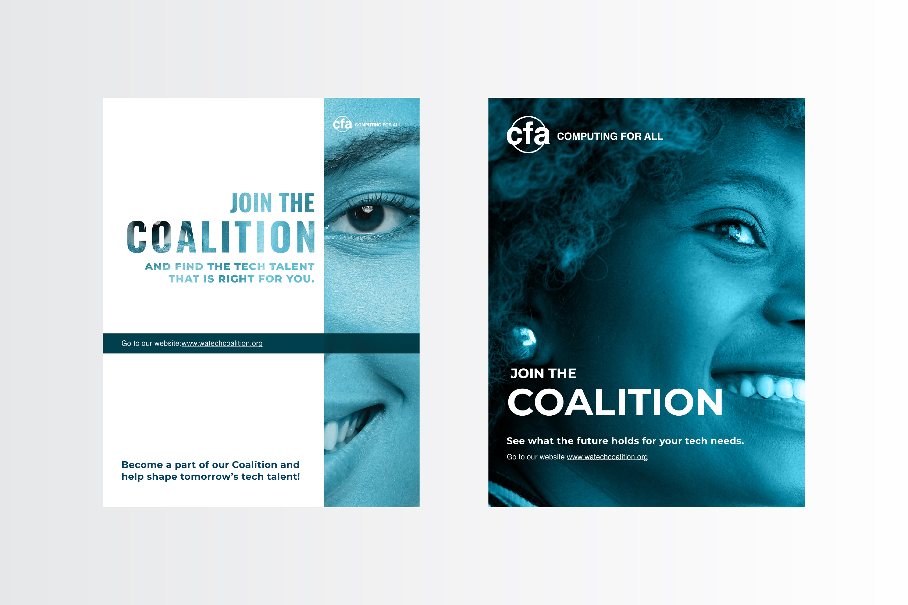
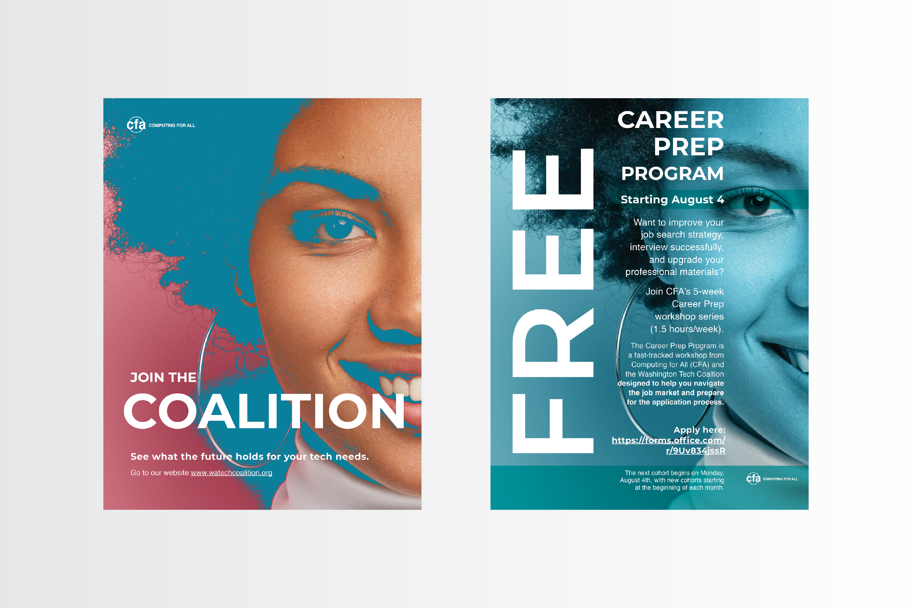
CFA does a lot of off-site events and the program directors work very closely with educators--so providing printable and digital flyers helped increase CFA's program awareness and provided crucial info for prospective candidates.
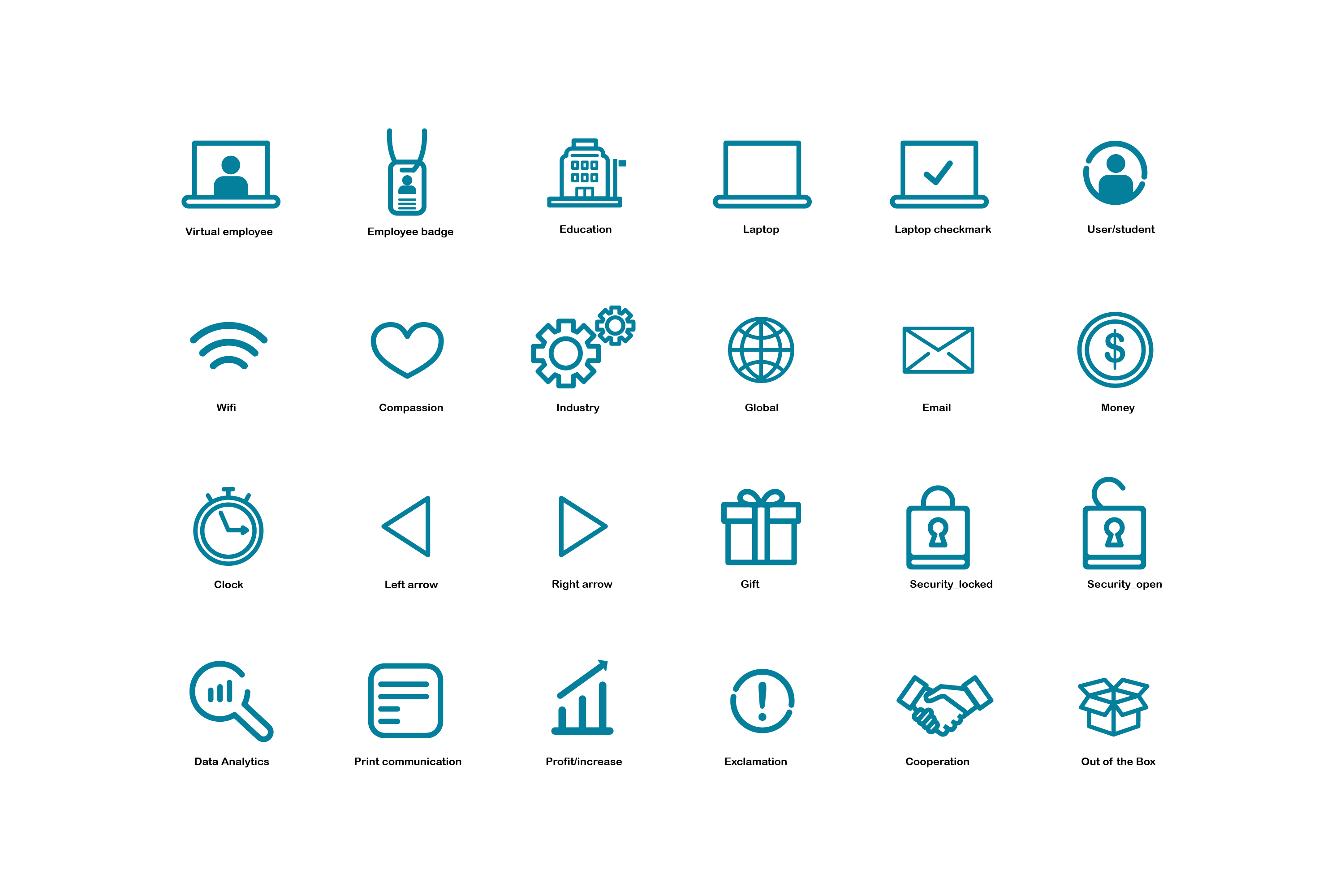
I also created a family of icons, meant to be folded into the brand styleguide and used on the website. It was decided, at some point, the icons would be used solely for flyers and other non-website assets.
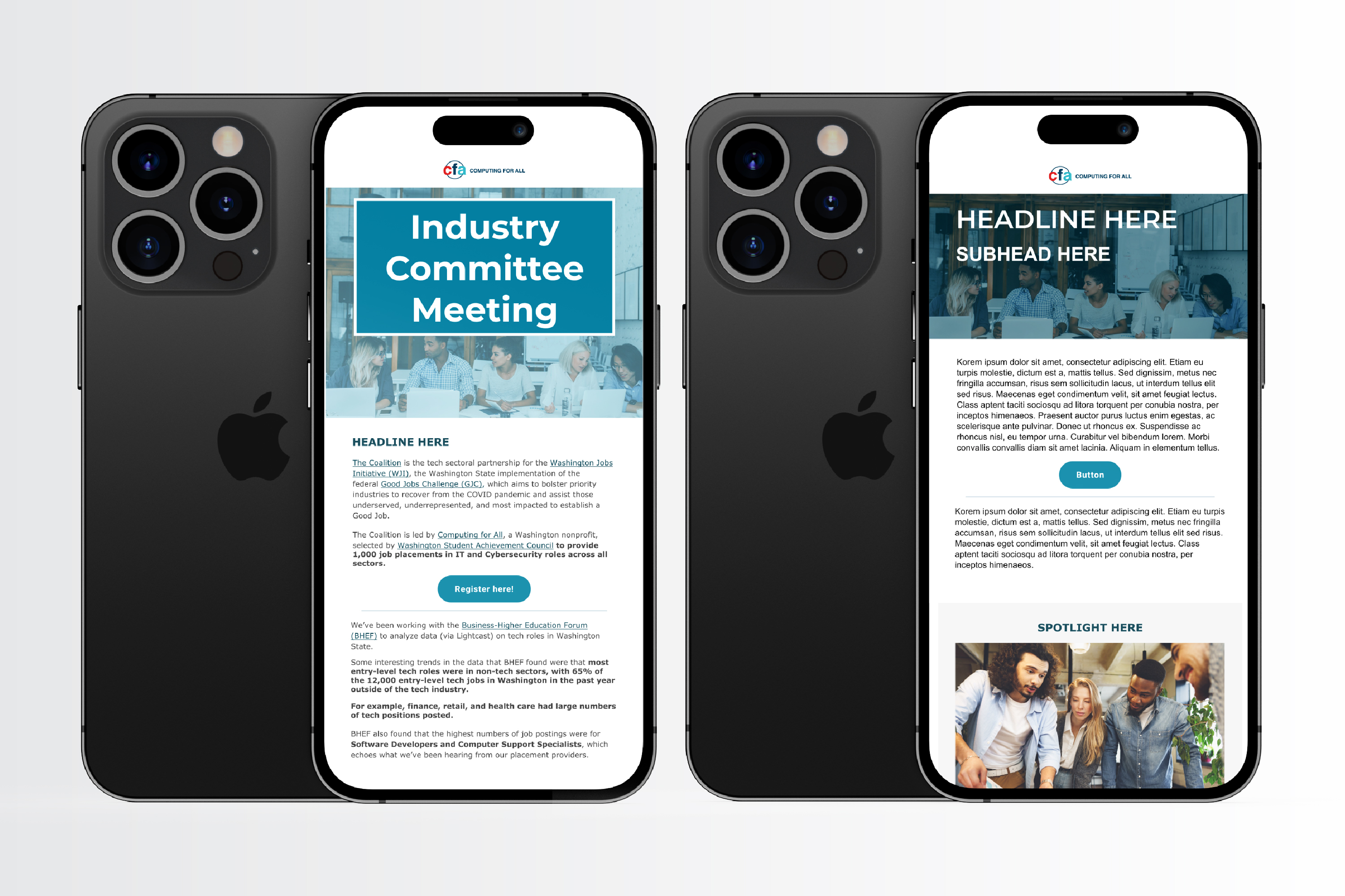
Also below are a couple of dummy email mockups, done in Figma and executed in Microsoft Dynamics, for their email marketing campaigns and event annoucements.

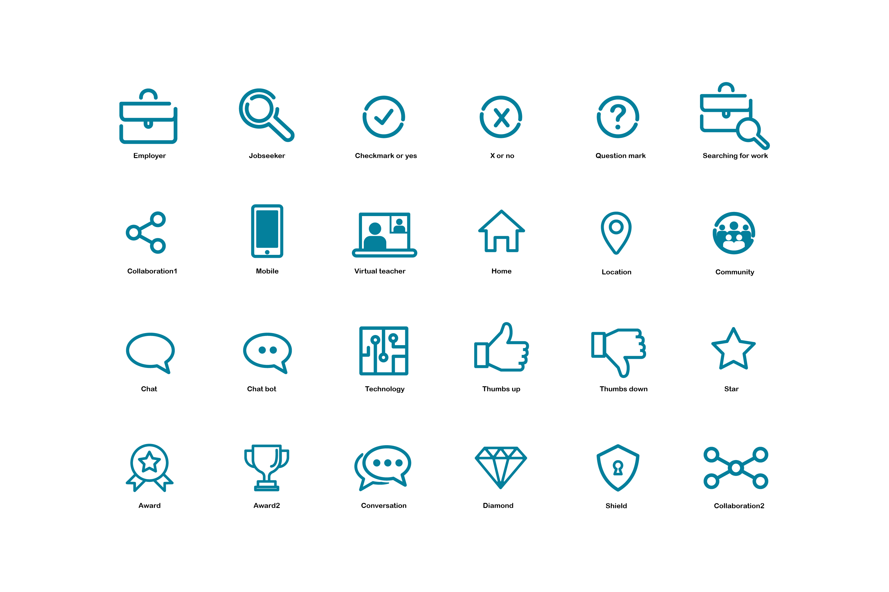
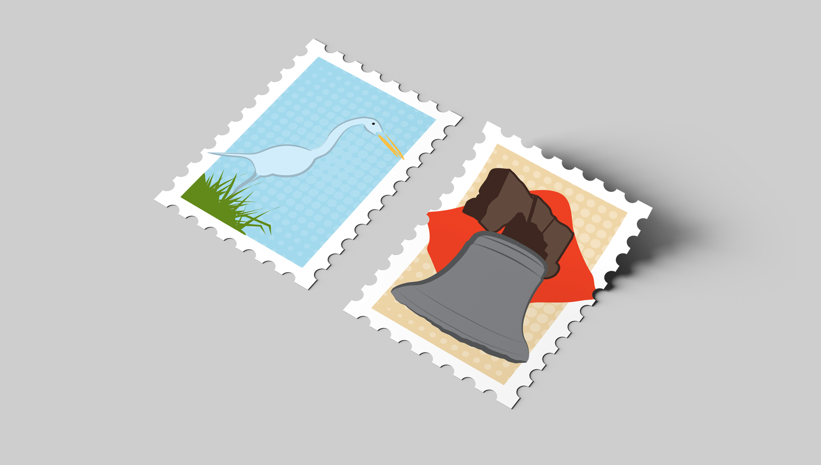
While working as an in-house designer for a Fortune 500 company, I developed a destination icon system for the organization's national awards program. The style was playful and outside of the normal brand constraints.
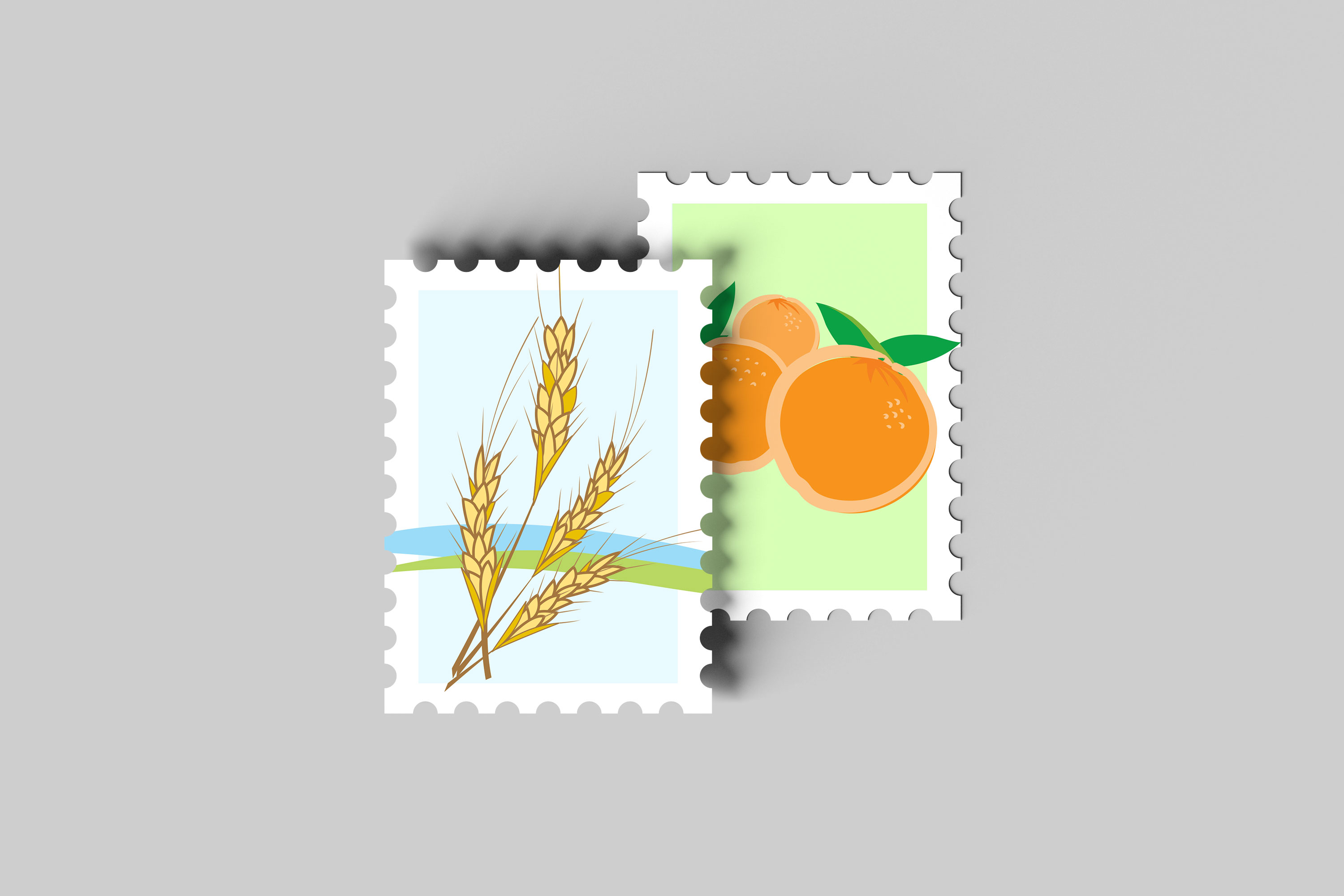
Some of these illustrations and icons were used for printed convention booklets and agendas....which, for the life of me, I can't find ANYWHERE. So, I created my own marketing mockups.
Scroll through the images by clicking on the numbers/arrows below.




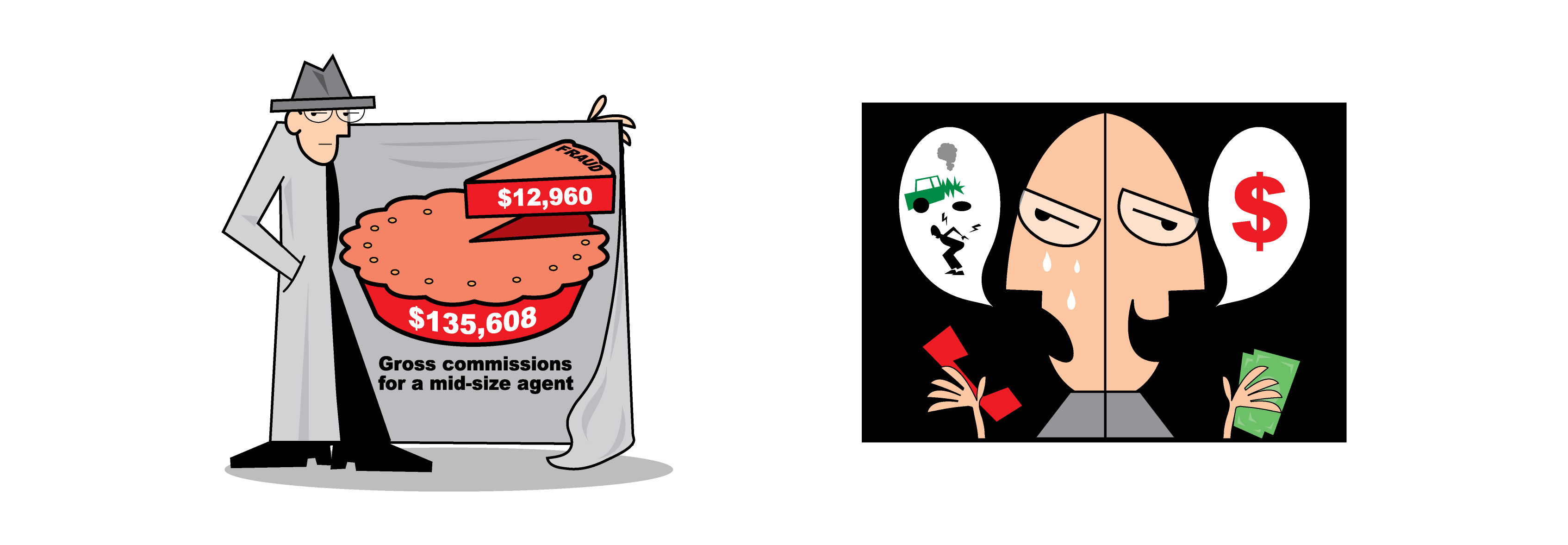
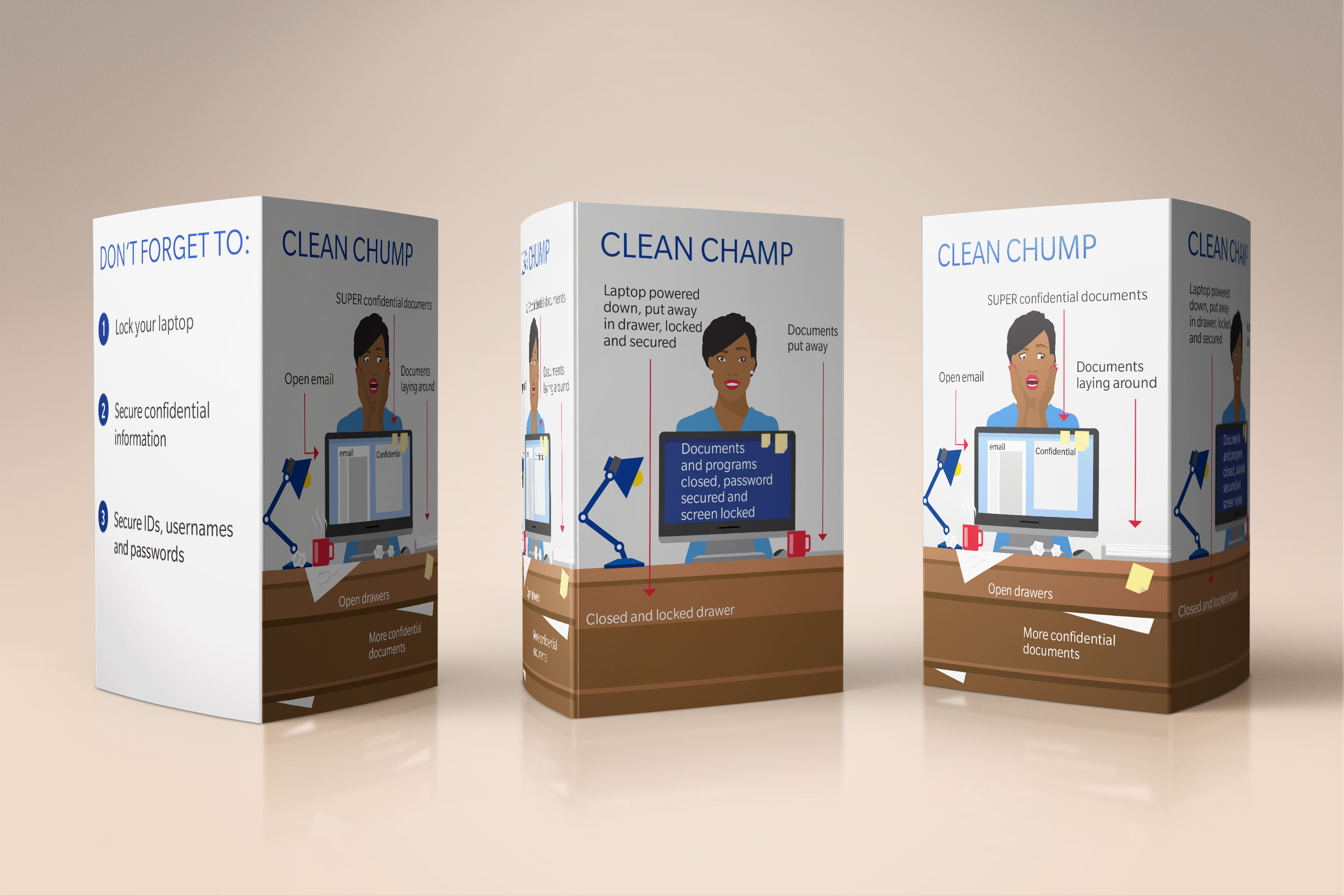
I often had to create illustrations for internal publications, marketing materials, and digital channels. This meant I had to mimic a style. Bold graphics and simple shapes allow the visual to convey a message quickly and concisely.
Below are a couple of examples of graphics for an article on insurance fraud, showcased in an industry themed publication.
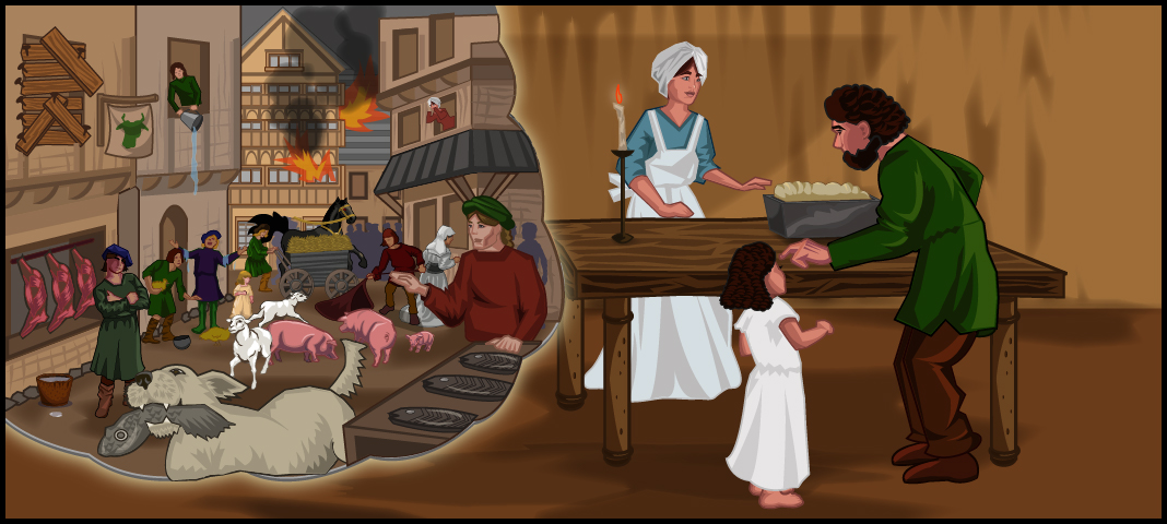
While most of my experience has been in the corporate marketing space, I have worked for several companies, focusing on the kids' genre: both educational and entertainment. I had a blast doing those assignments. Vector art worked perfectly since we often had to rescale for digital and print channels.
Below is a storyboard of illustrations on Genghis Khan and his rise to power for a project with Knowledge Kids Network, a kids learning website. Unfortunately, they are no longer in service.
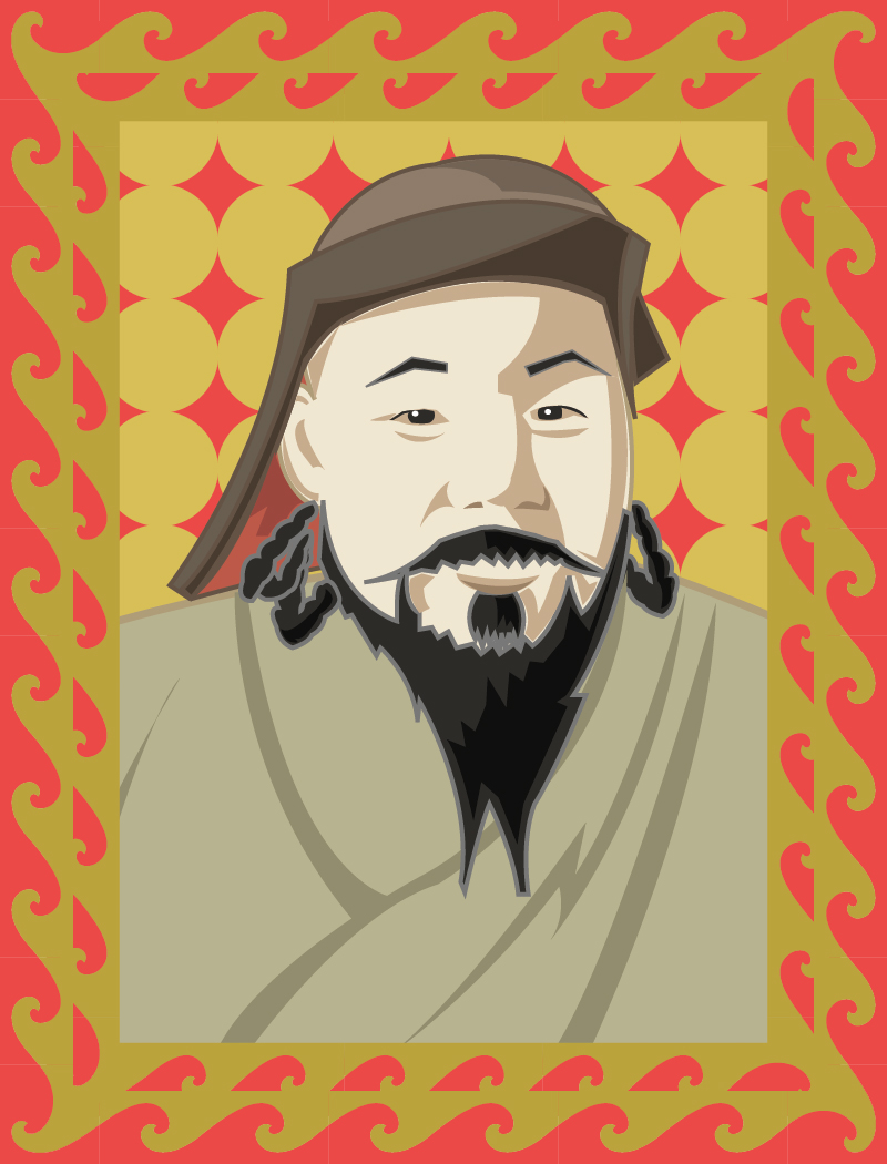
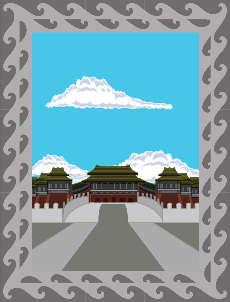

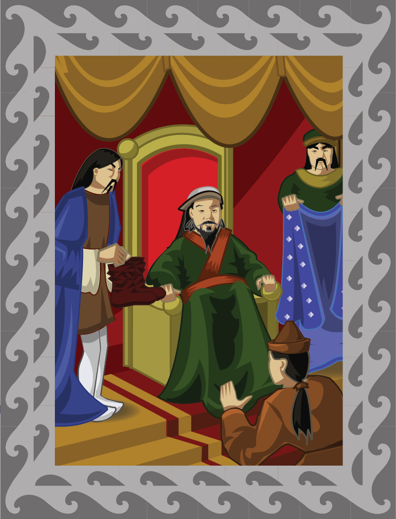
Also for KKN, we did a series of storyboards/panels for an educational module, with three panels telling a particular story. Below are a couple of examples....all illustration sketched and vectored in Adobe Illustrator.
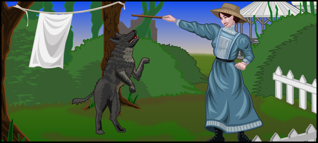
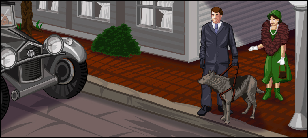
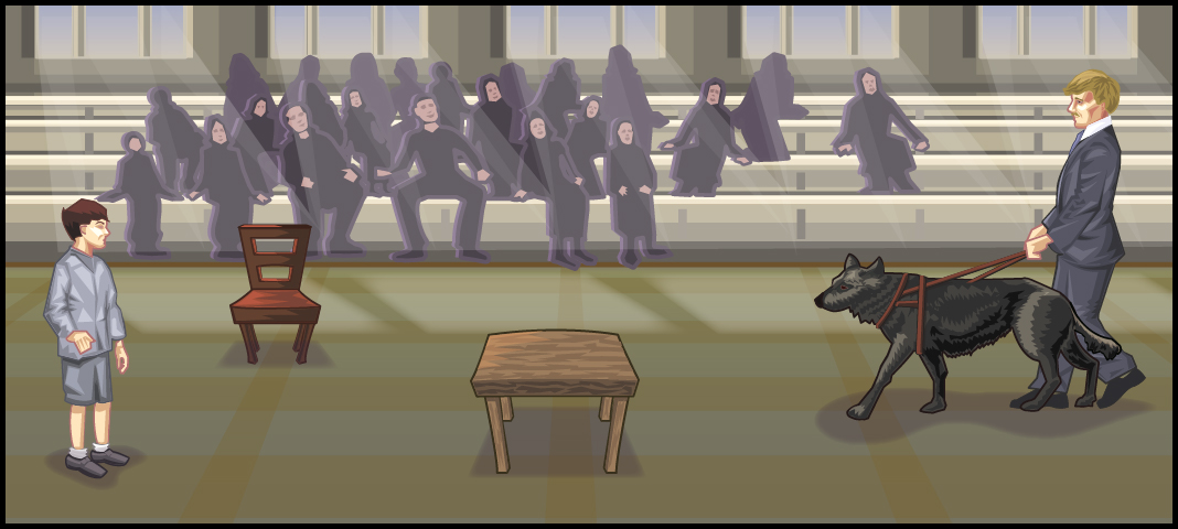
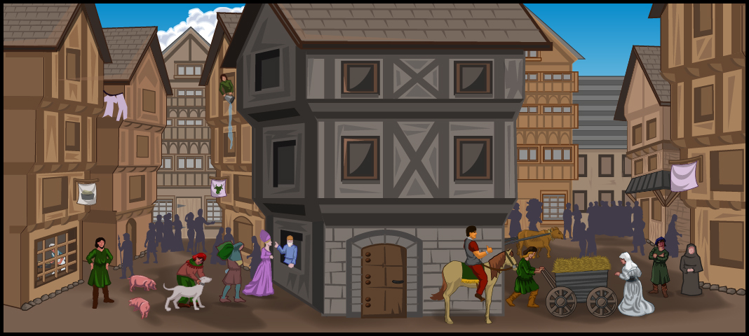
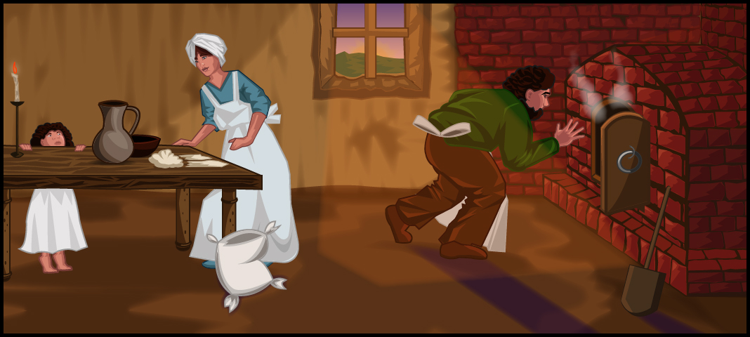
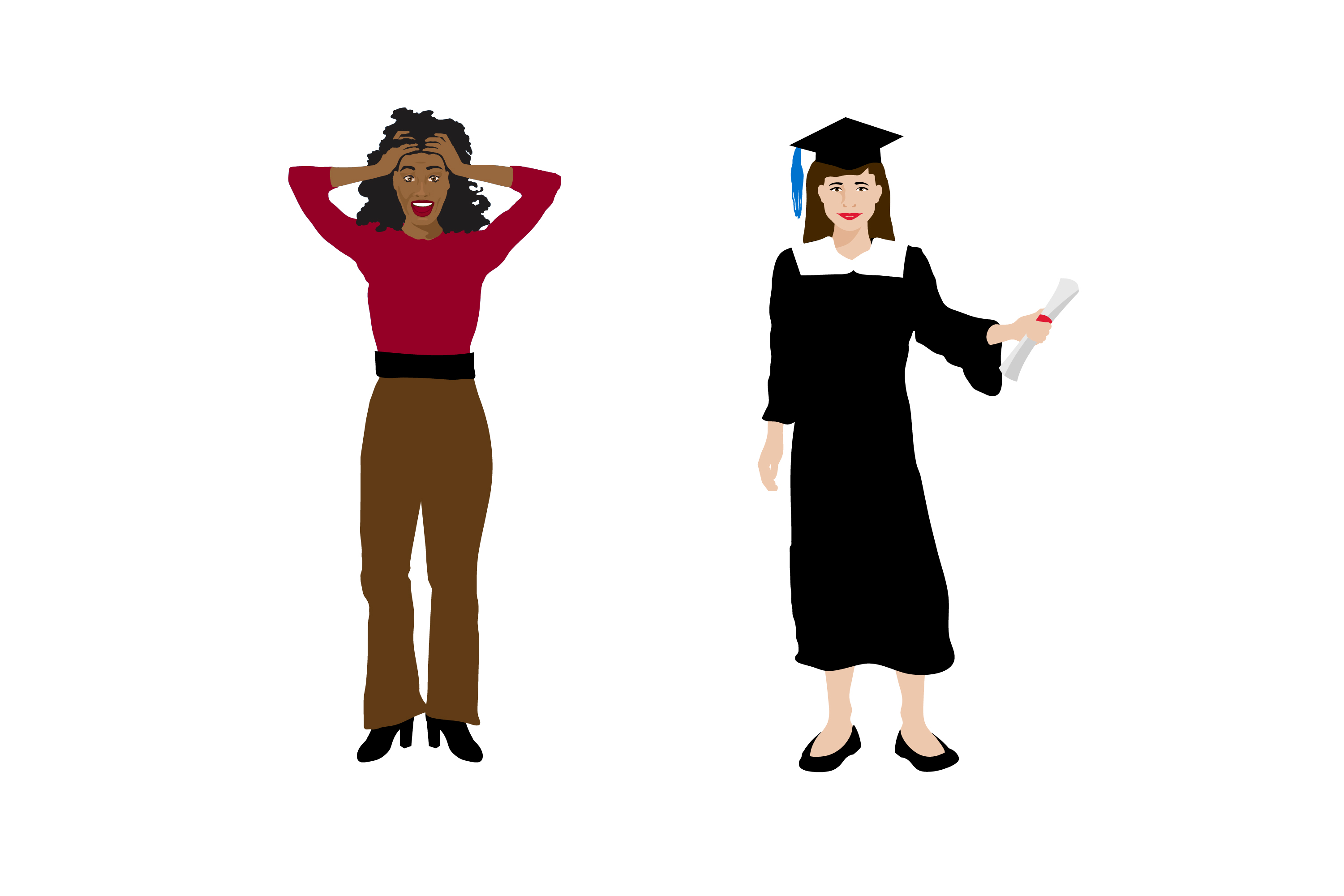
Drawing people and creating emotive characters is a lot of fun. Creating in vector programs, like Adobe Illustrator, makes it even better...since I can explore a lot of different styles and create various poses without loss of quality.
The below images were done for various projects and clients.
Scroll through the images by clicking on the numbers/arrows below.

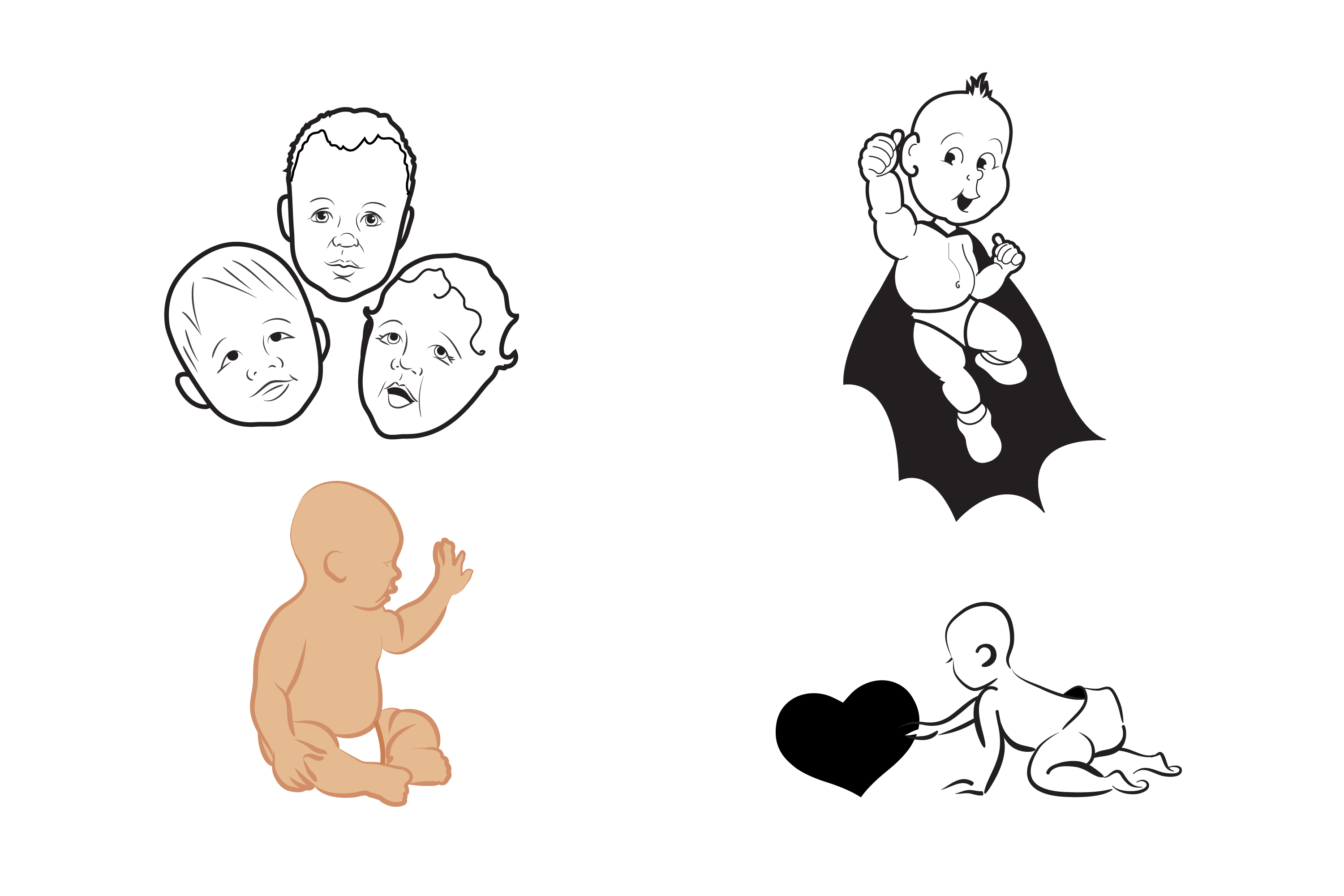

I did a few badge/sticker designs for an internal employee rewards system called 'Props.' They needed to be fun, colorful, and yet simple enough to read at a small size within the internal intranet. I made them into stickers because....well, I love to mock up my art!
The badges are Wally Wisdom, Einstein Achiever, and Ninja Reader.

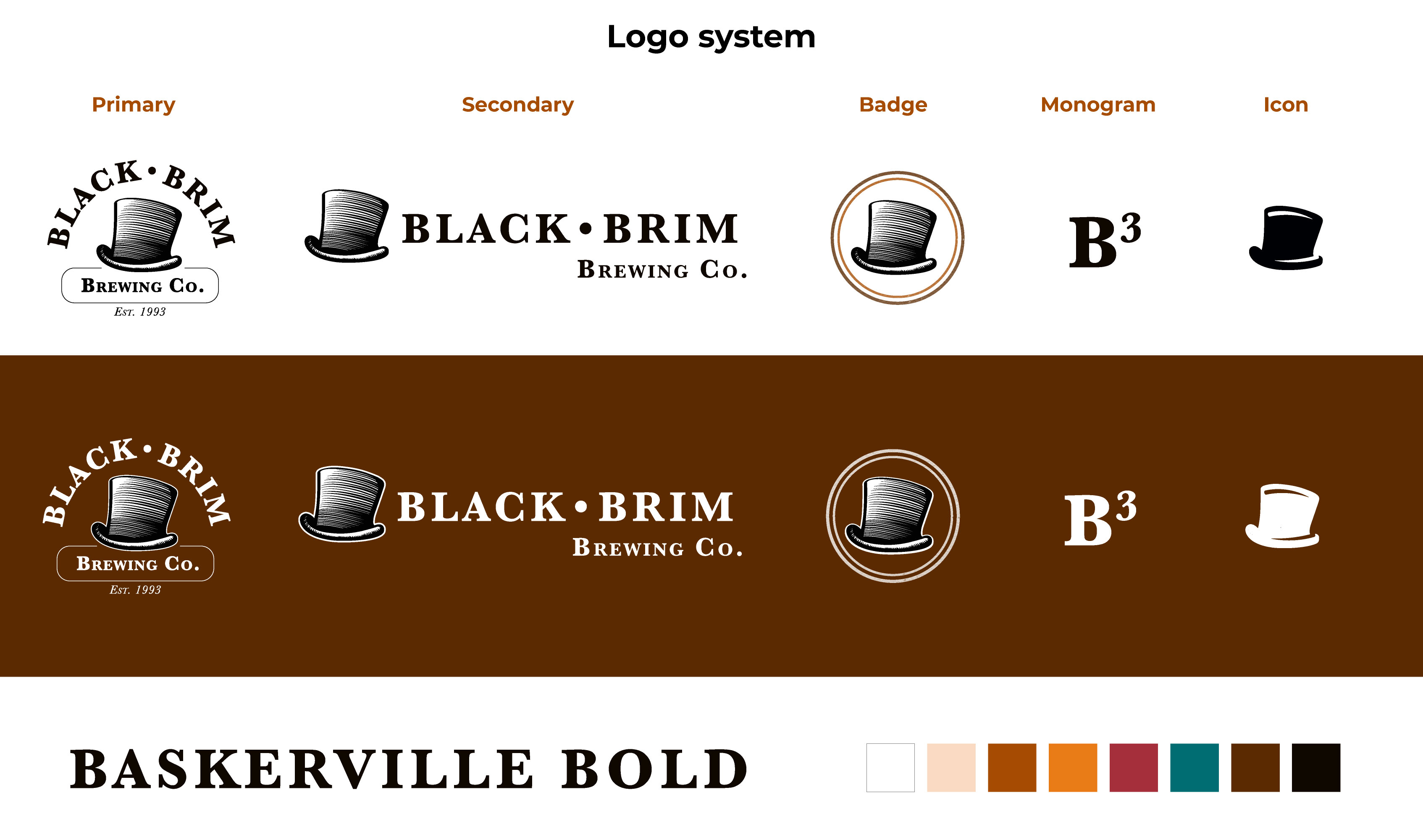
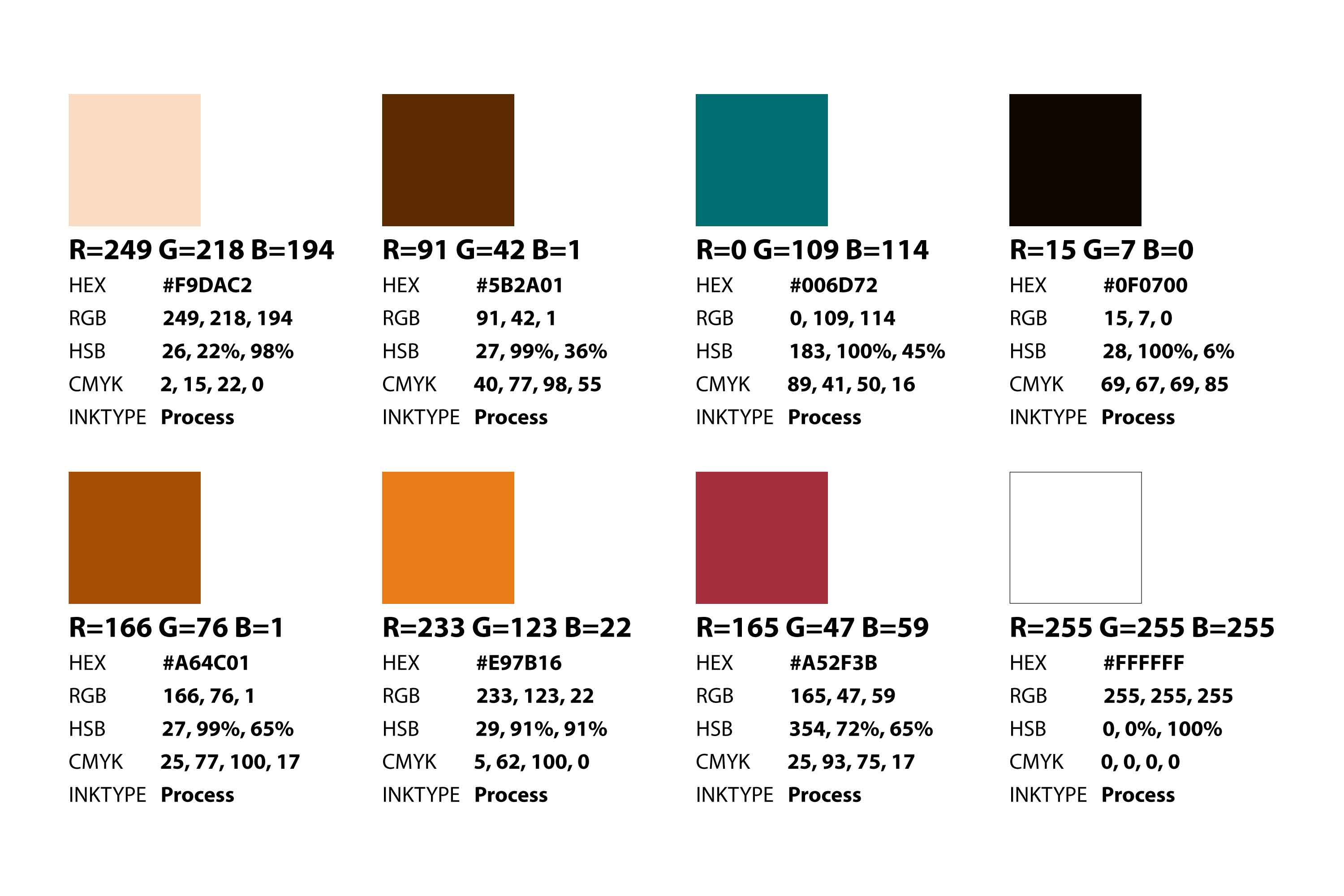
One of the challenges in creating a whole identity system for a California-based brewery was retaining the family tradition while appealing to a younger crowd. The engraved top-hat mark honors the brewery’s old-world family heritage, while the color palette, typography, and additional logo treatments give the identity a contemporary edge.
A system of logos were created to lend flexibility to various assets: whether it was the smallest of icons to be used in digital media or the primary logo, used on signage. Multiple application was key.
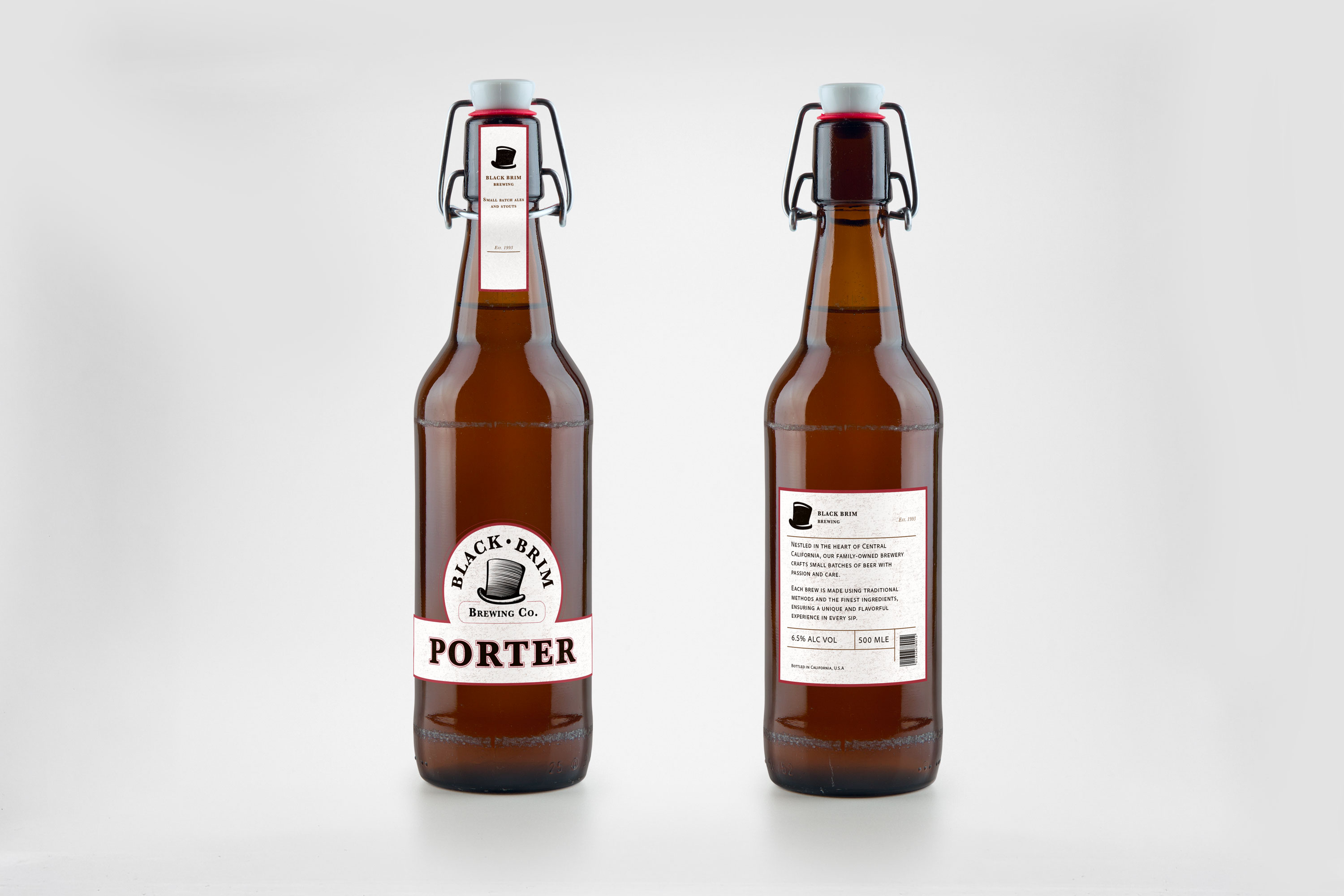
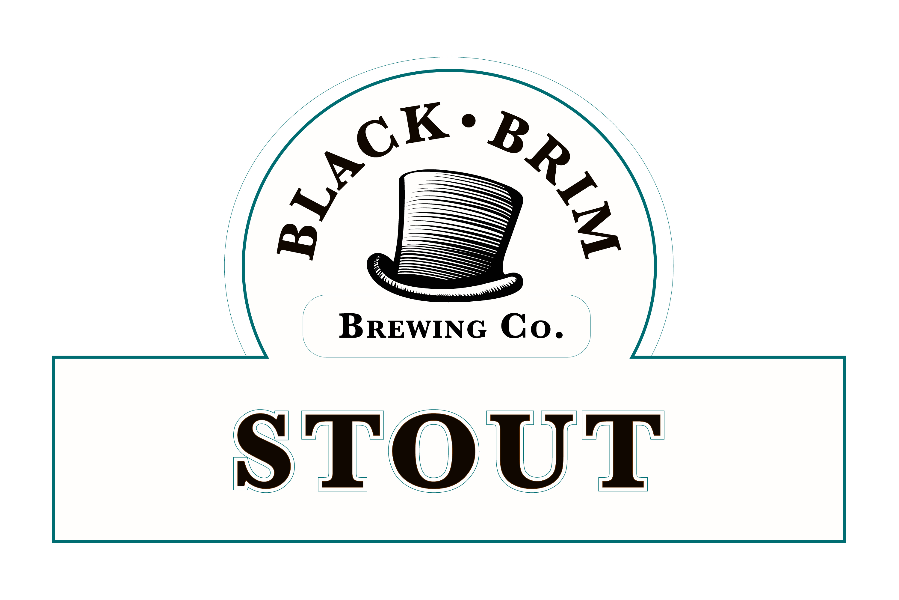
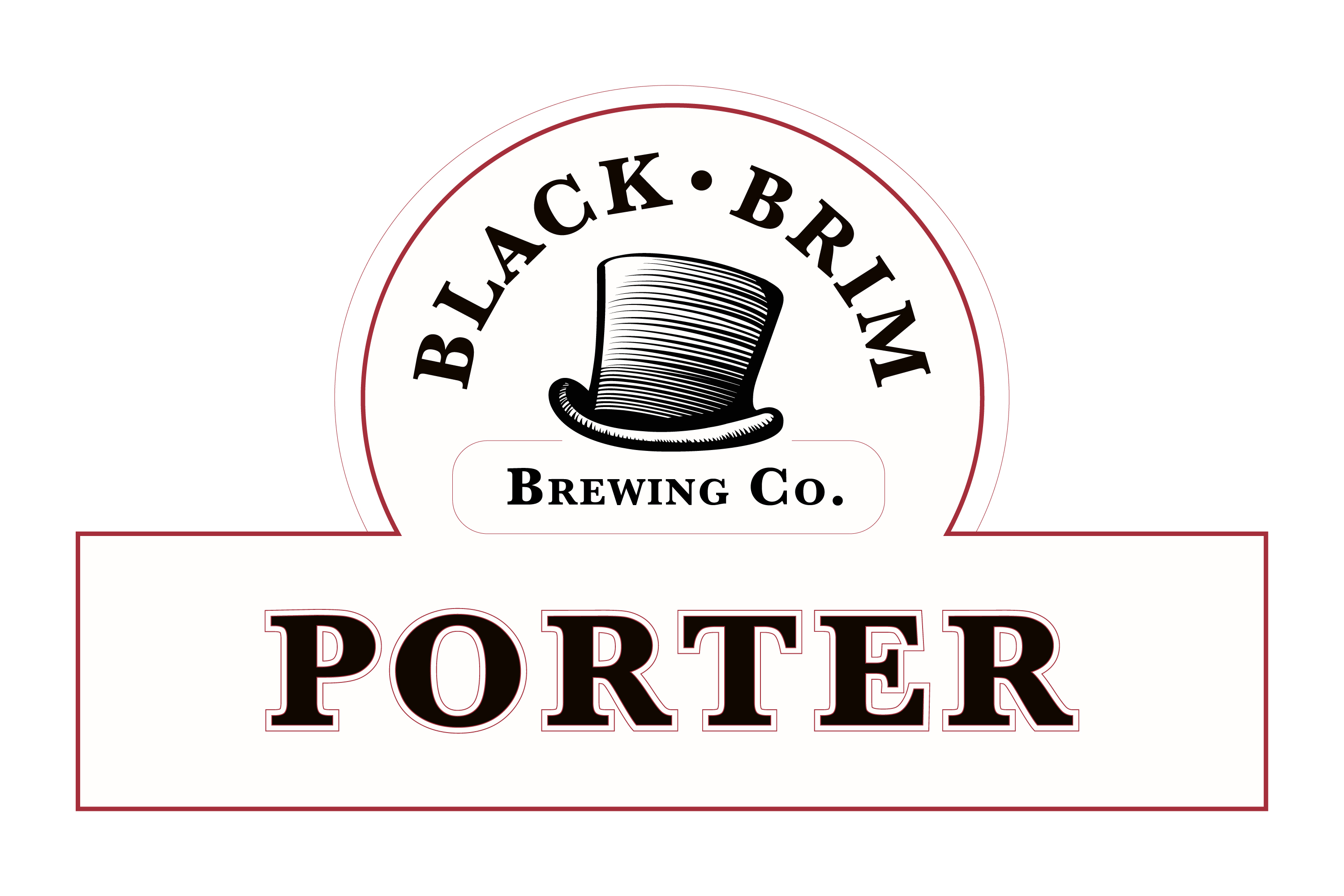
Once the logo system was created, it was time to do real-world application. So labels were created. Two taglines came to mind: 'Tradition in Every Pint' and 'We Mind Our Ps & Qs.'
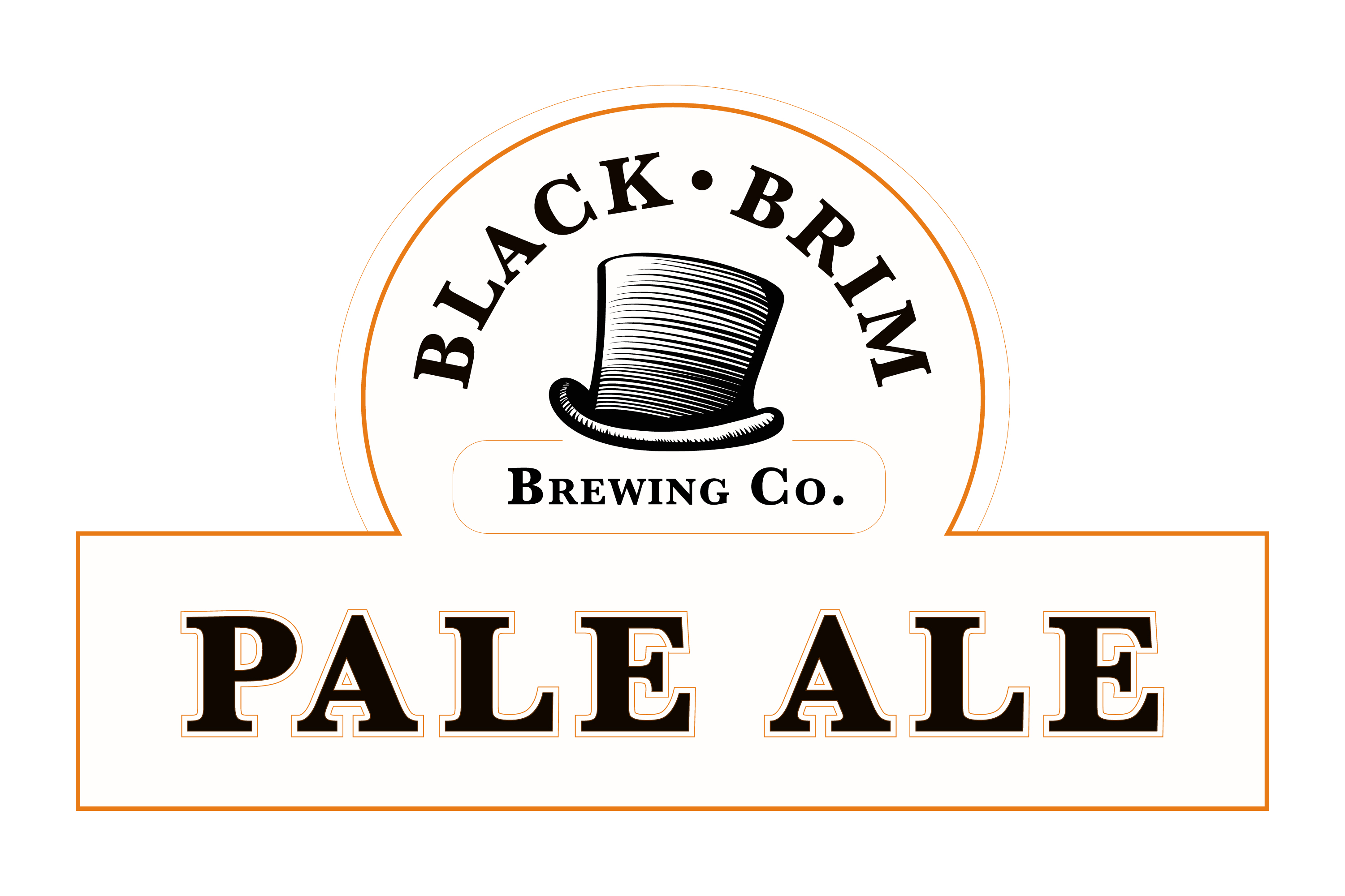
The flagship line includes Pale Ale, Porter, and Stout — three distinct styles designed to appeal to a broad range of tastes. The old-world bottle designs and textured labels gave the brand an authentic but contemporary vibe. Hipsters and Baby Boomers could drink together, similar to an European pub or café.
Scroll through the images by clicking on the numbers/arrows below.


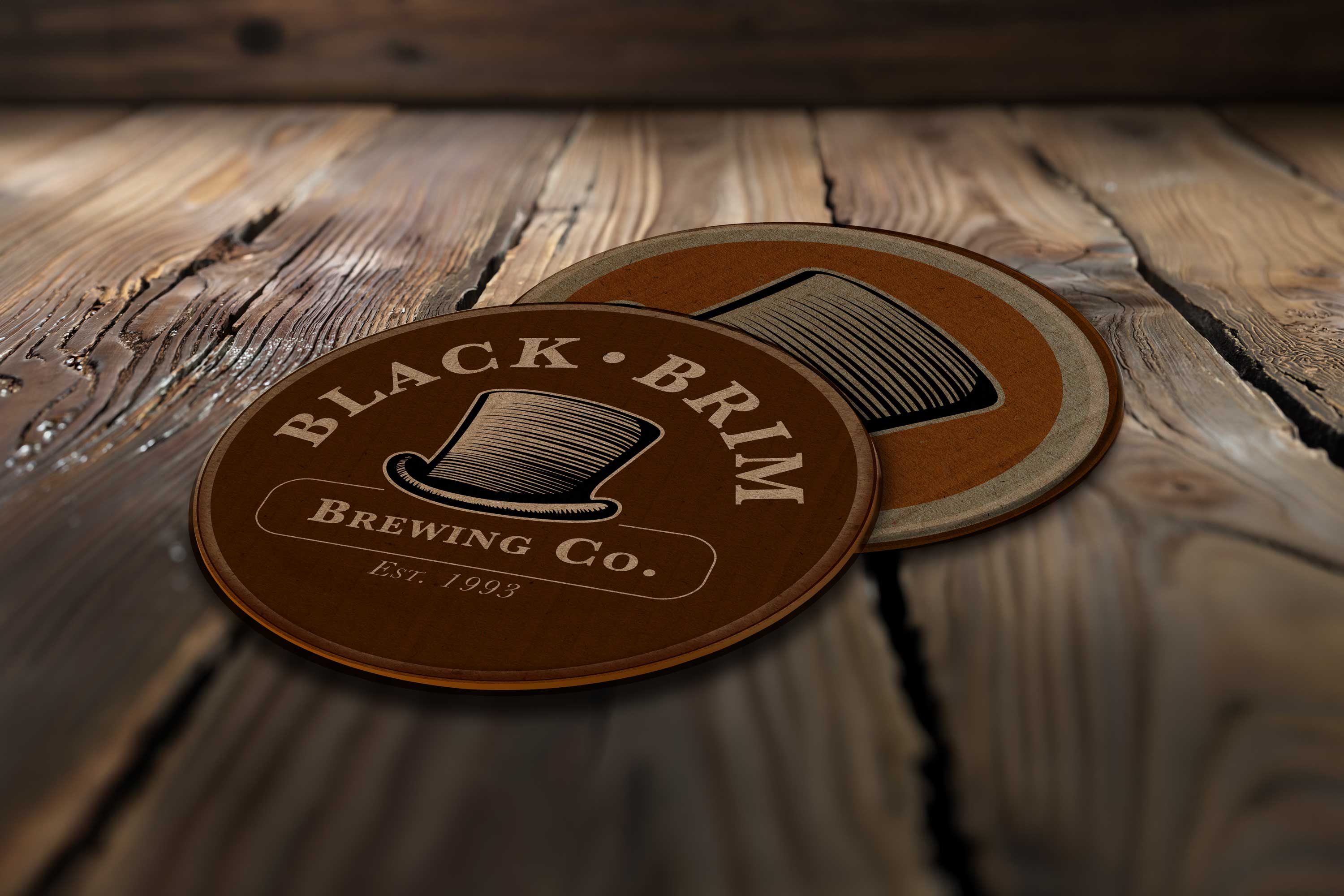
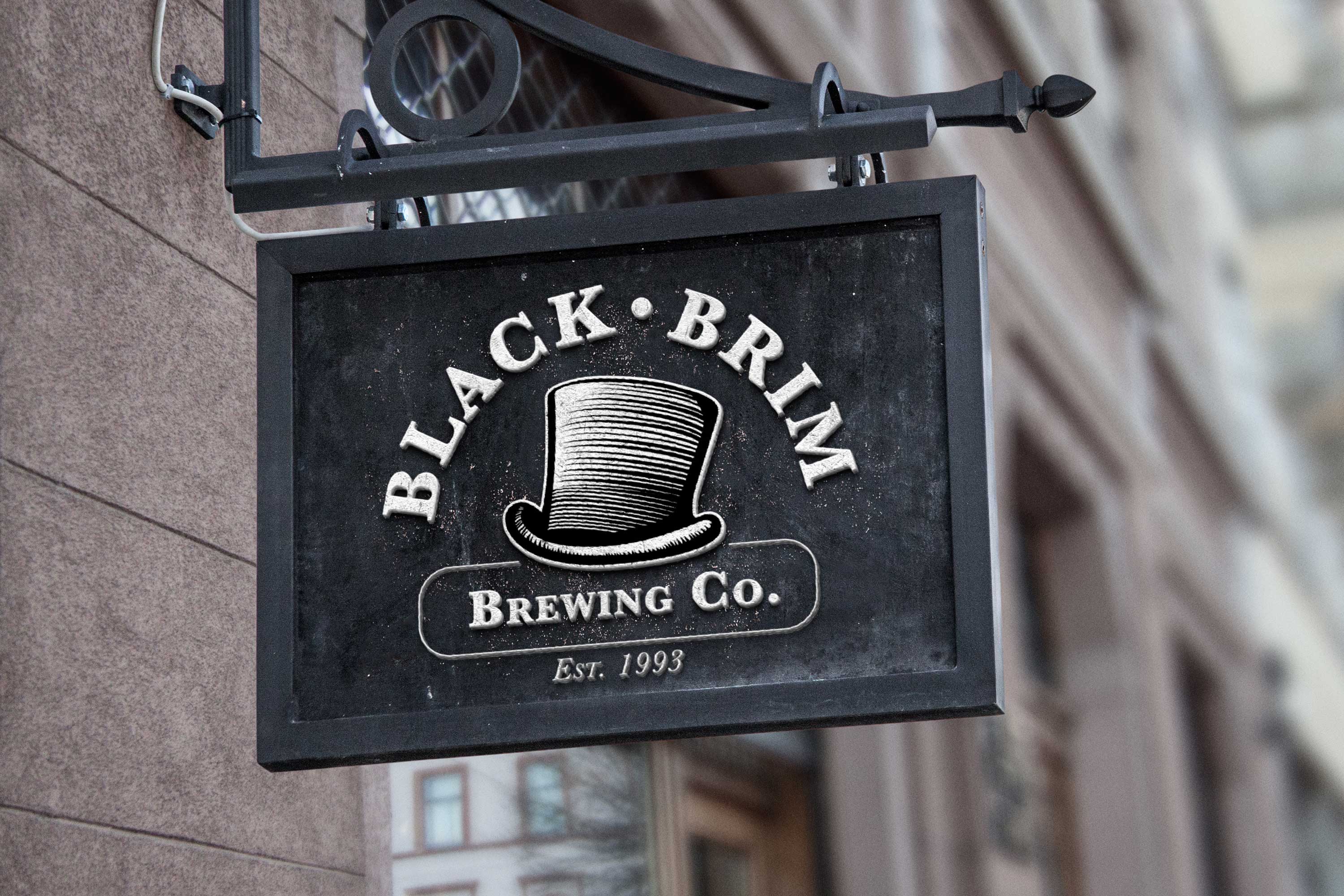
Signage, coasters, van wrap, etc., showcase the full branding system to help complete that warm ambiance of the Modesto and San Francisco pubs.
Scroll through the images by clicking on the numbers/arrows below.
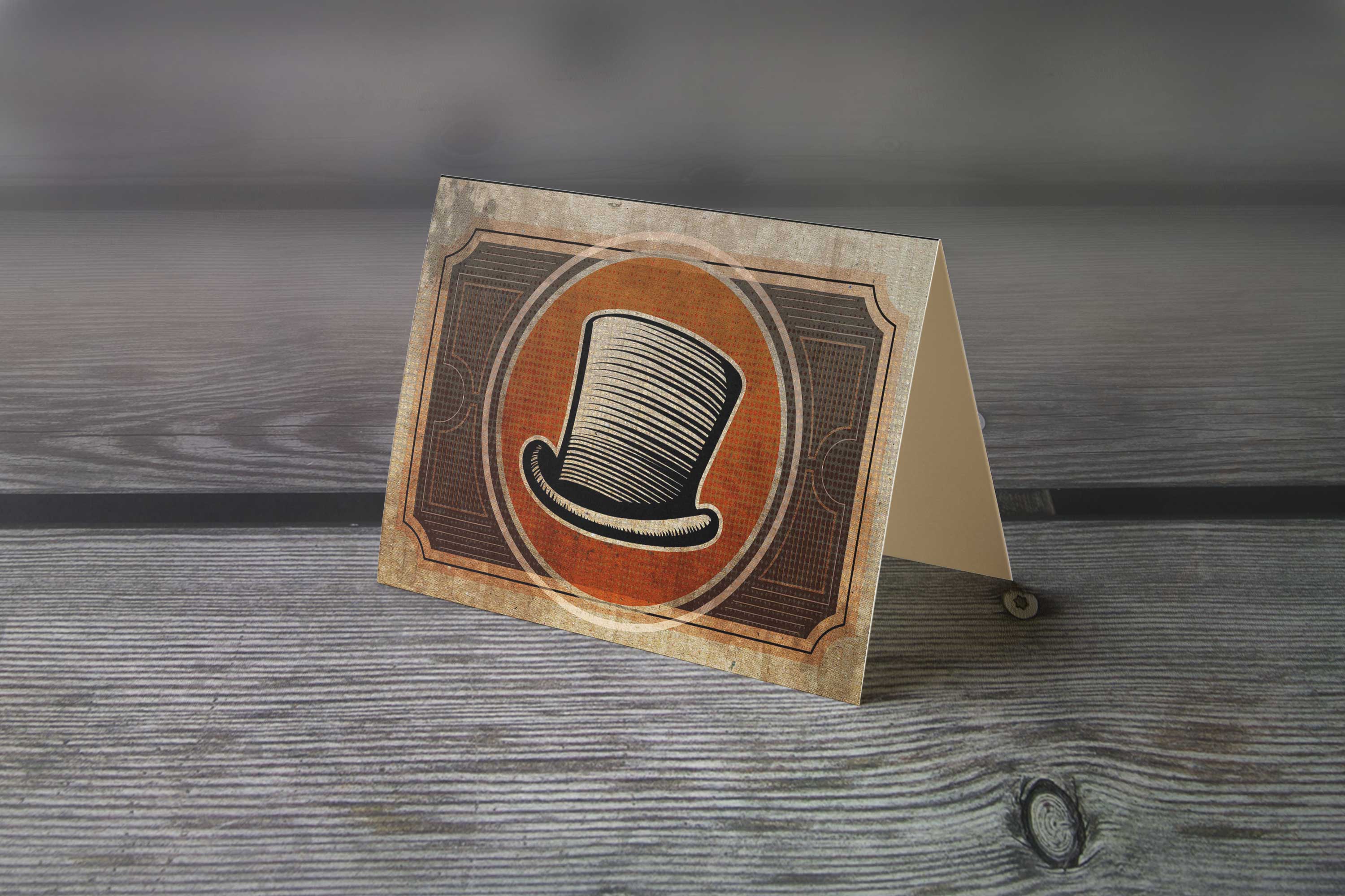
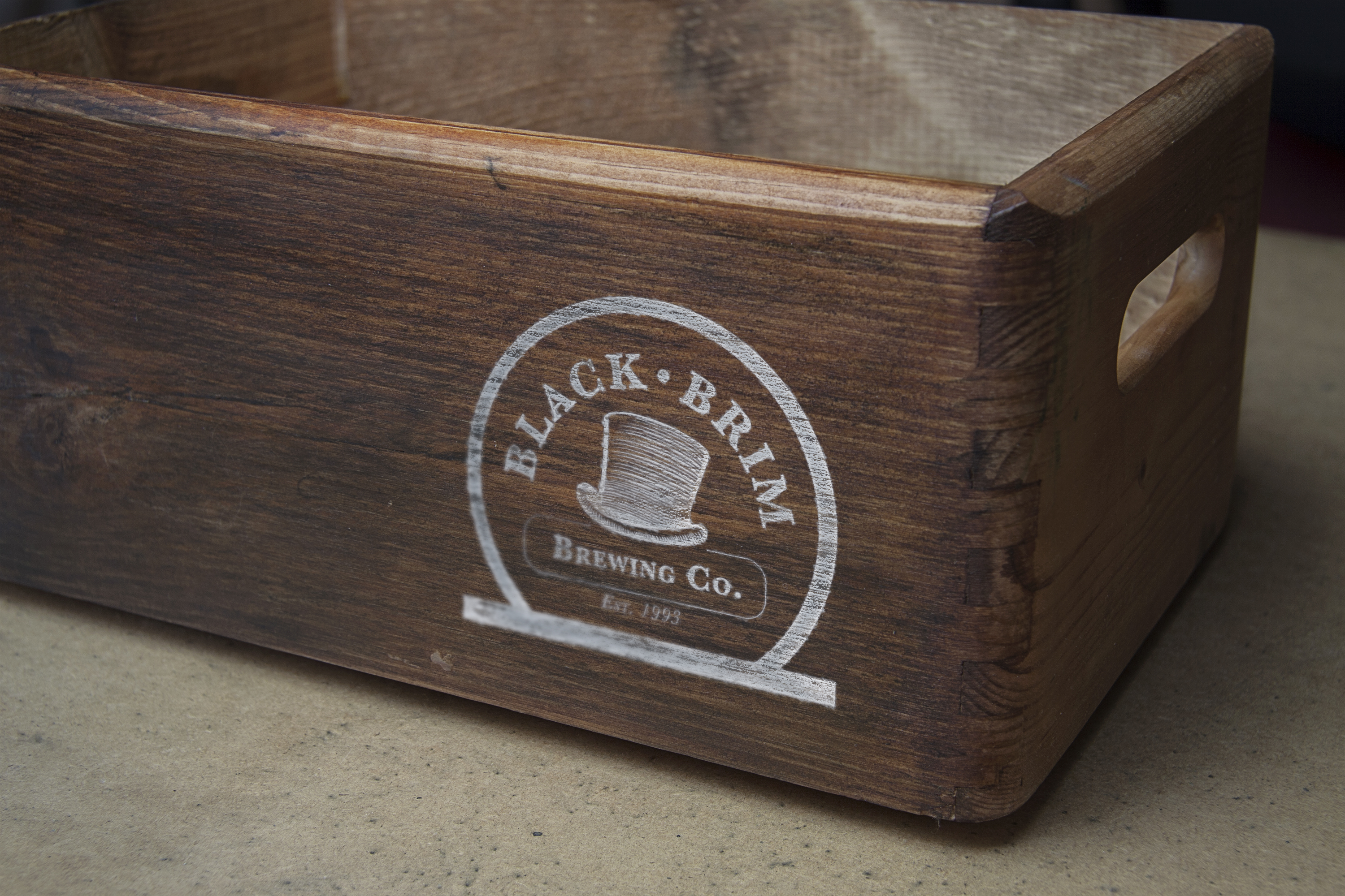
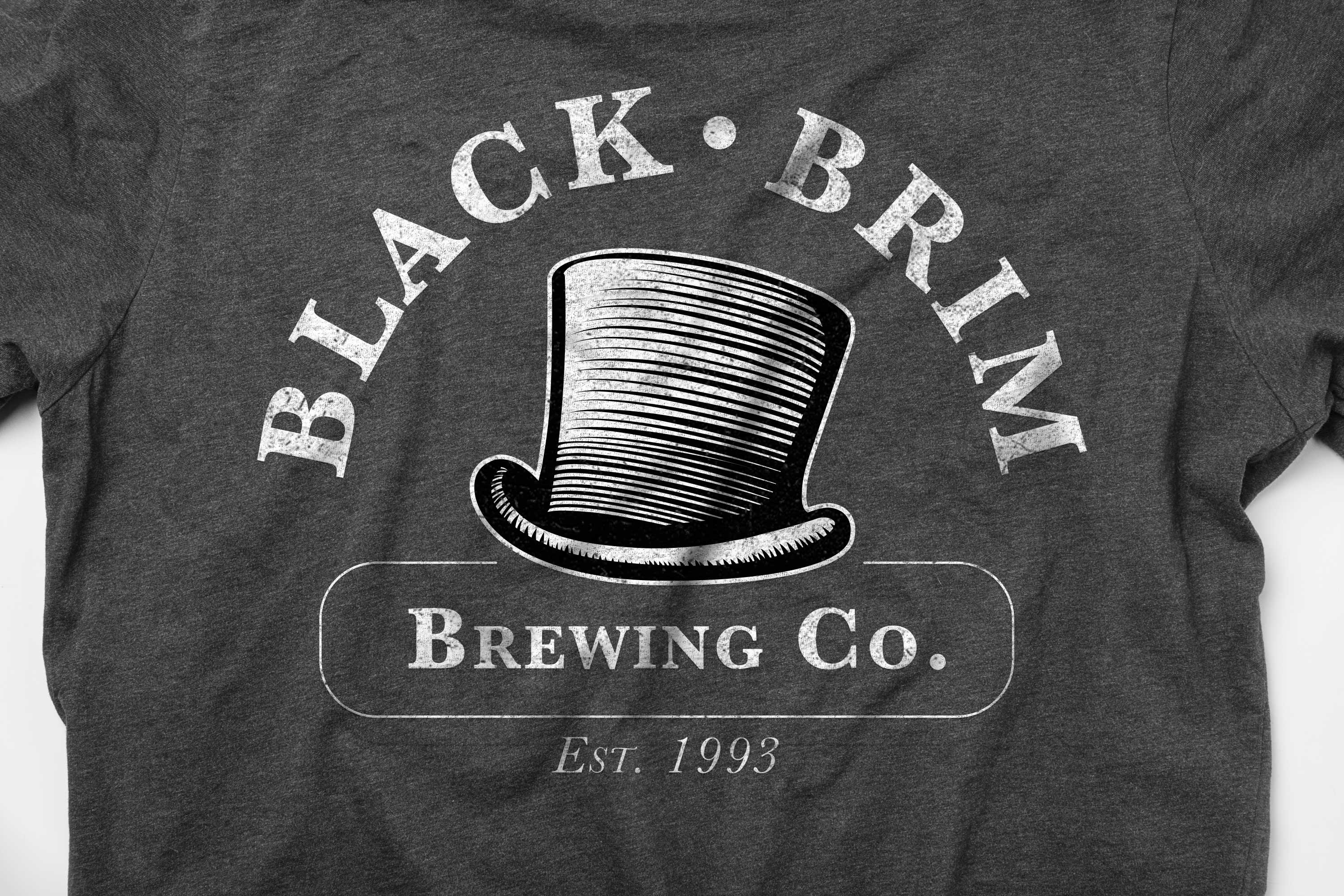
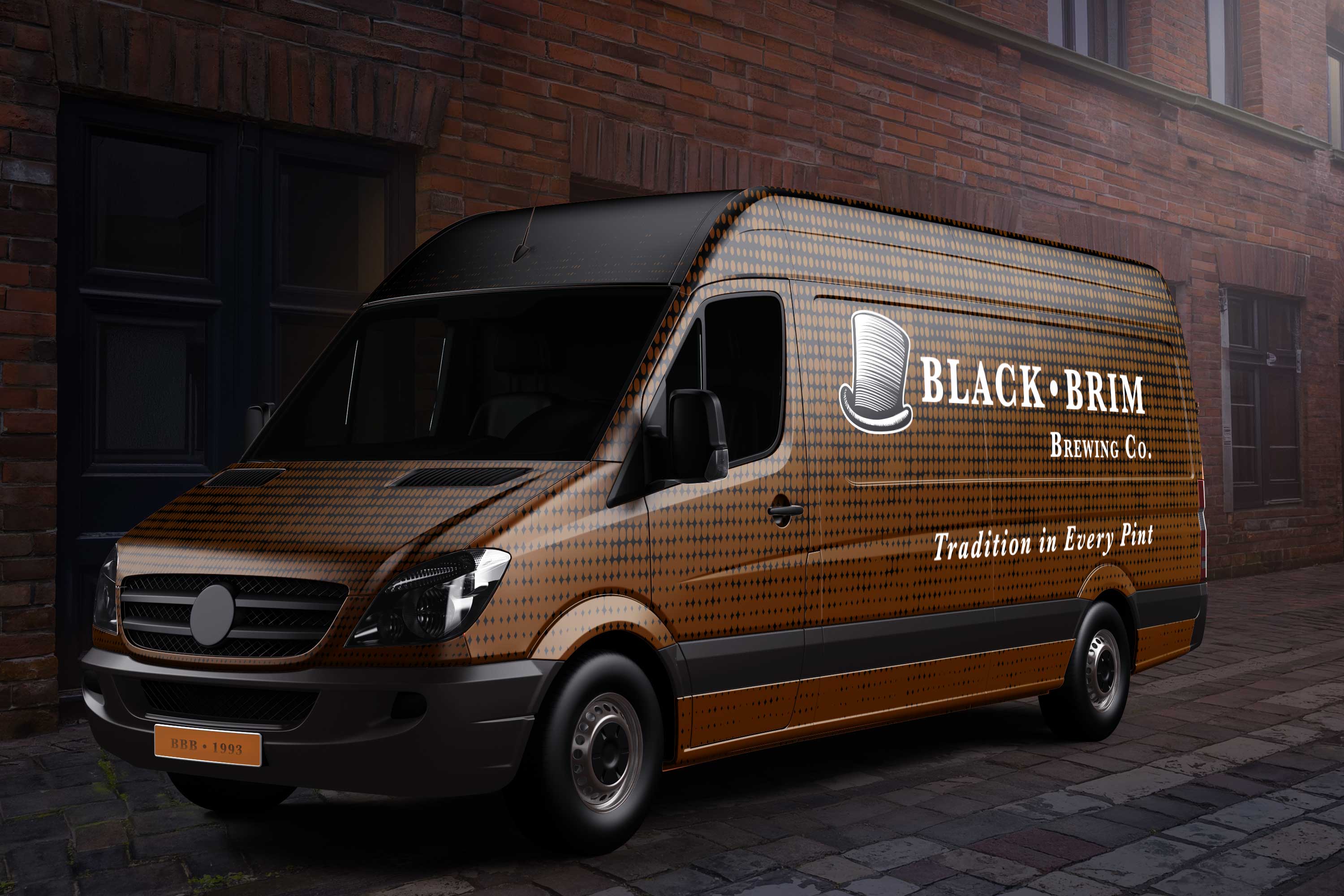
Three logo variations—stacked, reversed, and high-contrast—support a range of applications.
Every year, I participate in the #Inktober social media challenge: do an ink drawing, based on a daily prompt. It's for fun and for free. And, I get to not only exercise my drawing skills but my thinking skills as well. I find my personal work really enhances my professional work.
Below are my favorites. I often use my doggies as inspiration for some of the prompts.
Future iterations would add location-based tour discovery, a guest-checkout flow, and more robust filters for dates, amenities, and accessibility needs.
Brava Beauté is a high end product line so the signage needs to reflect that. Also, I wanted to display a typical sign for potential franchise owners.
Below are my favorite Inktober drawings.
Because this was an Instagram challenge, I didn't do any rough sketches or any preliminary work. As previously stated, there was NO time for research or preliminary fact-finding of the target demographic. Below are my favorite boards.
Learn From Experience web graphic, an HR infographic, and internal illustrations.

Use the links below to explore the projects.